Archives for July 2022

July 29, 2022: Fresh Baked

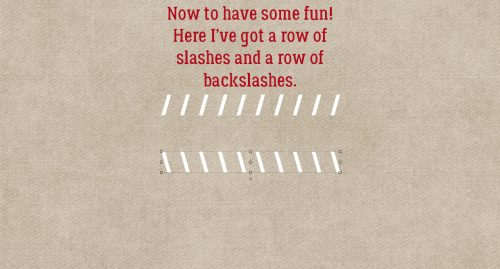
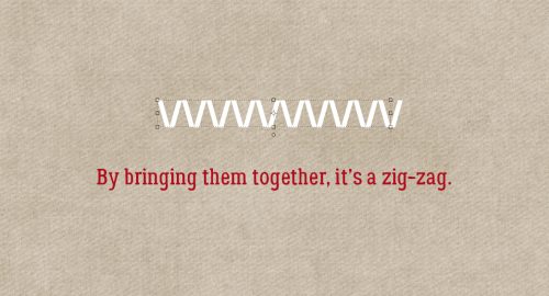
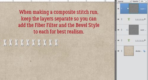
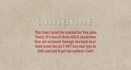
Welcome to another Friday. We’re almost to the end of another month. The months are going so fast.

Remember if you spend $10 in the store, you get this great collab for free.

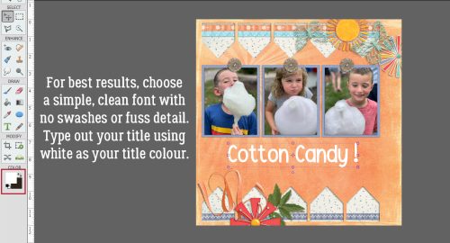
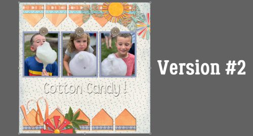
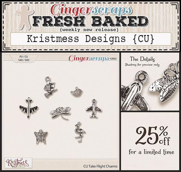
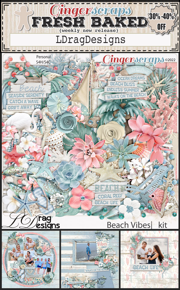
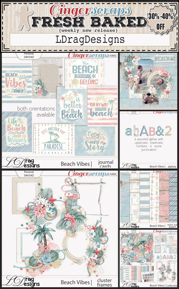
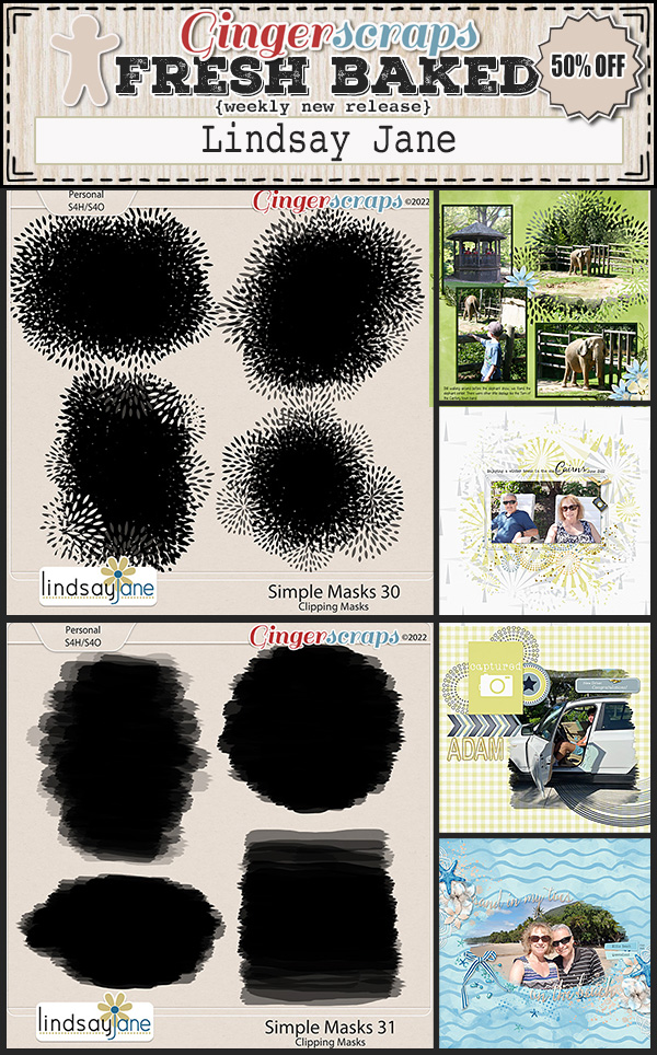
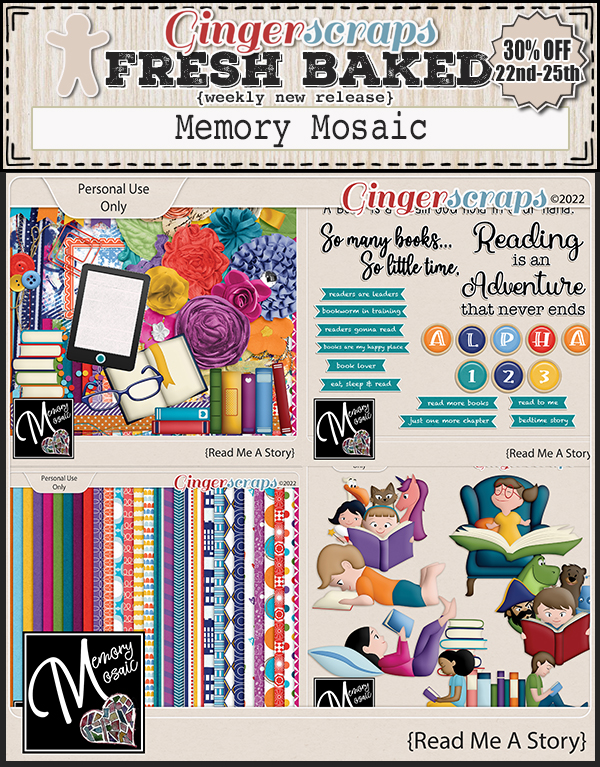
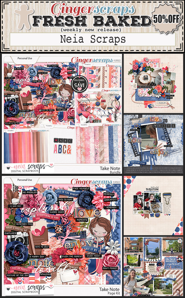
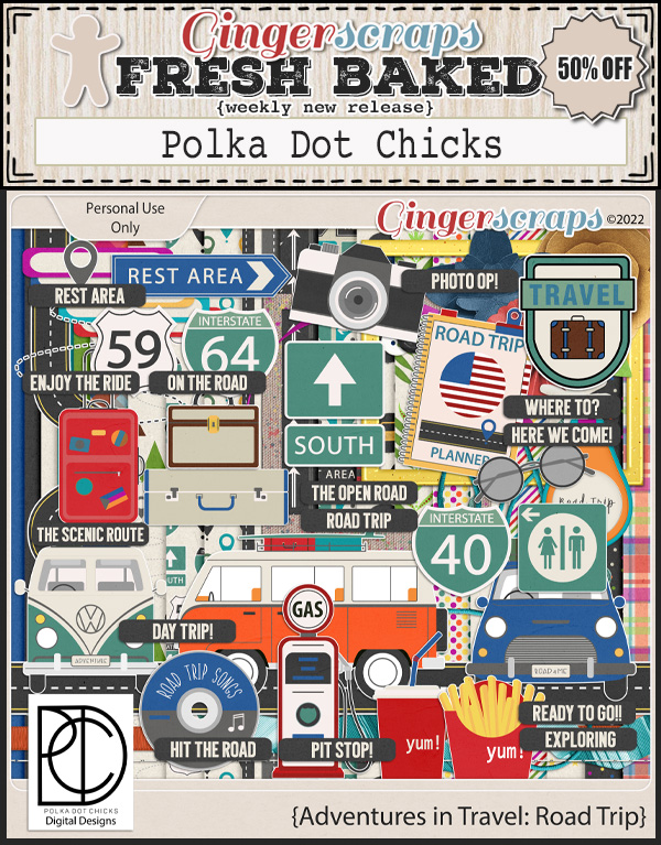
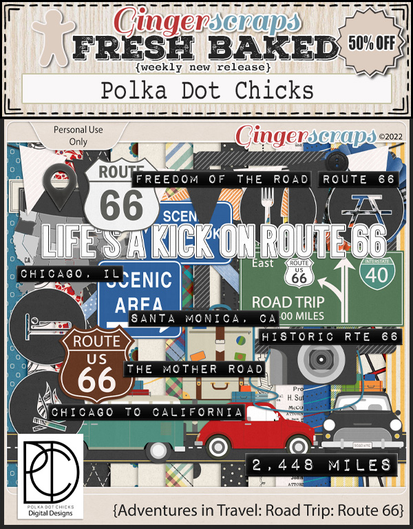
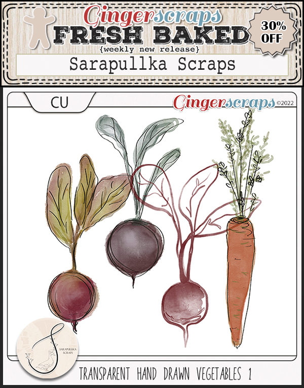
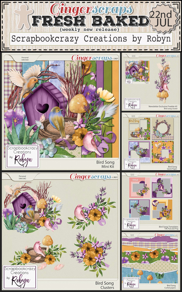
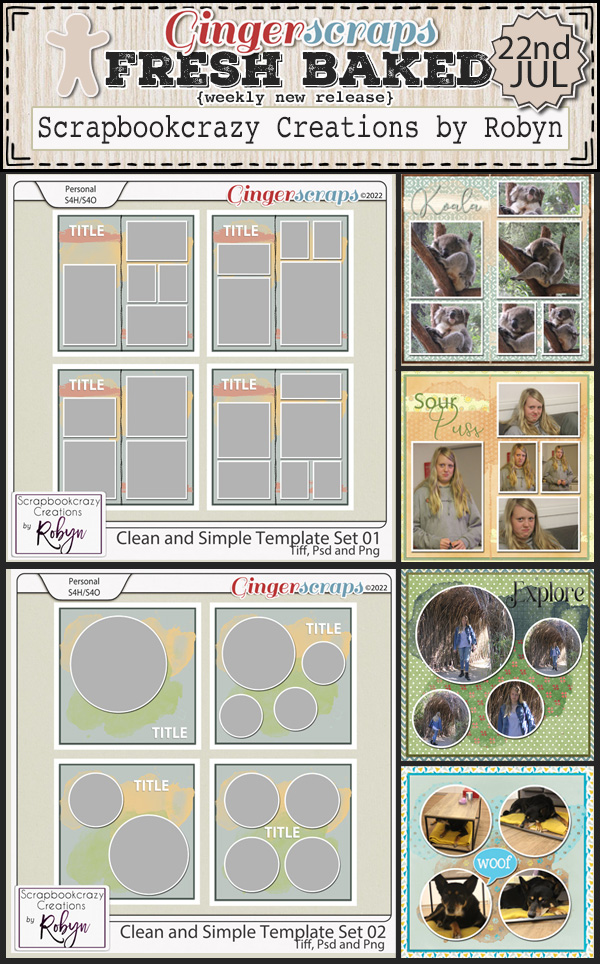
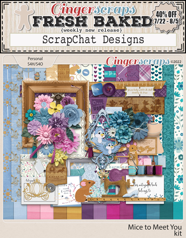
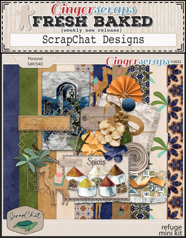
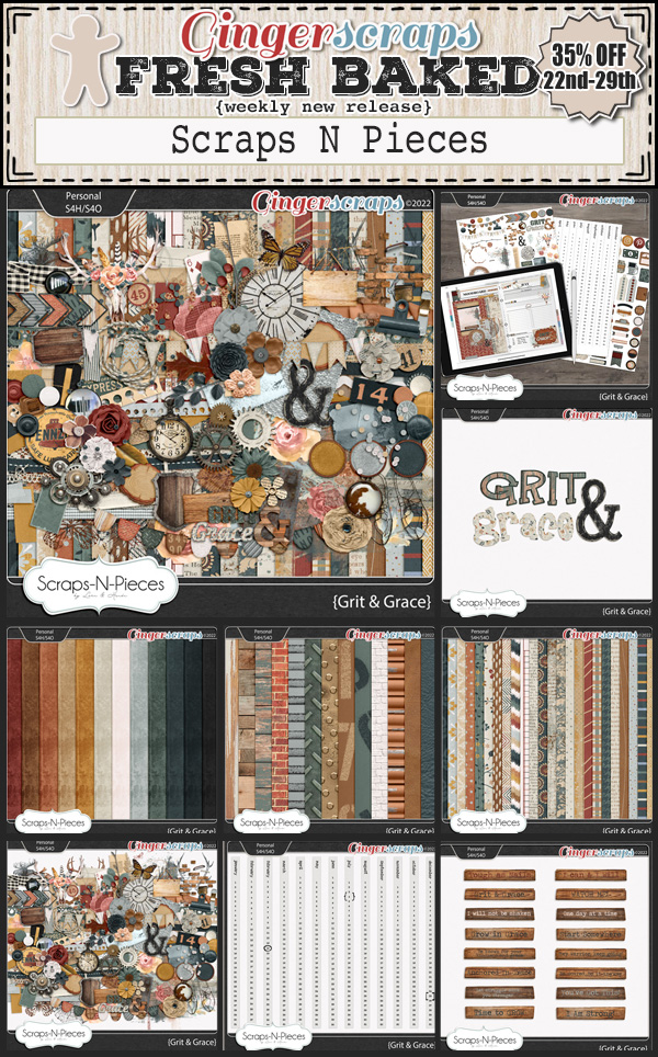
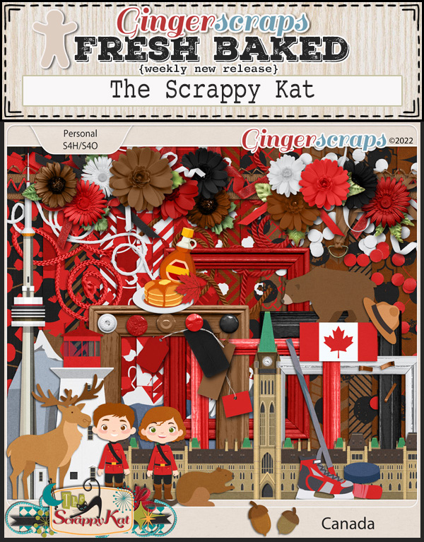
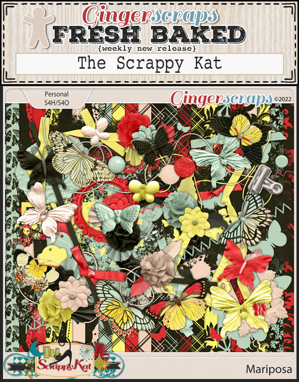
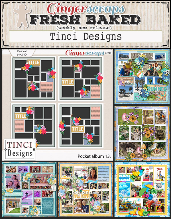
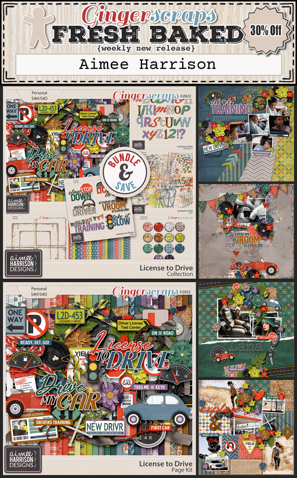
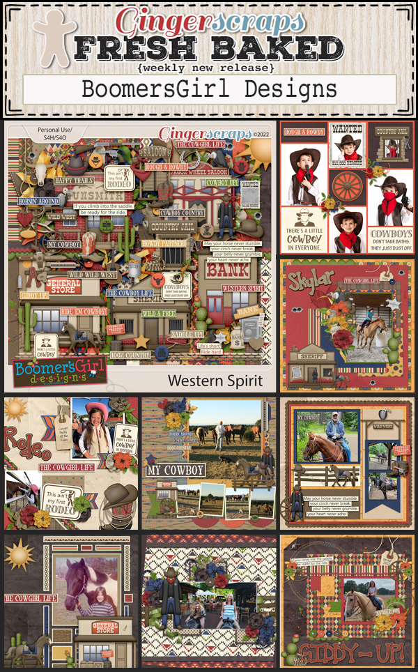
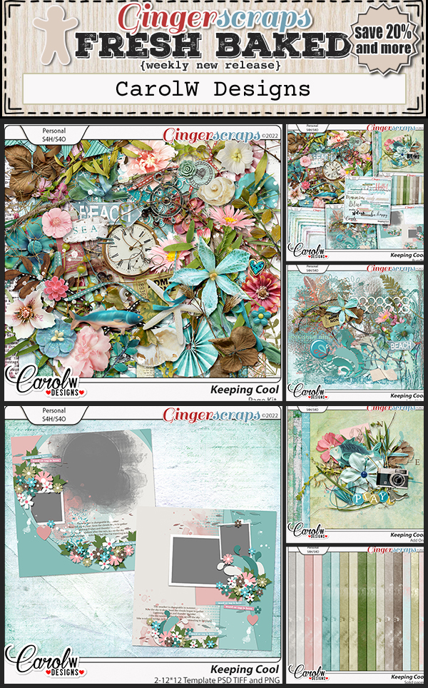
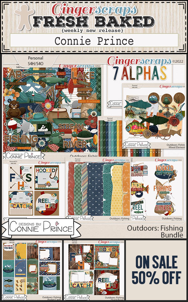
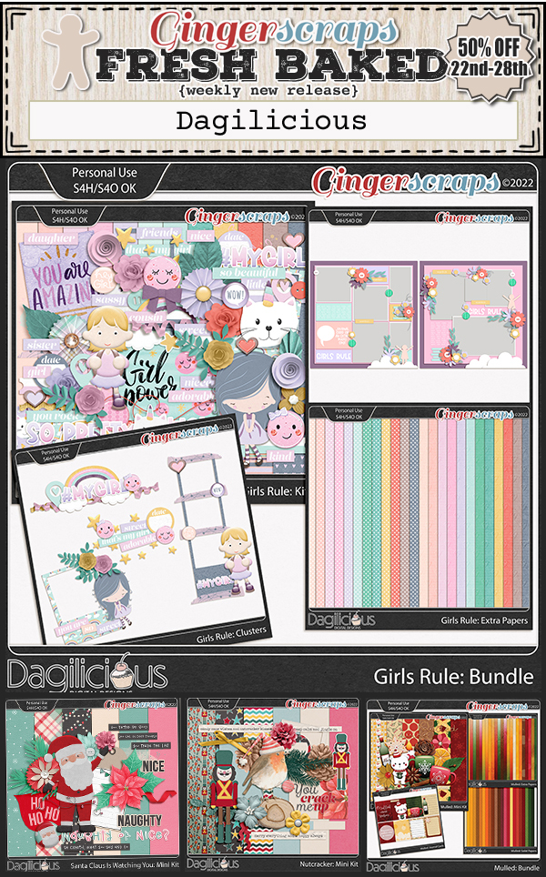
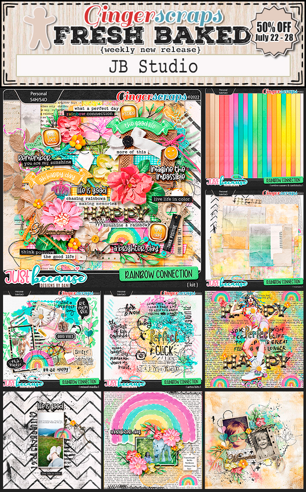
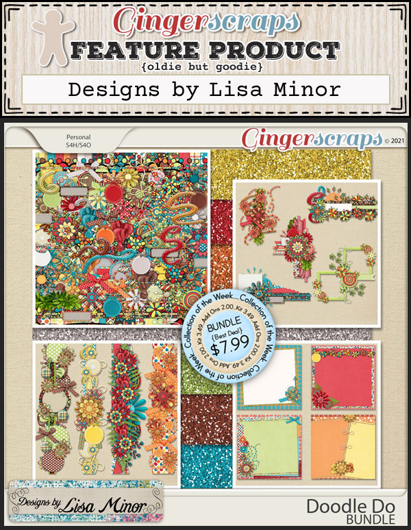
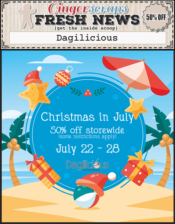
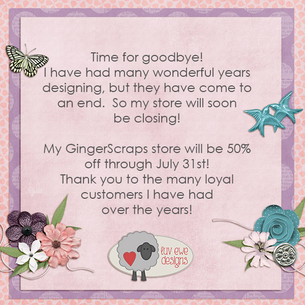
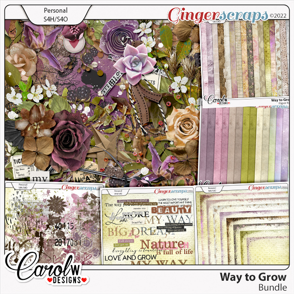
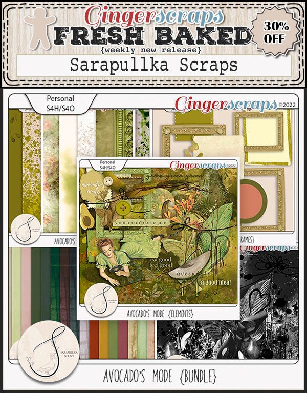
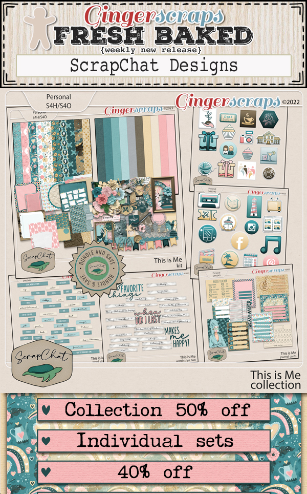
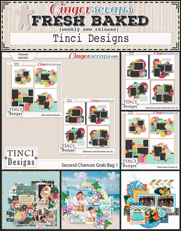
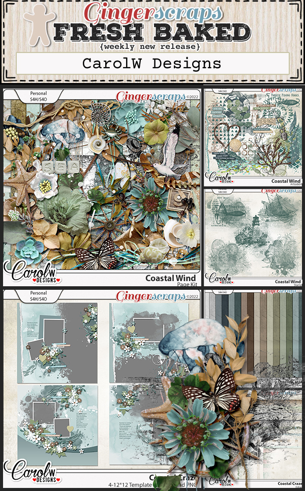
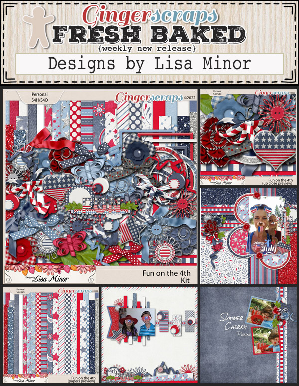
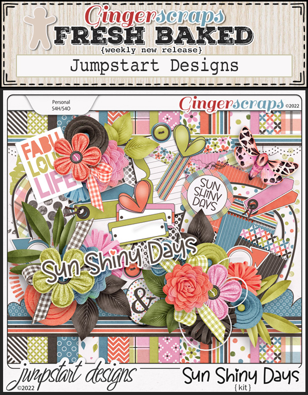
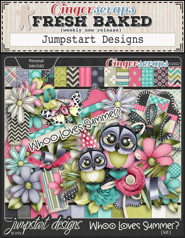
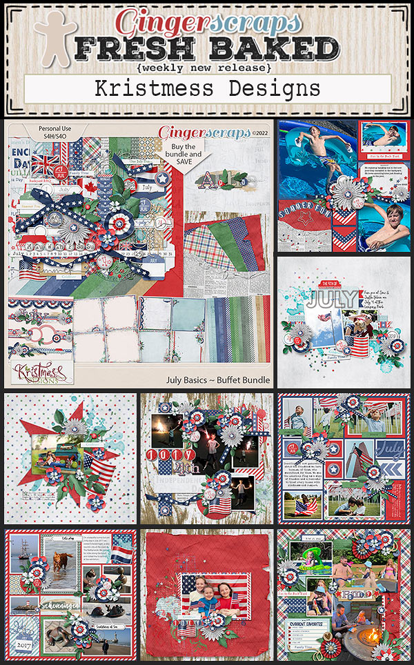
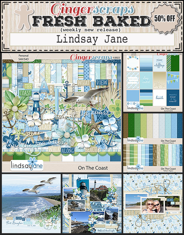
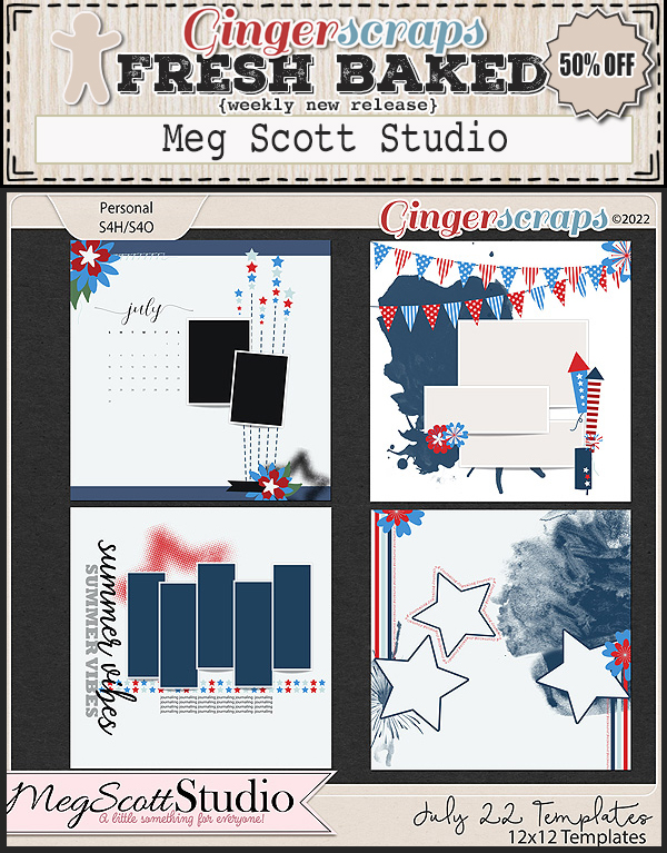
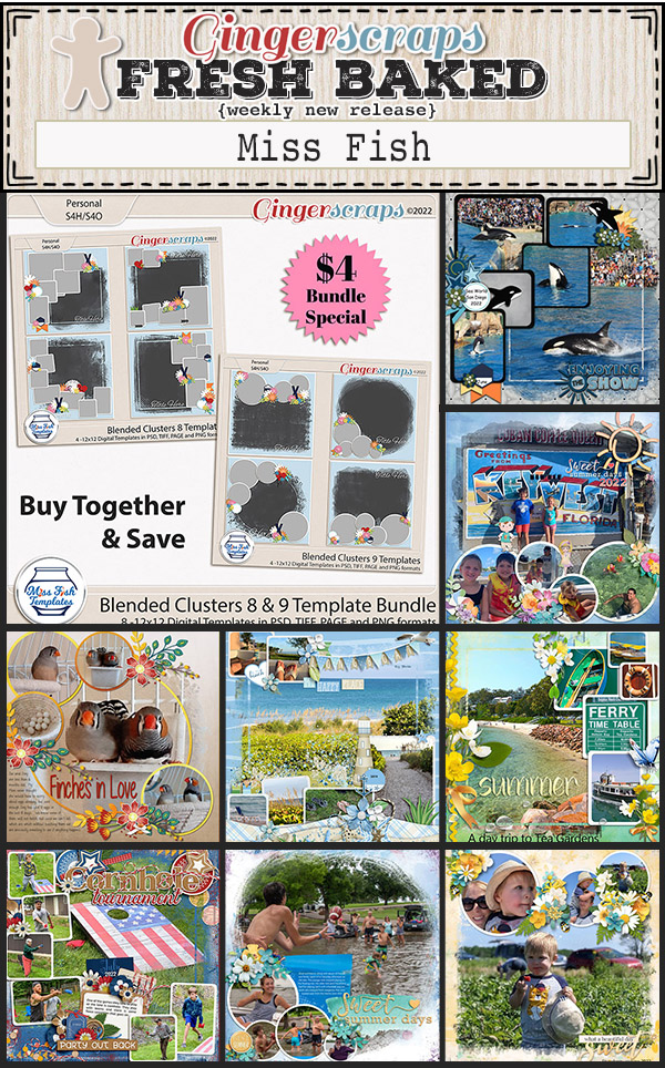
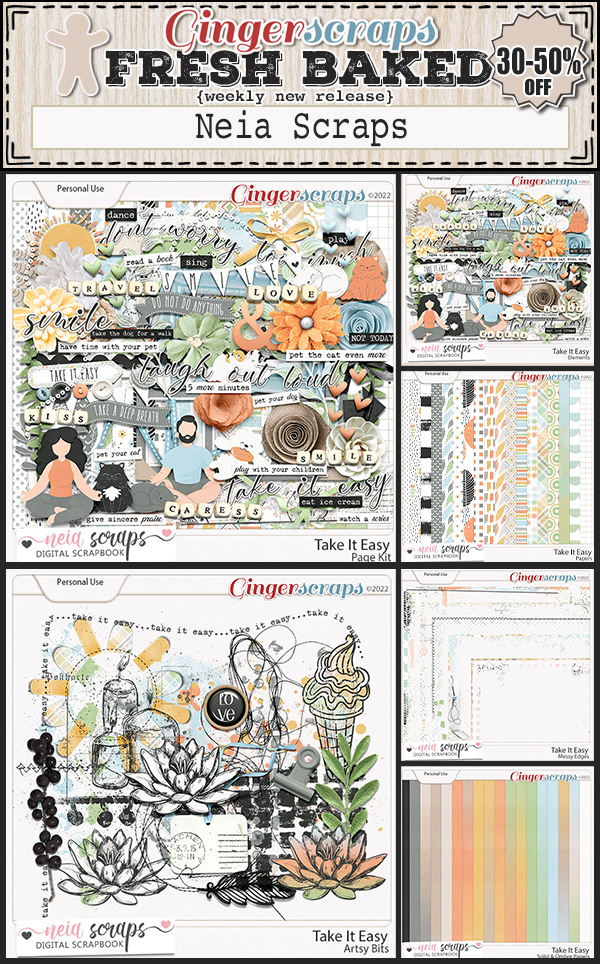
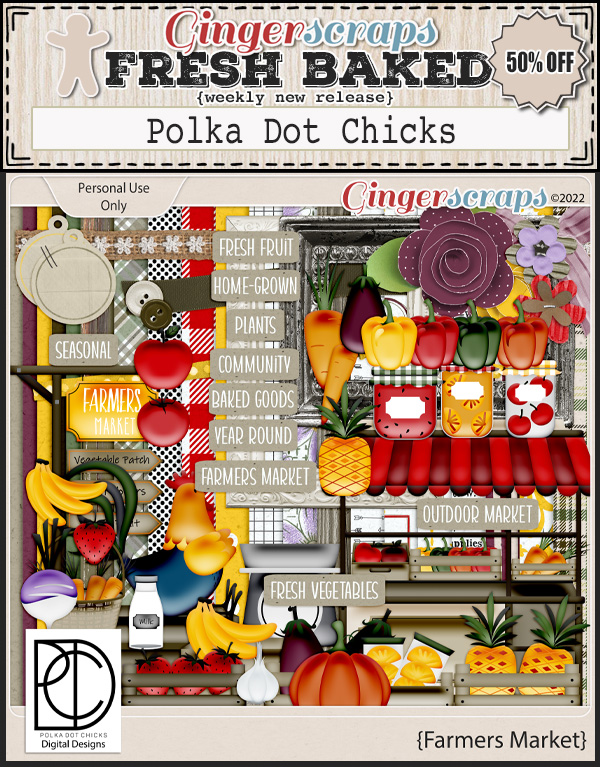
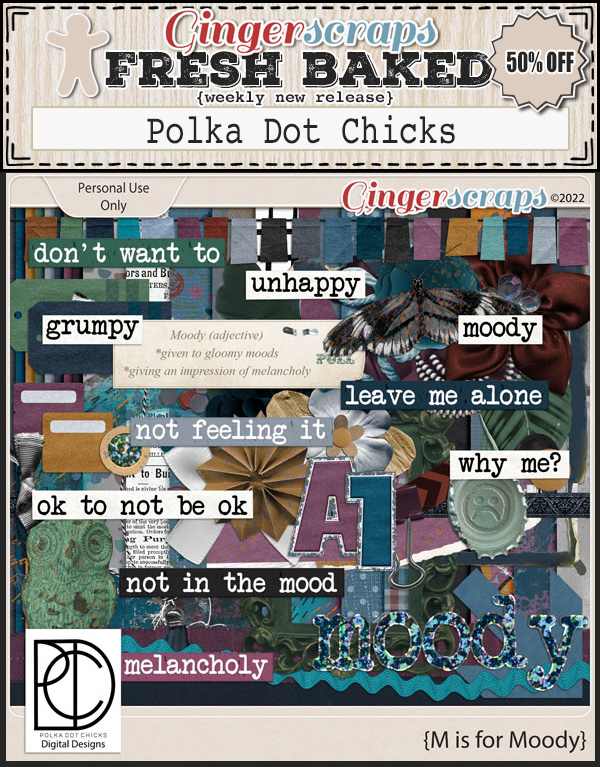
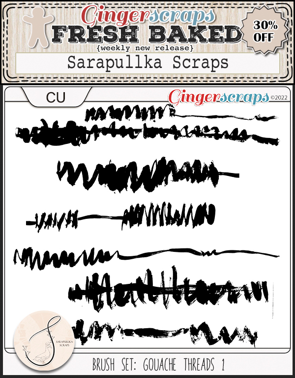
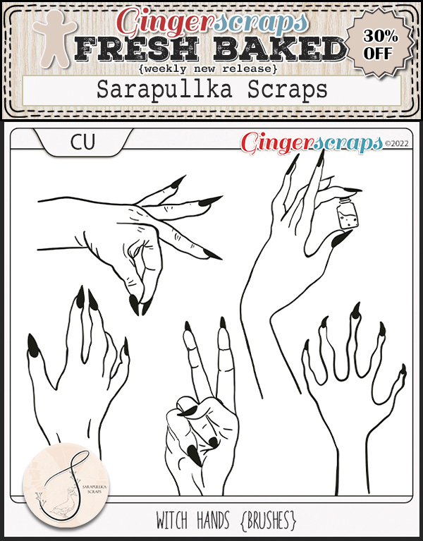
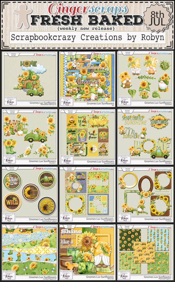
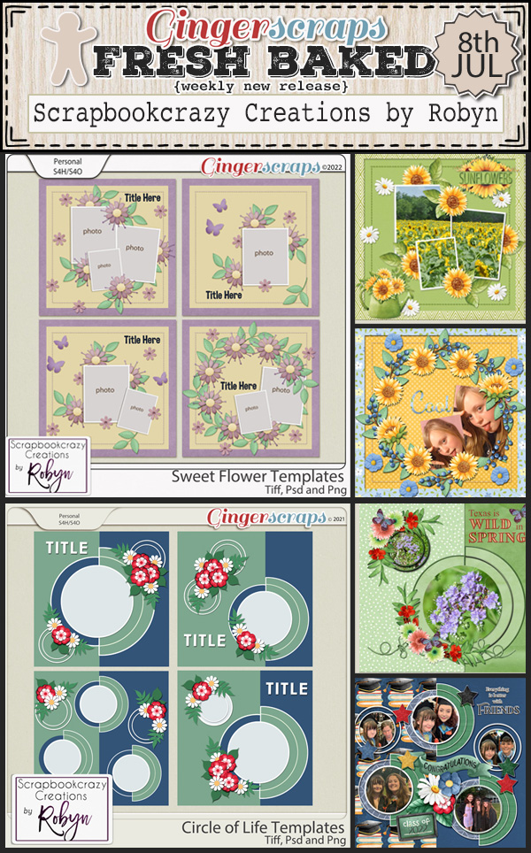
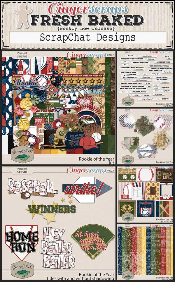
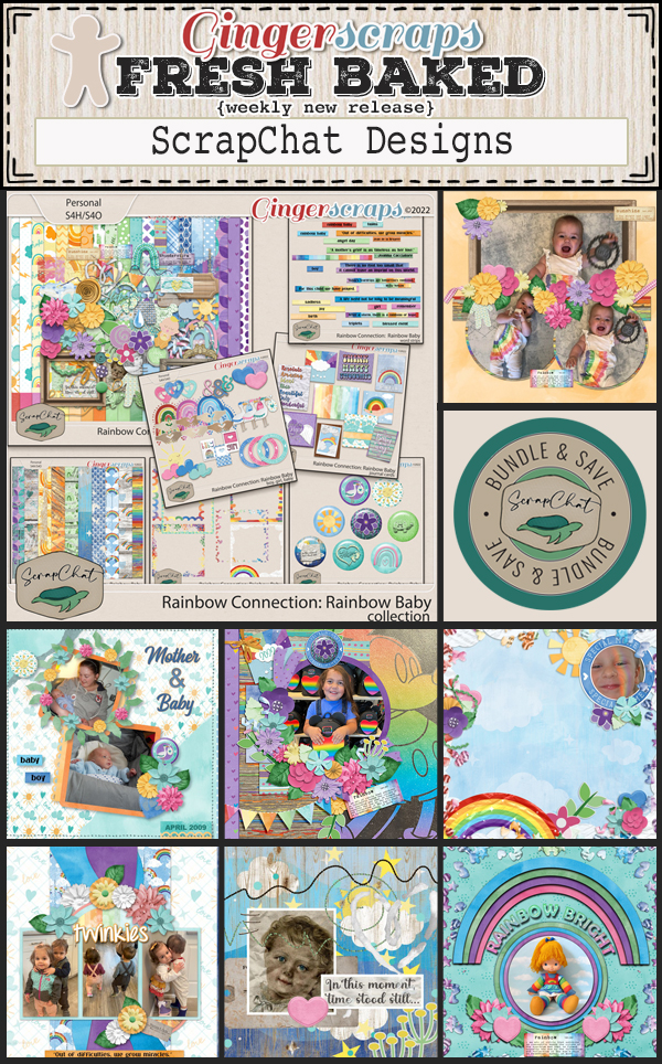
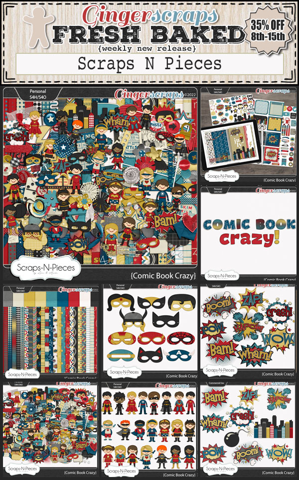
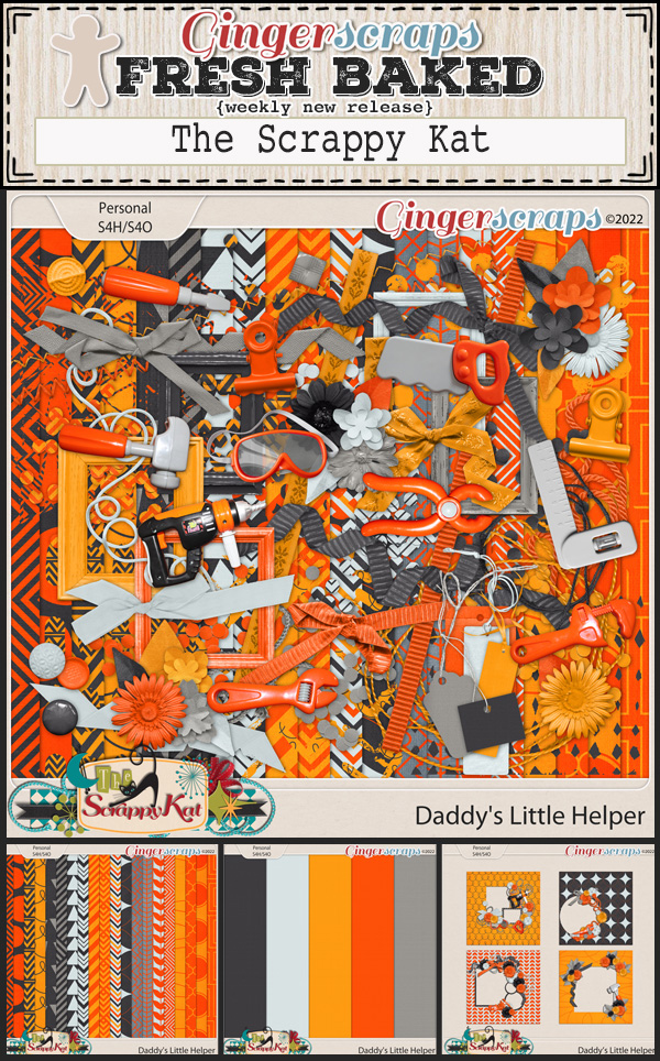
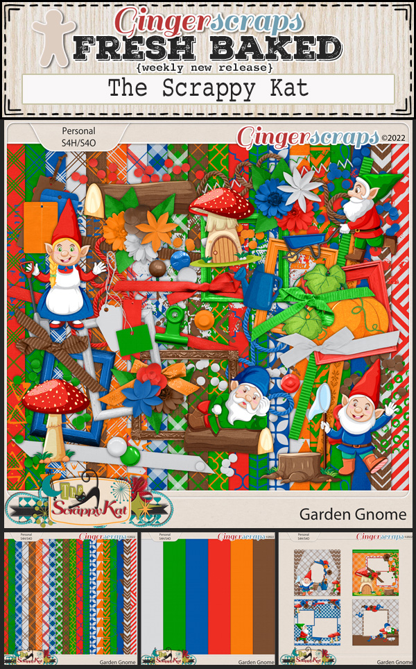
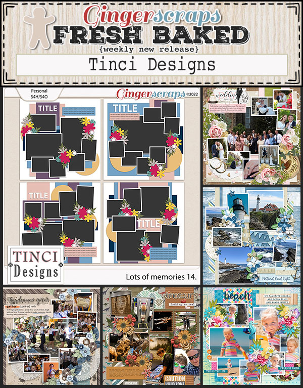
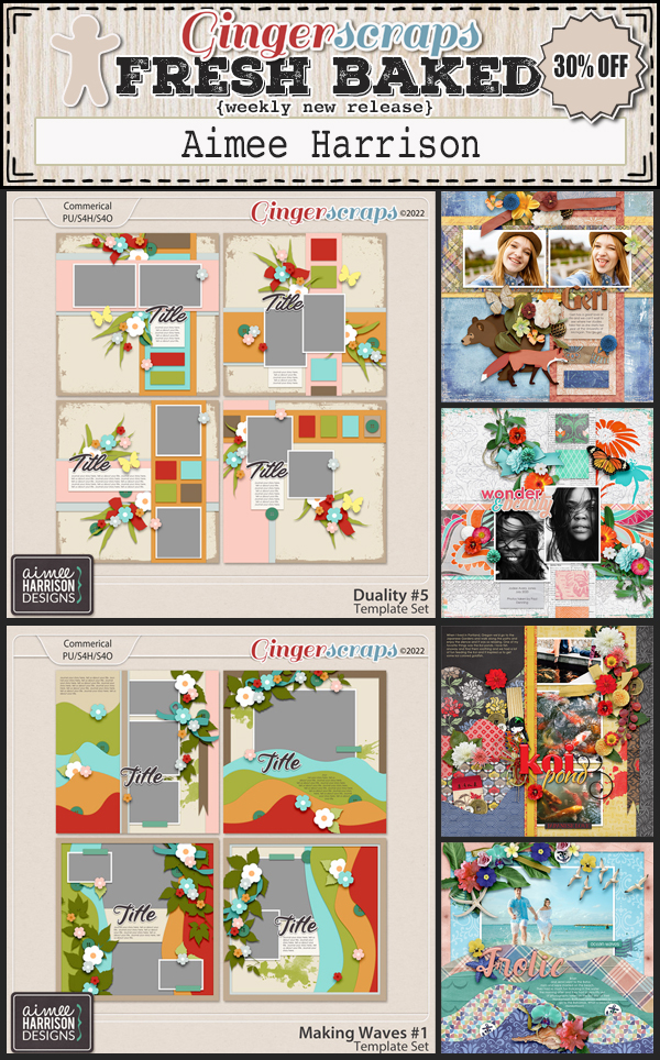
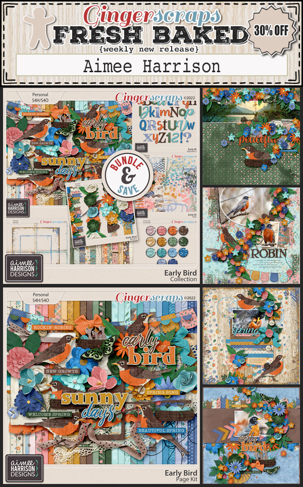
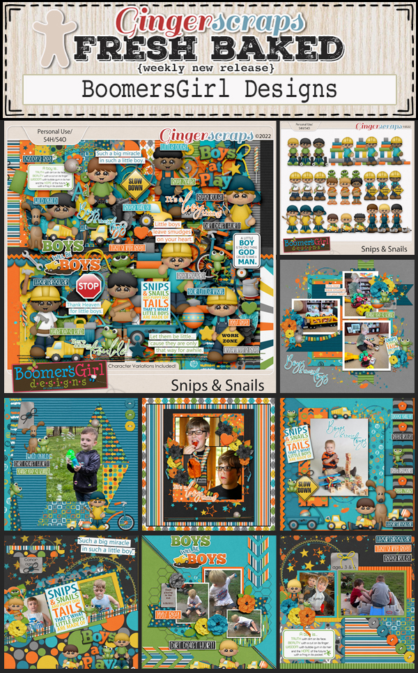
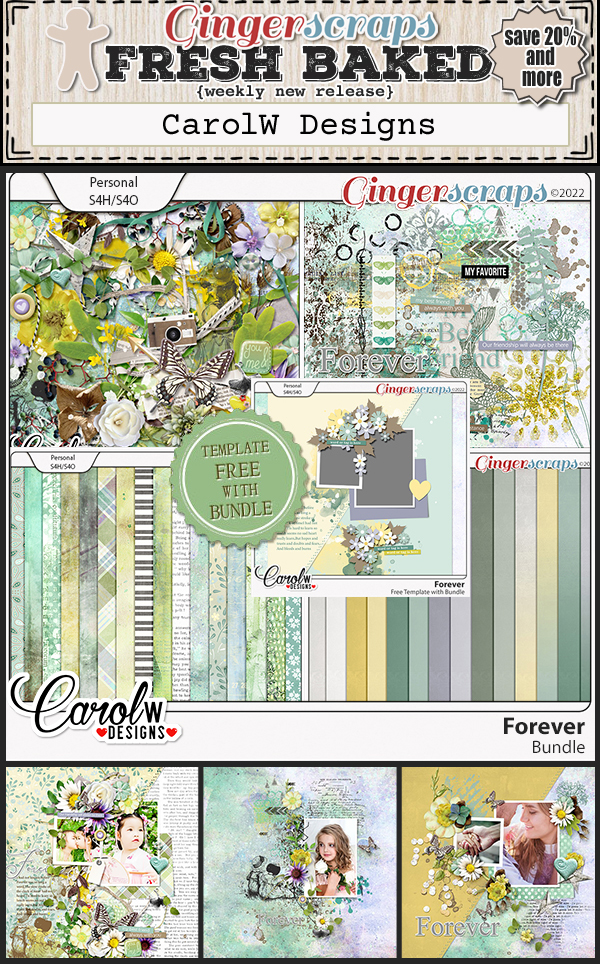
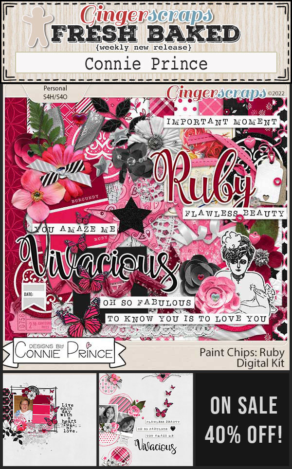
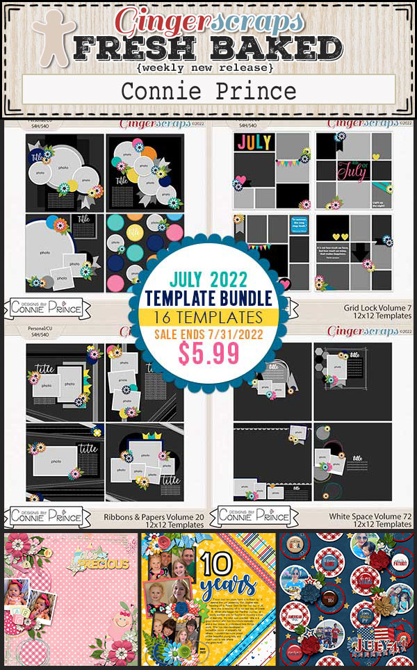
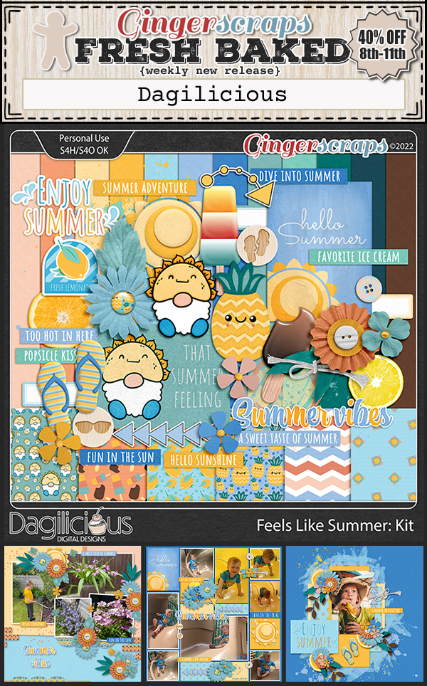
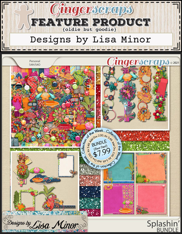
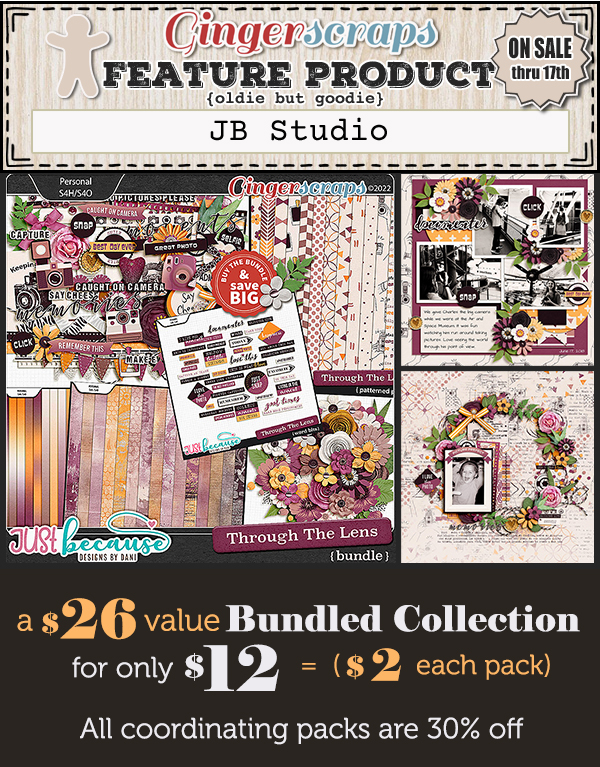
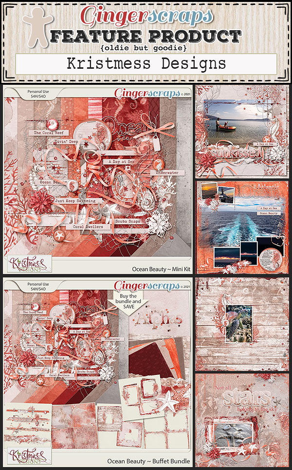
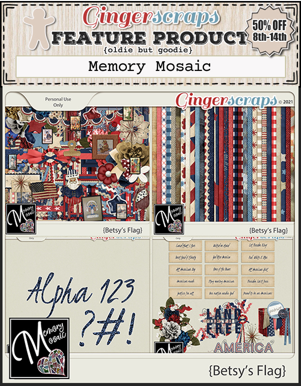
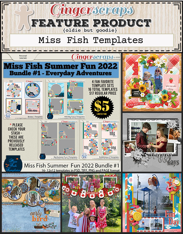
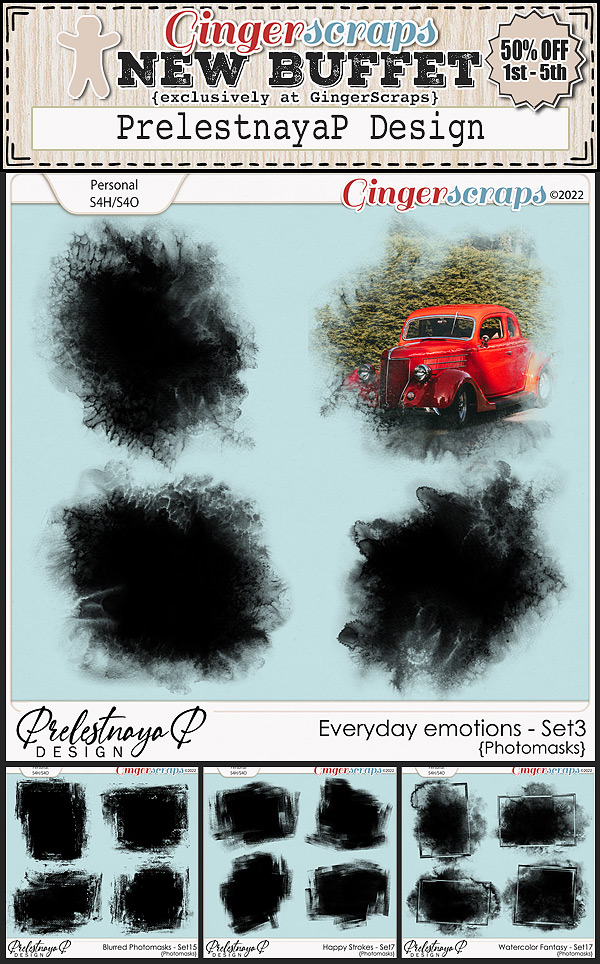
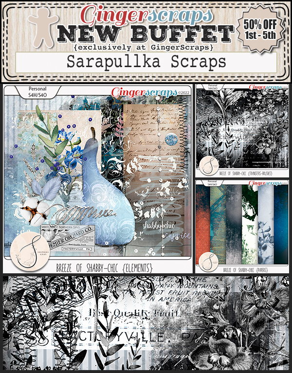
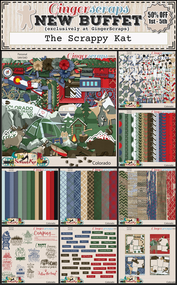
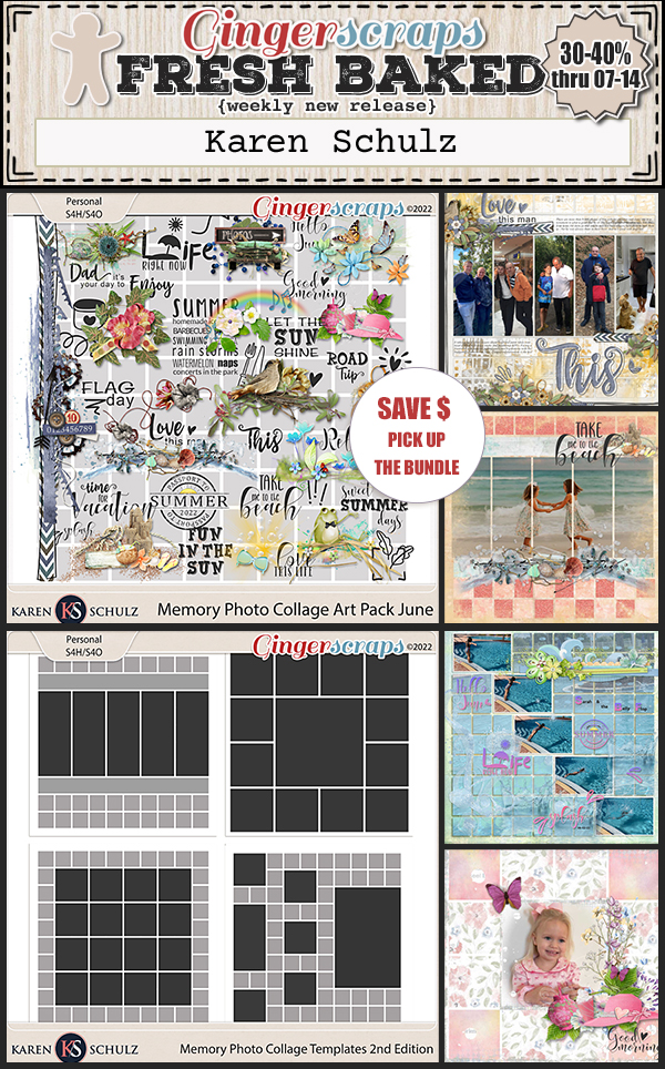
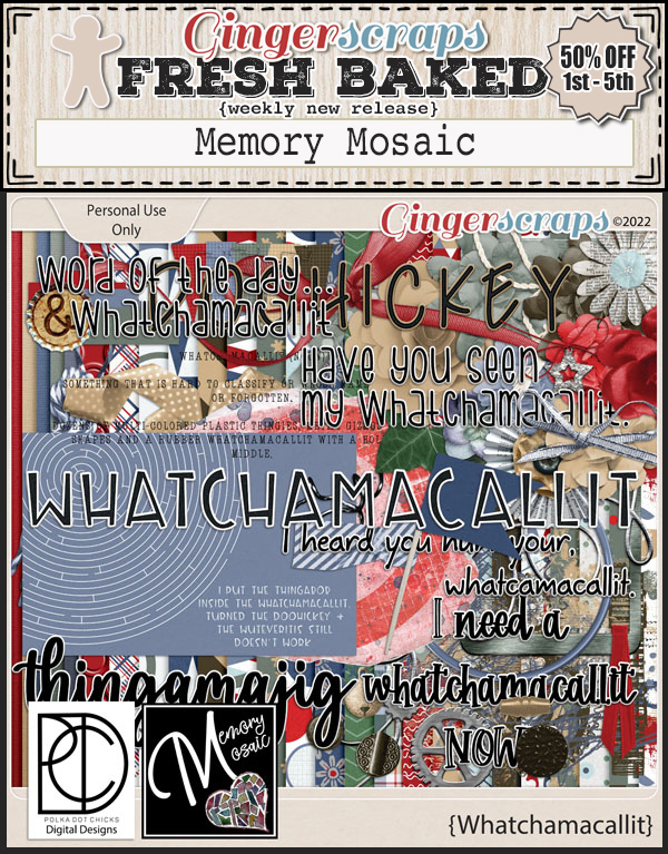
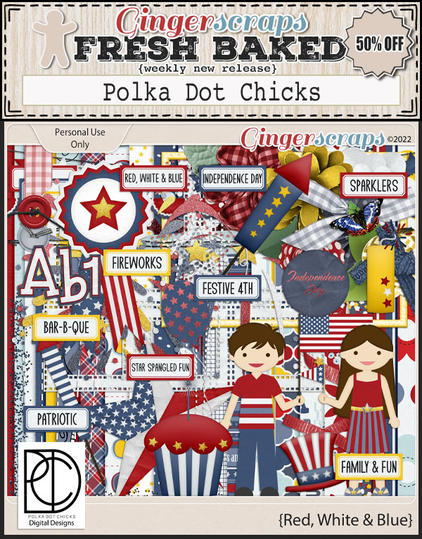
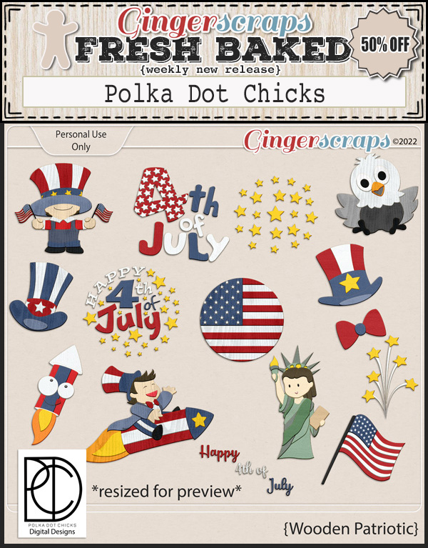
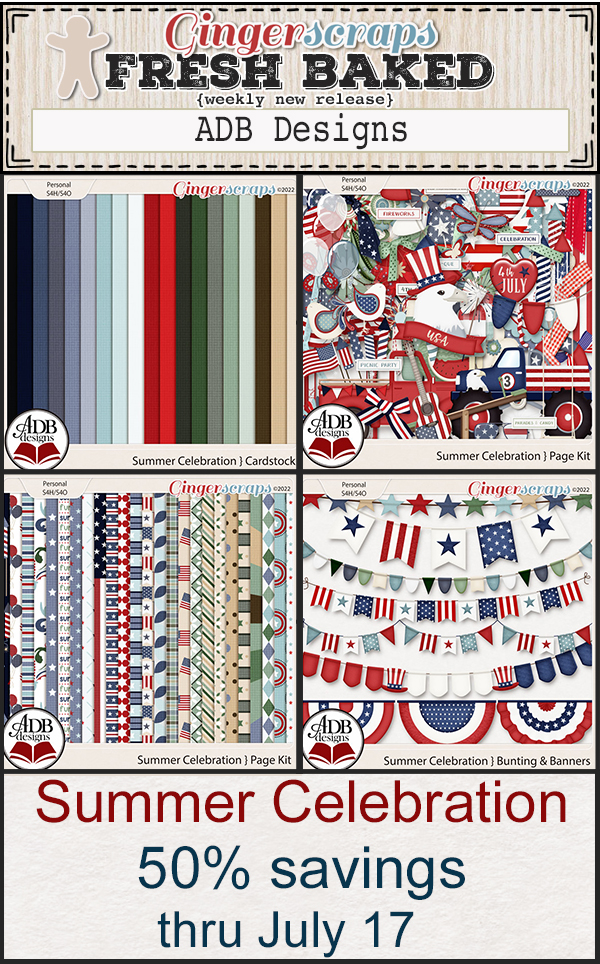
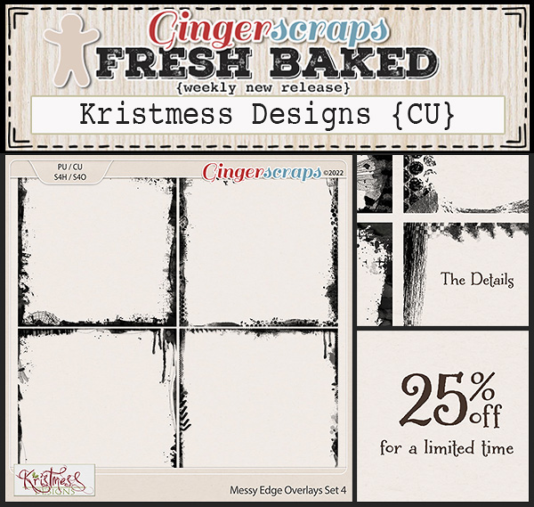
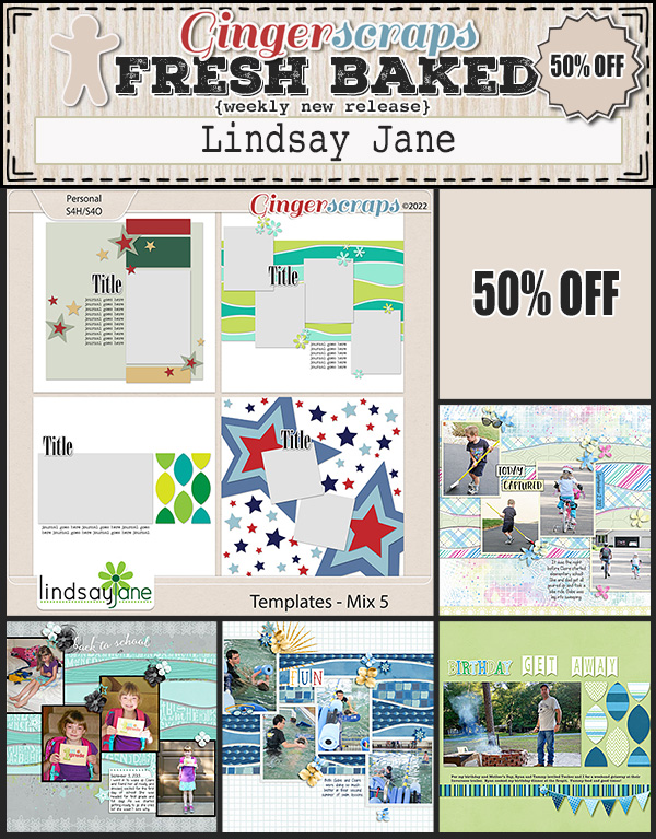
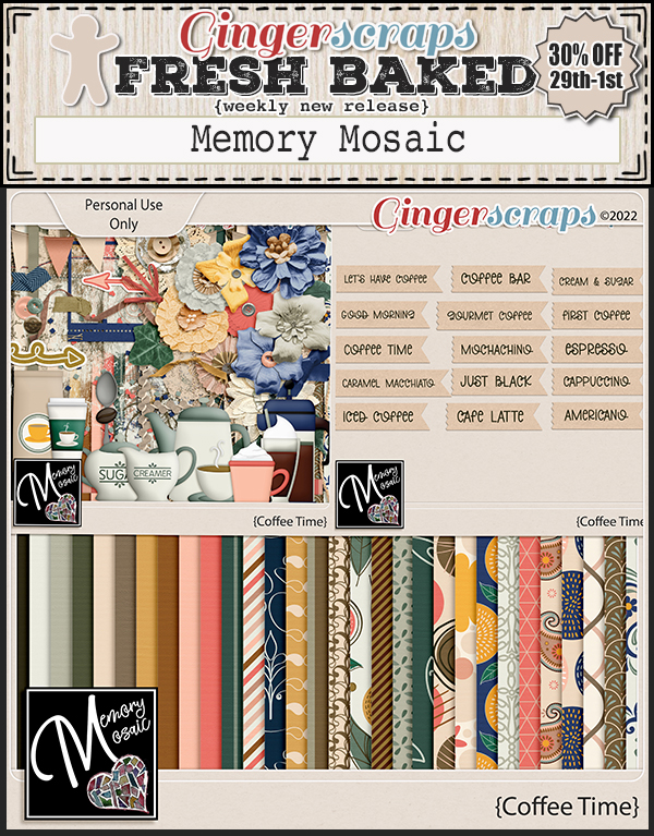
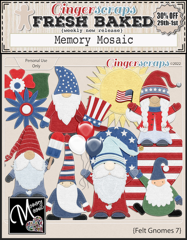
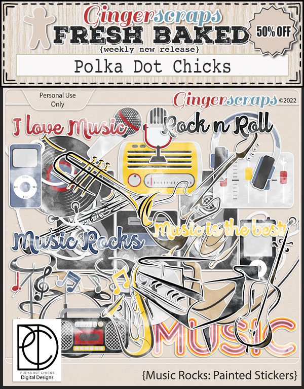
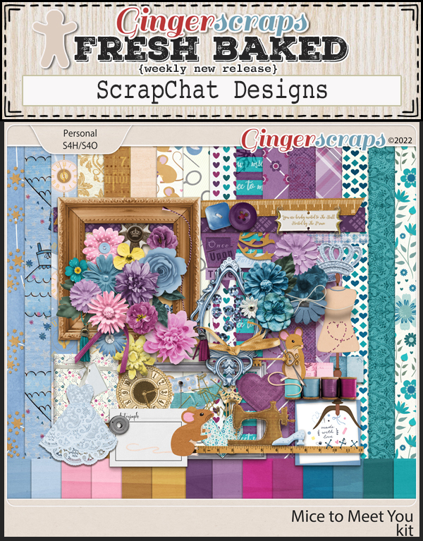
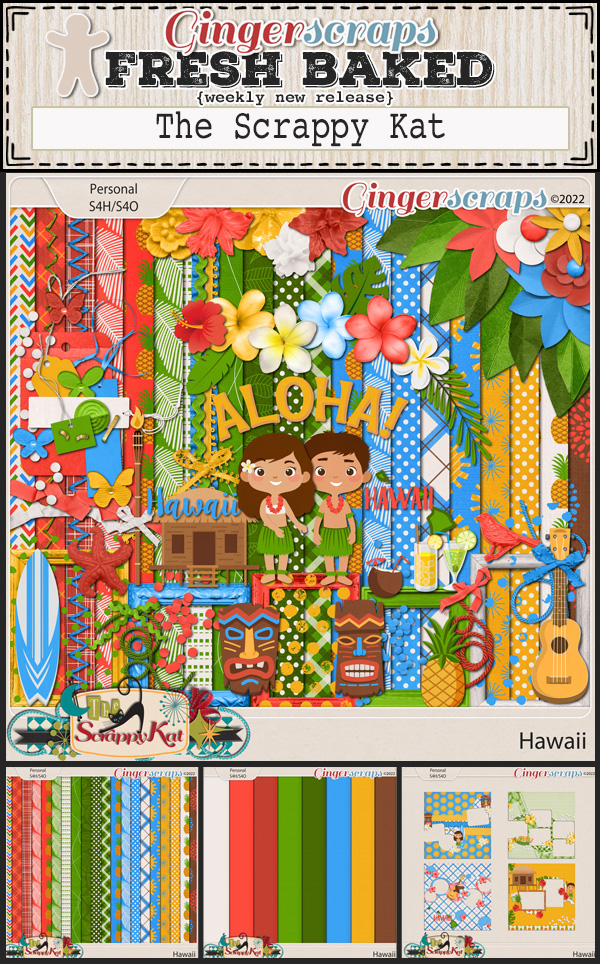
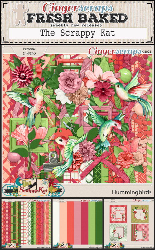
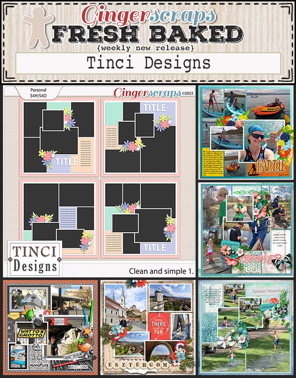
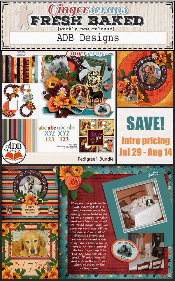
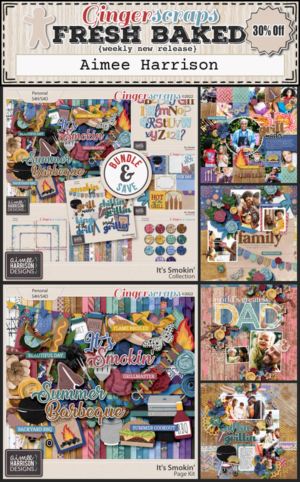
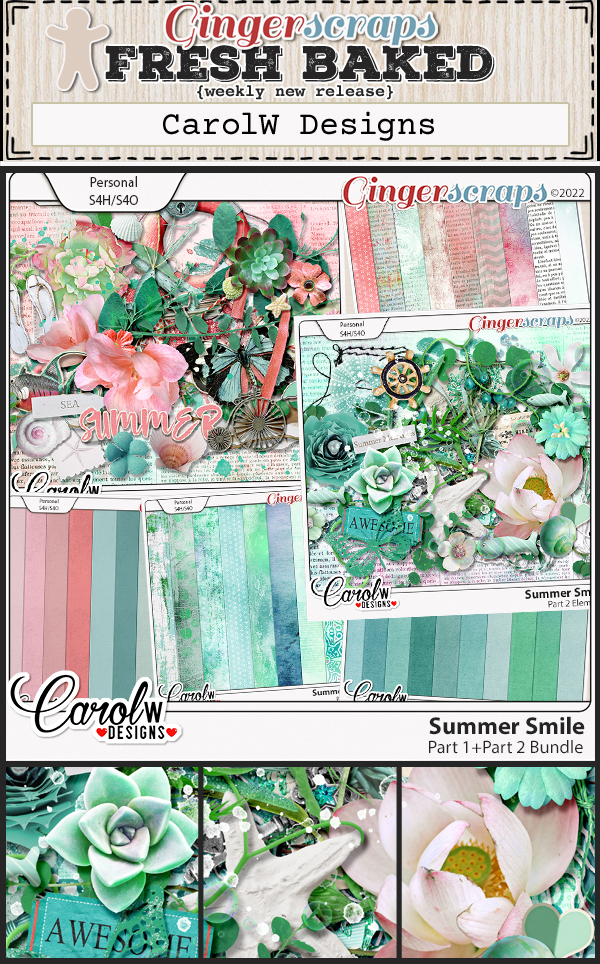
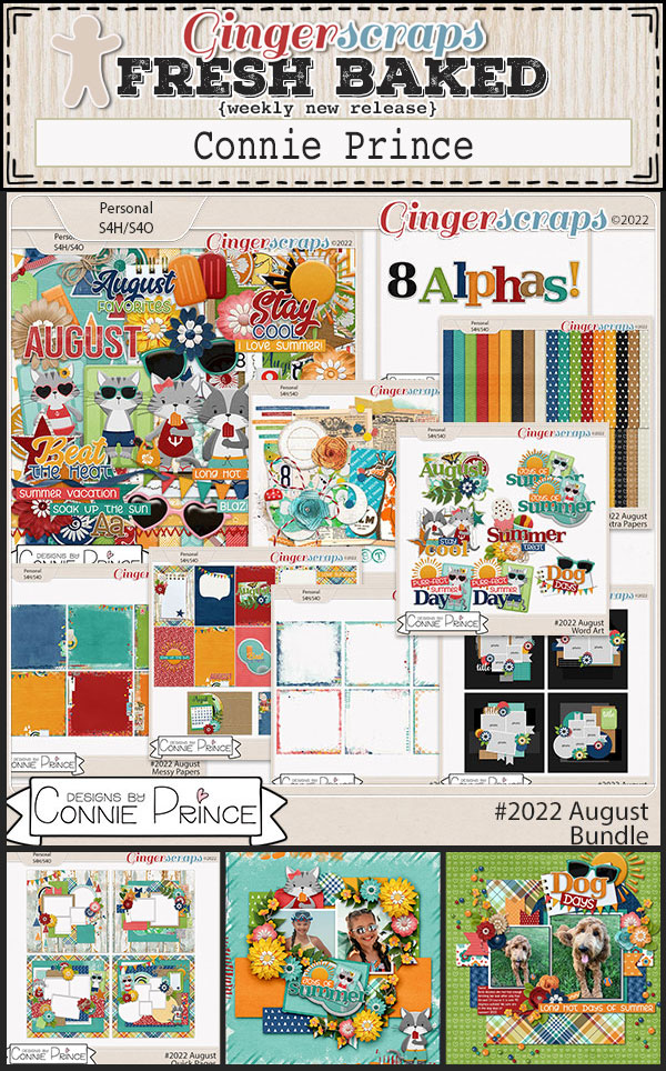
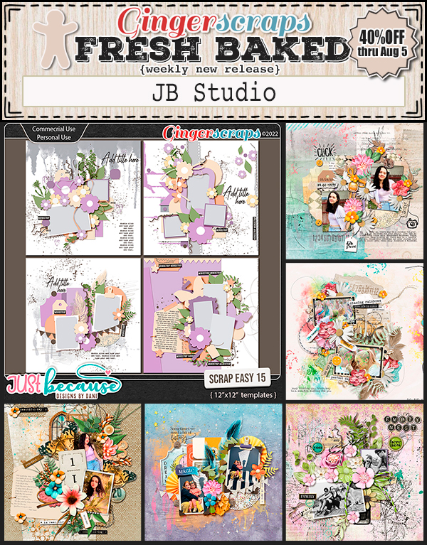
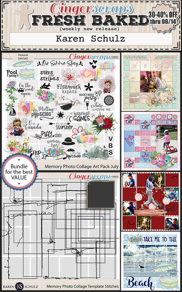
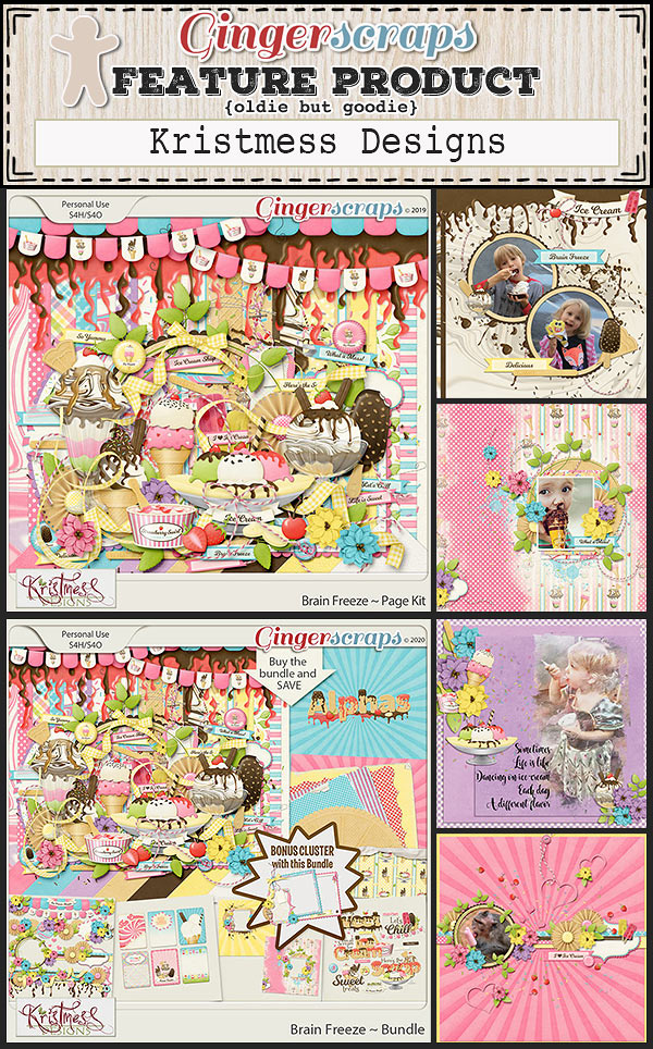
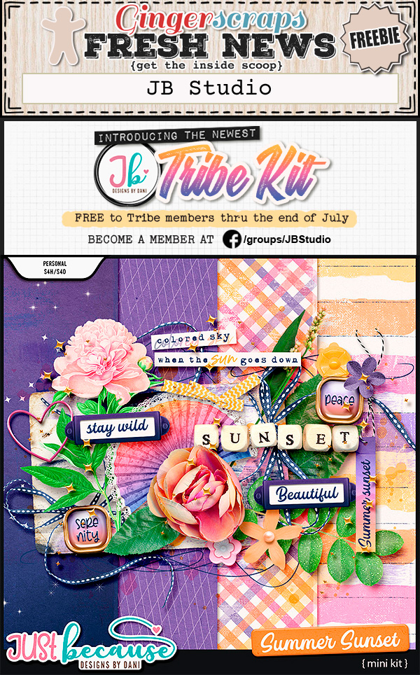
Now let’s check in on some of the new goodies that will be in the store this week.

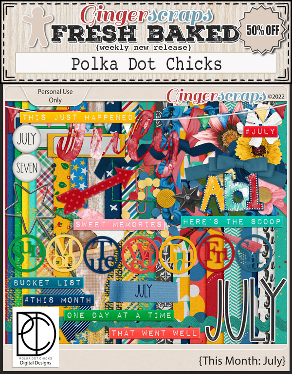
Have you picked up the July Monthly Mix? Only a few more days left to grab it at this price.

Are you getting your challenges wrapped up? Any 10 completed challenges gets you this wonderful collab as a reward.

Tutorial Tuesday (Photoshop Elements)

Quick Trick: Transparent Titles

PDF Version : https://bit.ly/3oHPCP7

If it’s Quick Trick Tuesday, this must be Belgium. I mean, this must be the last Tuesday in July. (Lame joke for the Boomer set… it’s a riff on the title of a 1969 movie with Suzanne Pleshette. Sorry, I couldn’t help myself.) RESET RESET RESET! Today’s Quick Trick is truly quick, max only 5 simple steps. Check it out! My layout is built on a Seatrout Scraps template with GingerBread LadiesSunny Days collab.

This technique comes with two rules. For best results, choose a font that’s relatively simple but substantial, with smooth, unfussy lines. I used this month’s Challenge font, Garlic Shrimp, in my sample. Other good choices would be Impact, Comic Sans (if you must), Alef, Arial, Lucida, basically most of the system fonts pre-installed on your computer, or any purchased/free sans serif font. 9A lot of the Kimberly Geswein fonts would be perfect!) But having said that, don’t be afraid to try fonts you like – it won’t be that big a time suck. The second rule it that you must type your title in white.

Next, click on Styles at the bottom of the Layers Panel and choose Bevels from the drop-down menu.

Choose one of the Bevel Styles. You’ll see how it looks instantly so it you don’t love it, CTRL/CMD>Z it and try another. I like Simple Emboss for this. The default size for Bevels is 21 pixels, but don’t stress about that.

Now, change the Blend Mode for the text layer to Multiply. The Blend Mode picker is at the top left of the Layers Panel, as shown.

And it really is THAT easy! but…

Last, completely optionally, if you think you want to adjust the Bevel, double-click on the fx icon on the text layer as shown below. When the control panel opens make sure the lighting angle is the same as for the rest of the layout. It’ll really look weird if it isn’t. And then use the slider to make the Bevel bigger or smaller. I made mine a bit smaller. And that’s it!

Wondering about that “Version #1”?

Just for fun, I rearranged my papers to see how I’d like it.

And again…

Which version did I decide was the one I liked most? (There was a Version #4, but it was so awful I rejected it immediately.) You’ll have to check the Gallery tomorrow!

PDF Version : https://bit.ly/3oHPCP7

July 22, 2022: Fresh Baked and Christmas in July!!

Merry Christmas.

Wait, what? You heard that right. We’re having a Christmas in July sale in the GingerScraps store.

Christmas In July 50% Off Sale! July 22-28 {2022}
*IMPORTANT NOTES* Sale effective for 7 days only, will end promptly at 11:59pm ET on July 28, 2022
(some restrictions apply)

As always, if you spend $10 in the store, you get this great collab for free!

Let’s see what is new in the store this week.

How are are your challenges going? Only 10 completed challenges gets you this wonderful kit. 

Tutorial Tuesday (Individual Style)

Challenge Spotlight: Daily Download

PDF Version : https://bit.ly/3zE9jwD

GingerScraps is, without a doubt, the most generous digital scrapping store on the web. There are SO MANY freebies!!! The monthly Daily Download is just one of them. Each day for the entire month, pieces of a FREE kit are provided to readers on the GingerScraps Blog (right here!) so by the end of the month, you have a whole kit. (Don’t worry, If you missed a few days’ DLs, the kit will be available for purchase in the GS Store later.) But it gets even better… the following month, that same free kit is the basis for a GingerScraps Daily Download Challenge. For the month of July 2022, the kit in question is CarolW Designs‘s Way to Grow (linked to the bundle).

It looks to me like Carol‘s kit was a huge hit with our scrappers. There are 20 layouts in the Daily Download Gallery already and there are still 12 days in the month! Let’s check them out – in random order. (Each layout is linked to the Gallery via the scrapper’s user name so you can drop in a little praise for the ones you like best.)

Our first sample is from willow. I love all the white space here. She’s taken only a small handful of the elements in the kit and created a beautiful, calm layout.

I like how chigirl has melded some grunge via her choice of papers and paint splatters with the flowery prettiness of the elements into this loveliness.

wendeeds has pulled colour from her photos and used coordinating elements and papers to create her fun Date Night layout.

I salute the dedication of people like makeyesup who create a new themed desktop for their computer every month!

202207 Calendar

How sweet is this? PixyGirl has used the Artsy Bits from the bundle to create a secret garden with a delightful little person in it.

This layout by NHSoxGirl is another gorgeous white space layout with a sparing use of elements. When you don’t have photos that work well with a kit, but you’re dying to use it anyway, you can always convert a fave photo into black and white.

Lucky for hiddenartist, she had a perfect photo! Her clusters and shadowing are top-drawer.

This layout from Danissa makes good use of the Artsy Bits and one of the grungy Edges in the bundle combined with a lovely cluster.

Sweetpea2020 lets the papers do the heavy lifting here. The stitching adds an earthy touch.

Look at how Alasandra has clustered these flowers so the kitty seems to be sniffing one. Beautiful!

The paper strips tie all of roxana‘s photos together and the clusters enhance them, leading the eye from photo to photo.

The vintage feel of this layout from kabrak1207 is quite pleasing. I’m such a sucker for old photos…

But then… bagheertje pops up with this brand-new photo of a brand-new human showcased by a lovely, grungy but extremely simple layout.

The kit’s palette seems tailor-made for this chipmunk’s portrait and bumblebeee has framed it exquisitely with papers.

For another delectable white space layout, look no farther! The photo dhariana chose pulls colour from the kit, her choice of background paper makes it pop, and her brush use enhances the overall image. Spectacular!

LidiaG has created another grungy-gorgeous-great-white-space layout here. The large cluster draws the viewer right to the eyes of that sweet child in the photo.

I’m at a loss for words when I look at this layout from Jill. She’s skillfully clustered the elements in a natural arrangement, and divided the photo over two frames in such a way that it’s the focus. There’s a lot going on, but in the BEST way!

Every picture tells a story, but sometimes it needs a little support from the wings. AJsRandom explains and balances her photo in a minimalist layout full of movement.

in her layout, wvsandy has created a beautiful frame for her prayer, and I’m pretty sure she’s used every element in the basic kit but the flair, bead spill and bottle cap.

Last but not least, alta2014 has pulled from various parts of the bundle to create a lovely, soft layout that enhances her photo. The messy stitching adds a nice casual touch.

Are you enjoying the monthly Individual Style/Challenge Spotlight posts? I find myself inspired every time I write one. Seeing how others interpret a challenge and use a defined set of tools so creatively really gets my mojo motor revving. Time to get some scrappin’ done!

PDF Version : https://bit.ly/3zE9jwD

July 15, 2022: Fresh Baked & BAKE SALE

Welcome to another Friday. We have some big things going on today. When the Fresh Baked and Bake Sale fall on the same day, it’s a happy time at GS. 

Remember if you spend $10 in the store you get this great kit for free.

Let’s see what we have for this week!

Who is ready for the $1.00 Bake Sale!? Here are the $1.00 deals we have for you this month:


How are are your challenges going? Only 10 completed challenges gets you this wonderful kit. 

Tutorial Tuesday (Photoshop Elements)

Creating Your Own Stitching [Part One]

PDF Version: https://bit.ly/3ckOJcE

Karen Hampton asked for some guidance on creating her own stitches. Today I’ll talk about stitching in a straight line, which I’ll build on in another tutorial for creating stitched shapes. These are the basics. (Spoiler alert: I learned something while I was playing with this one!)

This tutorial will use the Text Tool; it’s readily available and easy to use. My stitches have been created using the underscore key [ _ ], the space bar and white. The hyphen and the period will work too. The font I went with is a default font on Windows machines, Impact Regular set to 30 points. _SPACE_SPACE_SPACE_ to the desired length. This gives 3 1/3 stitches per inch.

This step, I’ve discovered, may not be necessary, at least with Elements 2021. But we’ll go ahead and do it anyway. Right-click on the text layer then choose Simplify Layer from the drop-down menu. Some manipulations to text can’t be performed unless this step has been taken.

This is an optional step. If you’d like your stitches to be thicker, the easiest way to do it is to Edit>Stroke (outline) Selection. That will add to both length and width.

Obviously, I’m using the same colour as for my text layer. I decided on 6 pixels centered on the stitches, which will give nice heft but won’t obliterate the spaces between the stitches.

This is another optional step. I’m a bit of a perfectionist, so when I go for realism, I’m all in. I want to add some texture to my stitches. Turns out the best way to do that is to use a Filter, placed on its own layer. (I tried to apply the Filter to the stitches layer and it didn’t work.) So pop a blank layer on top of the stitch layer by clicking on the sheet-of-paper icon at the top left of the Layers Panel.

I remember using this Filter for another tutorial but not in quite this way. Filter>Render>Fibers…

Thread and yarn are composed of multiple fine strands of fibers twisted together to make a single strand. There’s some visible variation in the thread, and I wanted to capture that look. The settings that worked best are shown here. Variance 3, Strength 64 and Randomize.

The twists in the thread fibers are usually on the bias, or somewhat diagonal. So I decided to Rotate the Filter layer on a center anchor to -35°.

I’ve been having some glitchy things with my Elements lately. Some keyboard shortcuts have failed to work when I try to use them. (Probably time for some system maintenance.) To get the striations onto the stitches, right-click on the Filter layer and choose Create Clipping Mask or use the keyboard shortcut CTRL/CMD>G for versions prior to PSE15 or CTRL/CMD>ALT/OPT>G for PSE15 and later.

The effect is quite subtle. If you don’t want to add it, skip ahead! For more optional steps, read on. Do you think you’re particular enough to want holes in your paper where the stitches go through it? This step’s for you. Add another blank layer above the stitch layer. Don’t want holes? Keep on scrolling…

This step gave me some trouble. I played with it for quite some time before all these key points came together. The stitches are in a straight line so the holes should also be in a straight line. I pulled down a Guide line by moving my cursor into the ruler at the top of the canvas and holding down the left mouse button, pulled down to the bottom of the stitches. The needle creating the holes is bigger than the thread, so the hole has to be wider than the stitch. I settled on a 16 pixel hard, round brush for this. Next came figuring out how to position the holes correctly. I found that putting the tip of the horizontal crosshair in my brush cursor right on the edge of the stitch while lining the same horizontal crosshair up with the horizontal middle of the stitch was perfect.

Of course, the holes need to be under the stitches and I tried doing the brush thing with the blank layer under the stitches but it wasn’t as easy lining up placement that way. So because the holes layer the holes layer is above, it needs to be moved down under the stitches. You can drag it down by clicking on the layer, holding down the left mouse key and just dragging it. Or you can use CTRL/CMD>] to go down. (Going up uses CTRL/CMD>[.)

When you see this part, you’ll ask me why I didn’t use a soft brush to start with. I tried it. I didn’t have enough control of it for my liking. So we’ll soften up the edges with a Filter>Blur>Gaussian Blur.

I love it that Elements lets me see what’s happening to my creation while I’m making adjustments. That makes fine-tuning so much easier. I like a Radius of 2.0 pixels for these holes.

It’s starting to look pretty realistic.

This part could have been done sooner, like before the whole hole bit began. I Merged the Filter layer with the stitch layer by clicking on the Filter layer, holding down the Shift key and clicking on the stitch layer to Select both, then right-clicked and chose Merge Layers from the drop-down menu. Keyboard shortcut: CTRL/CMD>E

Let’s have a look. The holes aren’t in your face, but visible to the discerning eye. You might see I’ve added a custom shadow layer to the stitches, but I’m not going to take you through that. Turns out it really isn’t needed.

Rather than adding shadows, let’s give the stitches a bit more dimension by adding a Bevel. Click on the Styles button at the bottom of the Layers Panel and choose Bevels. The one I decided works best is the Simple Inner one, as shown here. These Bevels are integrated in the software, so you don’t need to buy and install them.

The default settings are a bit much. And you can see why I realized the holes and shadows aren’t really required.

To adjust a Style, double-click on the fx icon on the layer in question. This menu opens. I adjusted the settings as shown.

Once more, with feeling…

But what else can we do with this besides a straight line of horizontal stitches? Some of the other characters can be turned into fancy stitches. Here I’ve made a row of 10 slashes and 10 backslashes on separate layers.

By moving one of the rows toward the other, I created a zig zag.

If I overlap the rows, I end up with a narrow cross-stitch.

When creating composite stitches this way, keep the layers separate so you can add the Fiber Filter and Bevel to each layer before you Merge them.

Just for fun, I made a row of really fancy stitches using the ASCII symbol for Yen/Yuan. How did I do that? The keystrokes are ALT/OPT>0165. (I use a lot of ASCII characters in my genealogy research since I have Irish, French and Swedish ancestry in the family.) I bet the < and > symbols on the standard keyboard could be used for stitching, as well as *, + turned 45° then duplicated a few times, =, 8 turned 90° and duplicated, and x in some sans serif fonts. There are so many options!

Part Two of this tutorial will look at stitching around a shape, which involves some additional steps. I may even do a Part Three using brushes instead of text.

If you have an idea for a tutorial, don’t be shy! I love the challenge!! You can easily reach my via Private Message (click on it, there’s a link!) in the GingerScraps Forum. My handle is ObiJanKenobi. Now back to your regularly scheduled programming.

PDF Version: https://bit.ly/3ckOJcE


July 7, 2022: Fresh Baked

Welcome to another HOT Friday. Did someone crank up the heat for the oven and forget to turn it down? We have had heat indices above 100° this week. How many days until Fall?

Remember if you spend $10 in the store you get this great kit for free.

Let’s see what goodies we have available this week!

Have you gotten a good start on your challenges? Only 10 completed challenges gets you this wonderful kit. 

Tutorial Tuesday (Photoshop Elements)

Title-Topia

PDF Version: https://bit.ly/3RfWQqL

I think we’d all agree that the title elevates the layout. That could be why I’ve created so many tutorials on creating wow-worthy titles. Ellen (gmae) had a great suggestion after my last title tut (the echo technique) – she thought it may be helpful to have a master list of title tutorials in one place. So that’s where we’re going today. A few words before I get started. I’ll provide the name of the tutorial (since I don’t always use succinct language) linked to the tutorial on the Blog -just click on the tutorial’s name – and a thumbnail photo of the finished product. These tutorials include a broad range of techniques; I write from the premise that the reader is just beginning their digital scrapbooking journey, so there will be review and repetition. If you’re an intermediate or expert user, you can skip the parts you already know, but the new learner can’t fill in the blanks if they don’t know there are blanks. And finally, I don’t always create layouts with the things I Blog about so many of the images I’ll be adding below are screenshots from the actual tutorial and not nice, tidy layouts. (In some ways, the screenshots give a more detailed look at the finished title than the layouts do.)

Up first is Titles Revisited: Alphas plus Fonts which is one of the first tutorials I wrote almost 5 years ago. It touches on a few tips for mixing fonts with designers’ alphas to create eye-catching titles.

Titles with STYLE(s) gets into using Style effects to take fonts from ordinary to awesome, as well as adding paper backing to simulate those fancy title stickers you can buy at the craft store.

In Title Tweaks the technique is a riff on stickers, with some added weight. It builds on the previous two tutorials and has several variations included so you can truly customize your work.

Over-the-Top TITLES sounds a bit grandiose. The technique incorporates a title into a large photo, making it appear to rise out of the image.

A really fun way to add interest to a large photo layout is to use the title as a divider, as shown in One BIG Word – Using a Title as a Divider. This technique can be used horizontally, as shown, vertically or diagonally – it all depends on what the large photo is showcasing.

The name of this tutorial – Another Take on Titles – is pretty nebulous. What you’ll see is a title with an assortment of papers clipped to individual letters, with a beveled outline.

With A 3D Title with Punch! the punch refers to a curving title that seems to grow as it crosses the page.

How Did They Do That? (Outlining a Title with Paper Cuts) was another request from a reader. It can be achieved with either a font or an alpha, and can be combined with some of the other techniques to really boost its impact.

This is the tutorial that led to Ellen‘s suggestion (she also suggested it as a topic in the first place): Creating a Title Echo for Your Layout

There are a few tuts that don’t include “title” in the name. For example, Fancifying Those Fonts is one of my earlier efforts. Part of my brain is always assessing how something might be worked into a layout or a tutorial, or both. This is one of those assessments!

This one is another of the early days’ offerings. Alphas Revisited describes placing a title around a circular photo. I like to think my skills have improved and my ideas more expansive since then.

One thing I really enjoy is coming up with digital versions of paper scrapping looks. I dabble a bit with mixed media for things like greeting cards, using commercial die-cuts (or now that my daughter has a Cricut, custom ones) along with printed digital elements and sentiments. That’s where More Fun with Fonts – Die-Cut! comes from.

The final addition to the list is Another Font-to-Alpha Option that uses a perforated bubble font. It also includes some instruction on using Styles.

I’m sure there are others that I’ve missed. If you know of one, please link me up in the comments so I can edit this list to include it. And, of course, if there’s a title you’ve seen somewhere that you’d like to duplicate but can’t figure out the steps for, shoot me a Private Message through the Forum. My user name is ObiJanKenobi and I love getting requests! (Glee, your recent request is a work-in-progress… not forgotten! And Karen Hampton, your request is also cooking. Stay tuned!)

PDF Version: https://bit.ly/3RfWQqL

Designer Spotlight: July 2022

Scrapcrazy Creations with Robyn

The second half of the year has begun. Anybody a little alarmed at how fast time’s flying, other than me?

I had the chance to chat with Robyn, Scrapcrazy Creations‘ creative arm. As usual, we started off with the mundane stuff… How long have you been designing?

R: This year I will have been designing for 6 years.

J: That’s a good long time. What made you decide to try your hand at it?

R: I was on 25 Creative Teams and decided that I would give designing a try.

J: Whoa!!! 25?! I had enough trouble with two. I can’t even imagine. What are your go-to tools for designing?

R: I use PSE11 (Photoshop Elements 11) to create and PSCC (Photoshop Creative Cloud) to quality check my designs.

J: I’d find that confusing, moving back and forth from two different platforms. Kudos! Where do you do your creating?

R: My design space is anywhere I can sit with my laptop. A comfy arm chair, desk and sometimes the beach.

J: That sounds sublime. I work in front of our floor-to-ceiling windows that overlook the mountains. Or like today, the clouds. Do you have anyone or anything that provides you with inspiration?

R: My children and their activities and photos that need scrapping inspire me to design.

J: I hear that a lot. 😉 Now, do you have a favourite kit in the GingerScraps store? What makes it your favourite?

R: I have many favourite kits but my current favourite is Flamingo Road because of the pretty pinks and I made some of the papers myself from scratch.

J: Ooh, paper-making sounds like a lot of fun! Is pink your preference? What colours do you prefer? Are there any you don’t love?

R: My favourite colour is purple and my least favourite colour is yellow. Give me anything purple and I am happy. Purple speaks to my soul. I love wearing purple tops, dresses and scarves. I also like receiving cut flowers and planting purple flowers like irises, roses, salvia, clematis, lavender and wisteria.

I do NOT wear yellow. As a child if I was given anything yellow I would pull a face and find it hard to say thank-you as I hate the colour yellow. As an adult I find that I do wear mustard but not bright yellow.

J: Same!! My garden is full of purples, blues and some pink and white. I didn’t plant the yellow Stella d’Oro daylilies, the developer did. [shudder] As for wearing yellow… gross. Working in an ICU, I wore a lot of isolation gowns. Guess what colour they are. So, before I completely ruin our appetites, if you could only eat one meal for the rest of your life, what would it be?

R: Roast lamb with roast pumpkin, sweet potato and onion and homemade lemon meringue pie.

J: You lost me with the lamb. I worked briefly in a nursing home kitchen. Pureed lamb smells so awful there’s no chance I’m putting lamb anything in my mouth. But the rest sounds scrumptious. Maybe I could substitute a nice prime rib? Aside from necessities, what one thing could you not exist without?

R: My Moconna freeze-dried coffee.

J: Hmm. I’ve never heard of that. Lemme look it up real quick. BRB… Ooh that’s quite the assortment of flavours! I’ve never developed a taste for instant coffee; I’ll stick to my Tim Hortons with a bit of Splenda. If you came with a warning label, what would it say?

R: BEWARE! Bites before morning coffee!

J: Got it! Well, thanks for chatting with me today. GingerScrappers, remember that Robyn is also hosting this month’s Daily Download (and the kit is awesome, y’all!) in addition to the Designer Spotlight Challenge. And… drumroll please… she has a coupon code for 30% off for almost everything in her store for the month of July.


Now if you’ll excuse me, I have laundry to fold! See you all again on Tuesday.


GingerScraps: NEW Buffet, New FREE with Purchase Collab, NEW Guest & MUCH MORE!

Welcome to July all you wonderful scrappers. Grab a cup of coffee or tea or something else and pull up a chair. This post is packed with goodness.

Let’s start off with our Buffet Bundles. One easy click to add bundles of Buffet goodies to your cart.

Beautiful colors this month and a lot of patriotic kits! Remember, since they all use the same color theme, you can mix and match the kits to make whatever you need.

Remember any $10 spent in the store gets you this great {summer dance} collab. This Free With Purchase was created by: Dandelion Dust Designs, Designs by Lisa Minor, Ilonkas Designs, and Key Lime Digi Design. This collab includes: 2 Alphas {1 Uppercase Only & 1 Lowercase Only}, 44 Papers {Including 6 Glitter Papers}, and 90 Elements.

The July Monthly Mix will have you ready for that {summer holiday}. The Monthly Mix was created by: CarolW Designs, HeartMade Scrapbook, LDragDesigns, and Wimpychompers. It includes: 1 Alpha {Uppercase, Lowercase, Numbers & Punctuation}, 54 Papers, and 92 Elements.

Now to the July Sneak Peek. This month’s Daily Download is from Scrapbookcrazy Creations by Robyn! Make sure you are checking the blog every day to get all the pieces of this kit!

We have a new guest designer for July!!

Cindy Ritter Designs

Bio:
Hi! I am Cindy Ritter. I am the mother of 2 grown children and grandma to an amazing grandson with ASD who I have raised since birth. I studied graphic design in the 1980s before computers were used in design, and worked as a graphic designer just long enough to learn that the corporate world is no place for a free spirit like me. I spent the majority of my career working as a floral designer and love all things green and blooming. I started designing in 2007 and loved being part of the scrapping community but needed an extended hiatus to care for my health and homeschool my grandson. He is a teenager now, back in public school and involved in competitive swimming and I am so excited to be back designing! I have an old school approach to my designs and my style is eclectic and a lot of thought goes into the usability of each product. My design style is a unique mix of whimsical, crafty, grungy, shabby & art journal with lots of color. I live on the Mississippi Gulf Coast and enjoy drawing, painting, Photoshop, music, going to the beach, swimming, baking, container gardening, playing cards and board games with my grandson and spending time with my family and our two precious kittens Bowie and Ziggy.
 

Not only do we have the wonderful Buffet and other first of the month goodies, it’s also Friday and that means Fresh Baked goodies too!


Take a look at the new challenge reward kit. If you complete any 10 challenges this month, you get this gorgeous collab as a reward! It was designed by Chere Kaye Designs, Dagilicious, Heather Z Scraps, Luv Ewe Designs, Scrappin’ Serenity, and Laurie’s Scraps. It contains: Alpha {Uppercase, Lowercase, Numbers & Punctuation}, 57 Papers, 92 Elements, and 4 12×12 Template {page, png, psd, tif file formats}.

Have a great week!!!