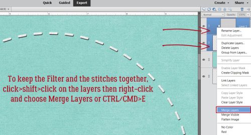
Yes! You CAN Create Curved Lines in Elements!
![]()
PDF Version : https://bit.ly/3QvbYPm
As we’re all well aware, there are lots of things Photoshop does that Photoshop Elements doesn’t. Sometimes there are work-arounds, sometimes there aren’t. I had given up hope on smoothly curved lines after trying a lot of things I felt should work – but failed spectacularly, and then I found George Peirson, the HowToGuru. He’s got some really interesting techniques that I had to try for myself. THEY WORK! Today I’ll show you the easiest one to master, and create a curved paper multi-layer border with it.
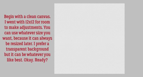
I chose to work on a transparent 12×12 canvas, since it’s my preferred layout size. There’s no reason this can’t be accomplished on a smaller or larger scale, so do what suits you best.
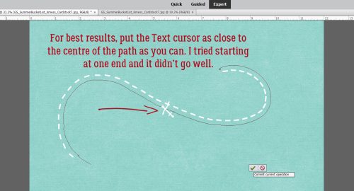
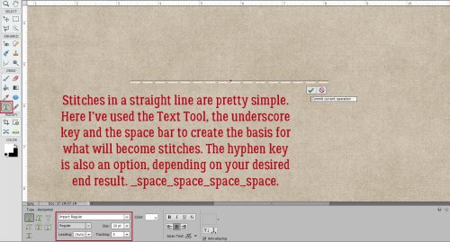
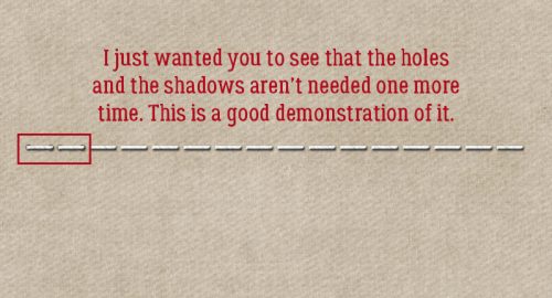
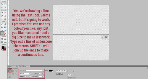
This is the shockingly easy way to curve lines, and it uses the TEXT TOOL!!! Any font will work, and choosing a big character size will make it quicker. Center your Text cursor on your canvas and type out a line of “underscores” – SHIFT>- to extend across the page. Using the underscore gives a longer dash than the hyphen does, and the ends join seamlessly.
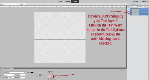
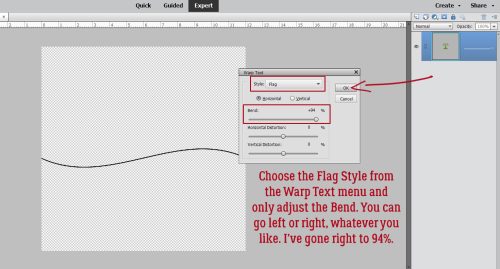
For once, we’re not going to Simplify a Text layer before we manipulate it. Instead, click the Text Warp button shown and a new menu will open up. Make sure Anti-Aliasing is also checked.
The Text Warp menu has a drop-down option bar labeled Style. Click on the bar and choose Flag. The only parameter we’ll change is the Horizontal Bend. Push the slider all the way to one side or the other. I’m right-handed, so I went to the right. For this example I’ve only gone to 94%, but 100% is also going to be perfect. If you want to see what the other adjustments do, play with them. They’re not permanent until you make them permanent.
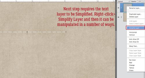
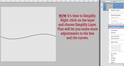
So now we have a very gentle sine wave. If you want something more um… dramatic, we’ll need to Simplify the layer.
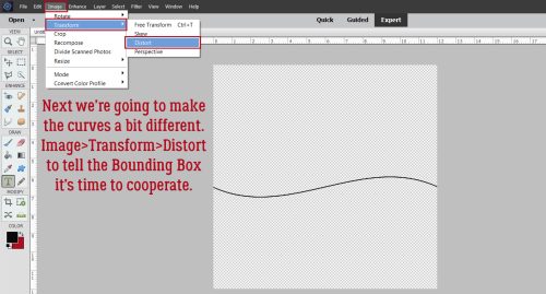
This Image>Transform Tool is so useful! For my sample, I chose Image>Transform>Distort. This command tells the Bounding Box that each of the “handles” is moveable in any direction.
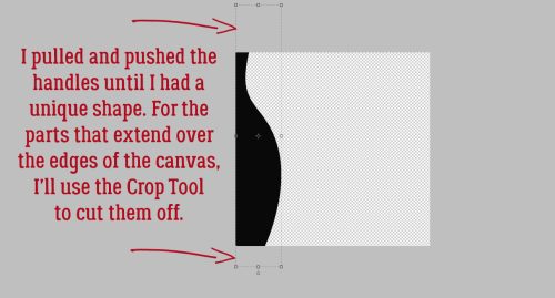
So just grab a handle and pull it or push it around until you see a shape you like. Then click the green checkmark.
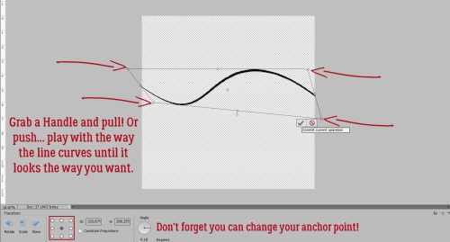
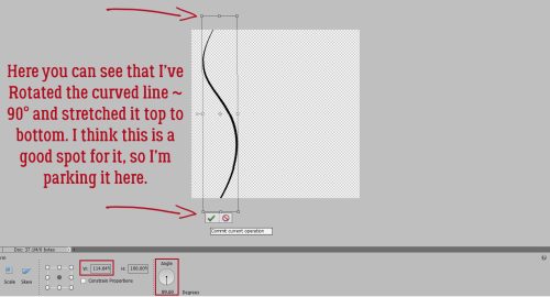
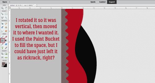
The usual Resize and Reposition functions are still operational, so you have lots of room to make adjustments. I Rotated it so it’s vertical, then stretched it top to bottom and positioned it where I liked it best.
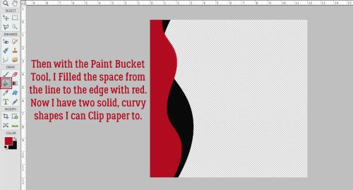
My goal is to create some Clipping Masks for a curvy border, so I used the Paint Bucket Tool to fill the space between the edge of my canvas and the curvy line.
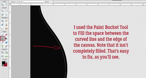
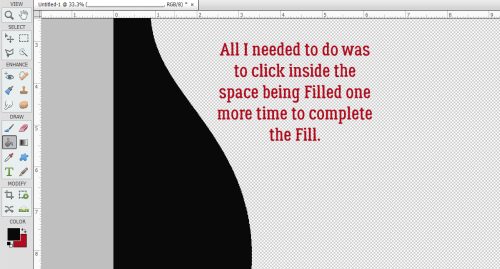
You can see there’s a faint blank area. That happens sometimes with the Paint Bucket. It’s easy to remedy. Just click the Paint Bucket in the space again and that blank area will fill.
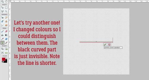
Okay. I have one layer. Let’s make another one. I’ll use a different colour so it’s easier to see what’s what. I’m also going for a shorter baseline.
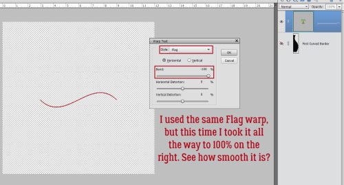
This screenshot shows how the length of the line and the percentage of Bend influence the curves when I used the same Style through the Warp Text Tool.
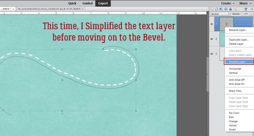
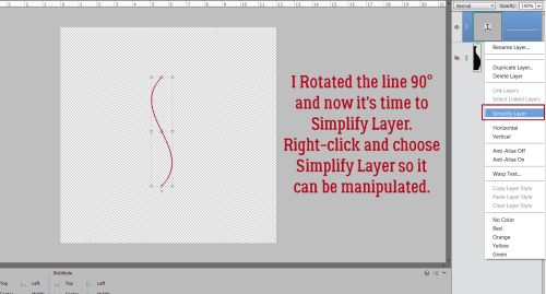
Here I’ve Rotated the line already, and I’m ready to Simplify it.
This time when I chose the Image>Transform Tool, I chose Skew.
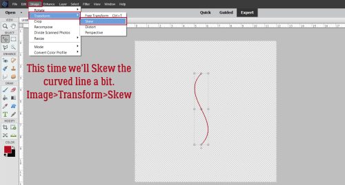
With Skew, the handles can move in two directions, horizontally or vertically. You can see my Bounding Box in the screenshot.

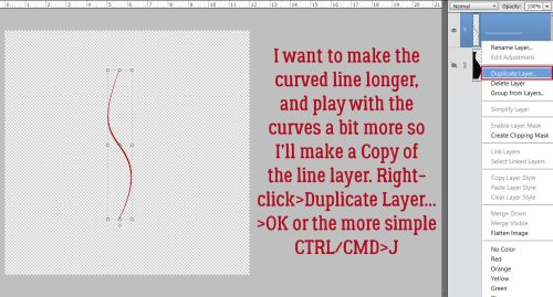
I’d like to make the curved line longer, and have more curves, so I’ll make a Copy layer.
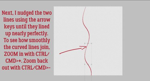
Then I moved them around so the spot where they intersect provides a smooth curve. I did some Zooming while I was lining them up.
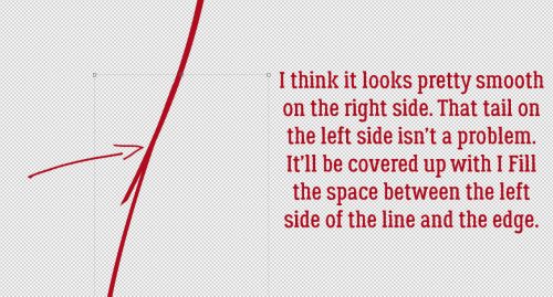
It looks pretty good to me. I won’t worry about the tail on the left side of the line.
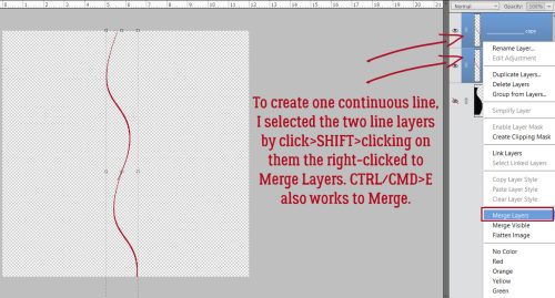
Then I Merged the two lines into one long one.
Once I had just one long line, I moved it over so it sat on top of the black shape, which is visible again.
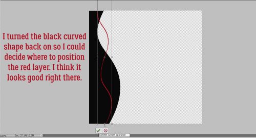
And I dumped the Paint Bucket into the space. Clipping mask #2 is done.
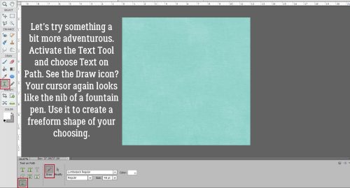
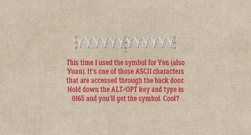
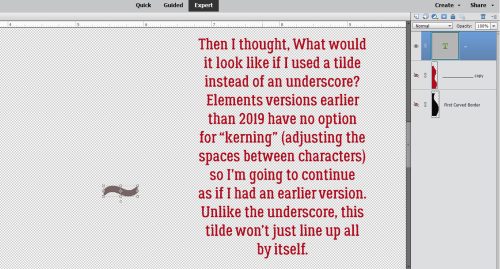
I wanted to try one more thing, using a tilde ~ instead of an underscore. The main difference is that the line of tildes won’t connect up the way the underscores do. Elements 2019 finally included kerning: the ability to adjust the space between characters, only they call it Tracking. Earlier versions don’t have that function, so I’ll show you the “non-kerning” method of creating a wavy line with a tilde. It’ll take a few extra steps.
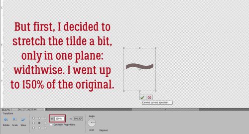
But before we do that, I decided I wanted to stretch the tilde widthwise by 50%.
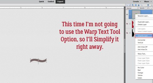
The Warp Text Tool isn’t going to work for this curvy line so the tilde layer needs Simplifying.
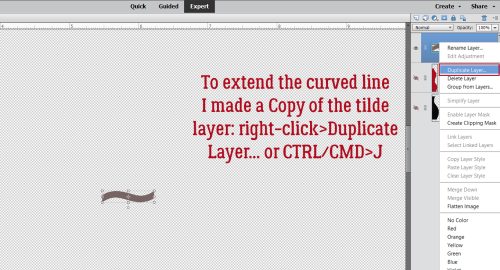
I made a Copy of the tilde layer.
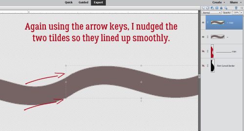
Using the arrow keys I nudged the two tilde layers so they created a smooth wavy line.
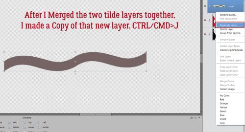
I Merged the two layers and made a Copy of the now-double-tilde layer.
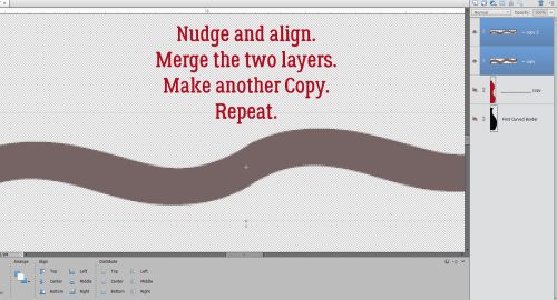
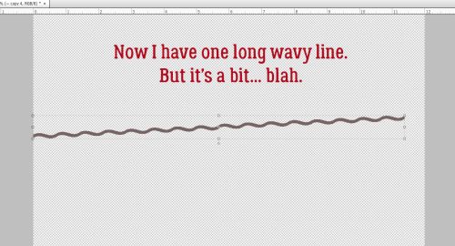
Nudge the two layers to create a smooth wavy line, Merge the two layers and make another Copy, this time with double the bumps. Keep repeating these steps until the line stretches across the whole page.
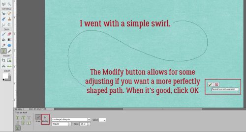
I think it needs something…
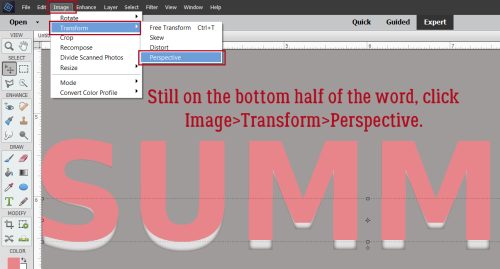
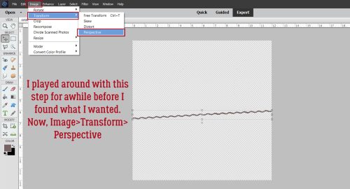
This time, after much trial and error, I chose Image>Transform>Perspective.
Woohoo! It looks like rickrack! I could use it just like that and be quite happy.
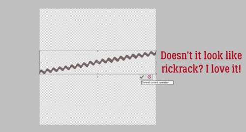
Instead, I moved it into position and Filled the space.
I liked what I had, but thought maybe one more layer. Rather than make a whole new one, I instead played with the original shape. I made a Copy of it then hit it with Image>Transform>Distort.
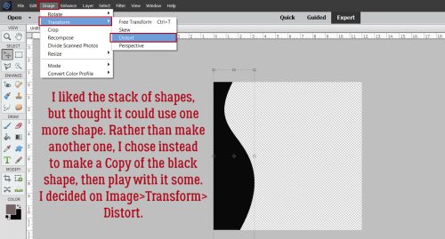
It’s just different enough that it’ll add something to the stacked border. Whenever I have something on my canvas that extends outside the edges, I use the Crop Tool to get rid of those parts so they don’t mess with the final product.
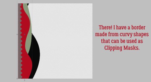
I changed the colour of that last layer to a grayish-green then flipped it horizontally and Rotated it 180° so the widest part was at the top. I think it’s good now.
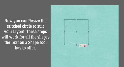
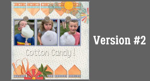
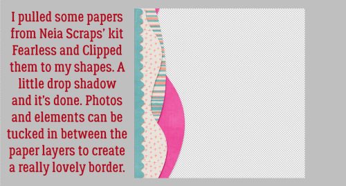
Here’s a view of the four Clipping Mask layers with papers Clipped, and with a small drop shadow. You could position the layers horizontally, which could give you a nice wave effect, too. Now I can tuck the corners of photos in between the layers, add some elements and have a really unique border when I’m done.
In a coming tutorial I’ll show you a couple of other ways of creating curved lines so you can choose the one you like best.
Whew. It’s still Tuesday where I am. I made it!
PDF Version : https://bit.ly/3QvbYPm
![]()