Goodness, it’s the last Friday in October. This month just flew by. Not always a good thing when one still has a bunch of things left to do for the month.
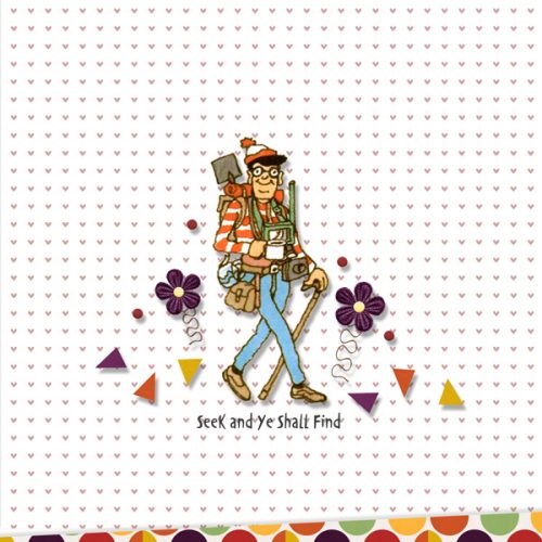
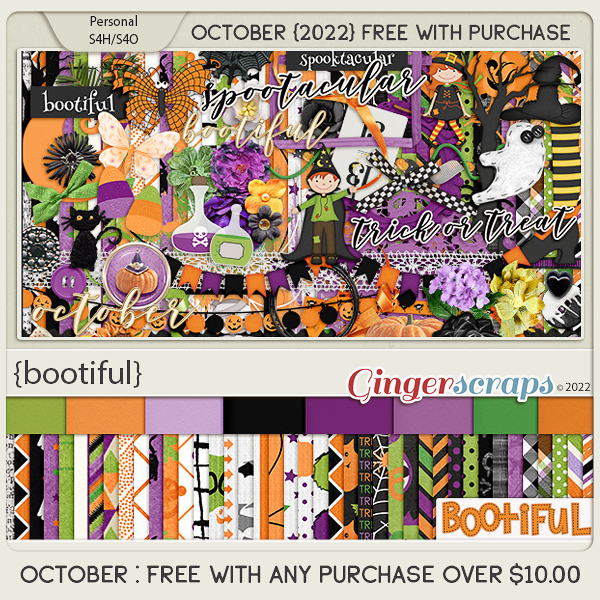
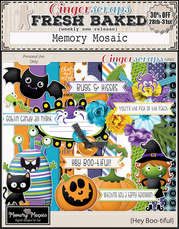
There is still a few days left to get this amazing Halloween kit. Spend just $10 in the store and get this free with your purchase.
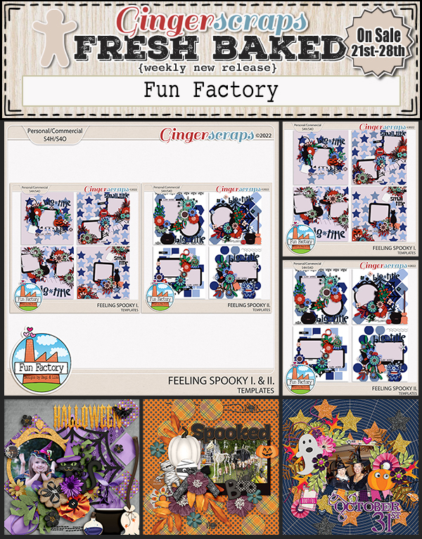
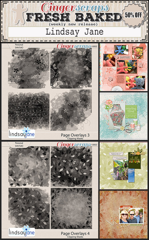
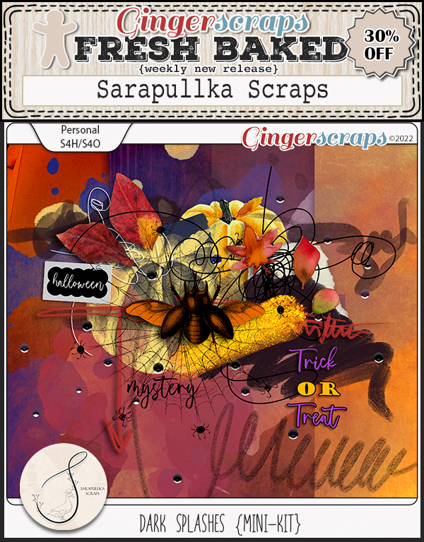
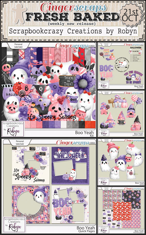
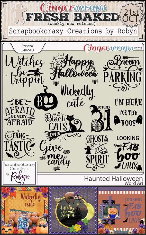
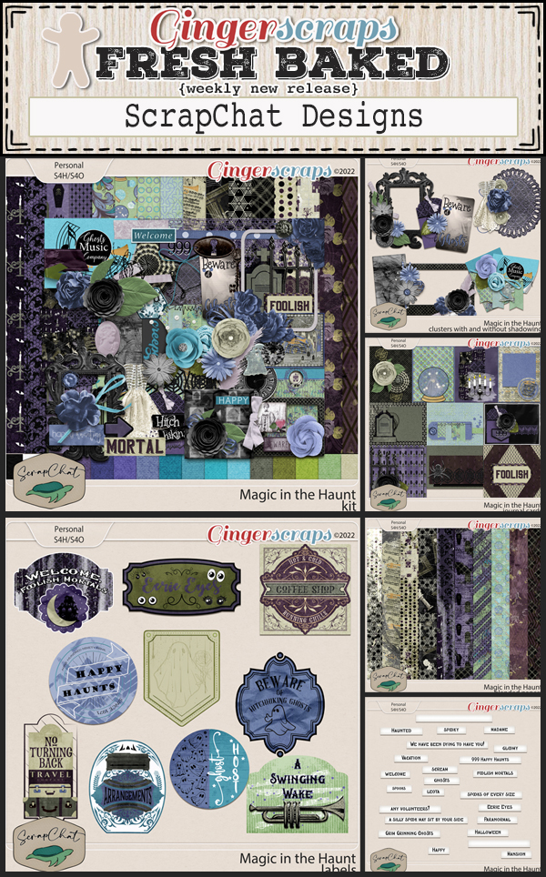
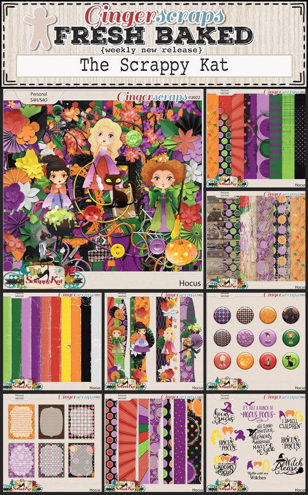
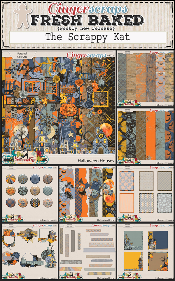
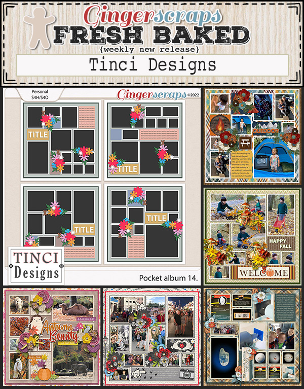
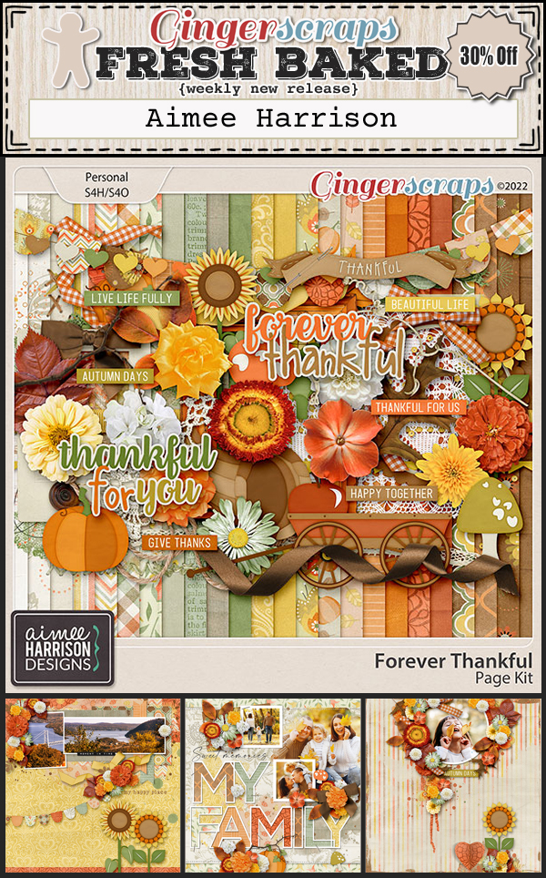
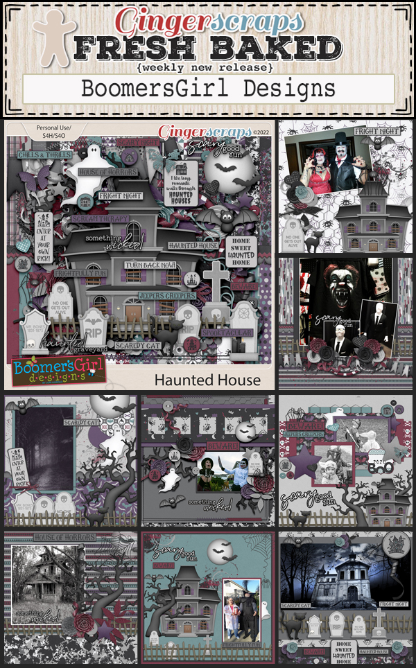
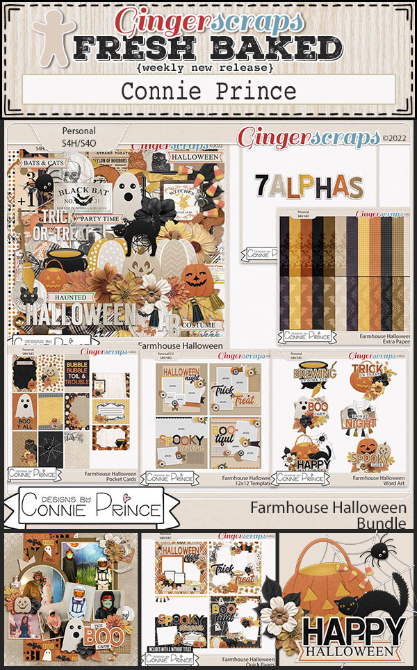
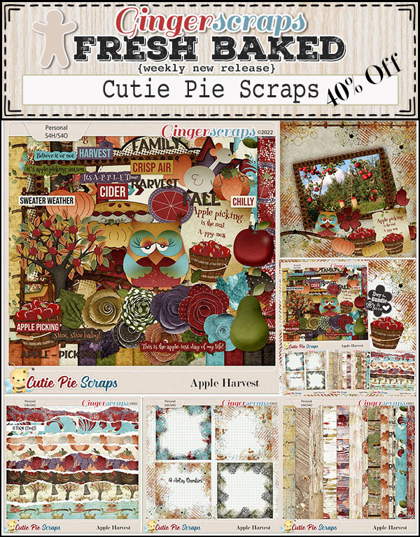
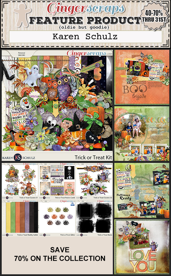
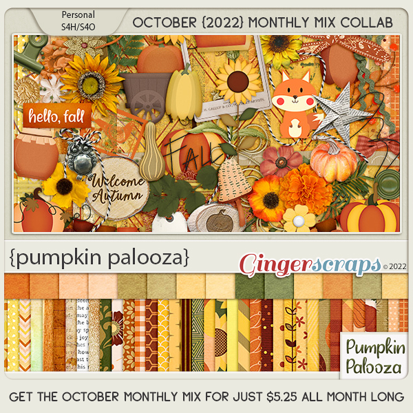
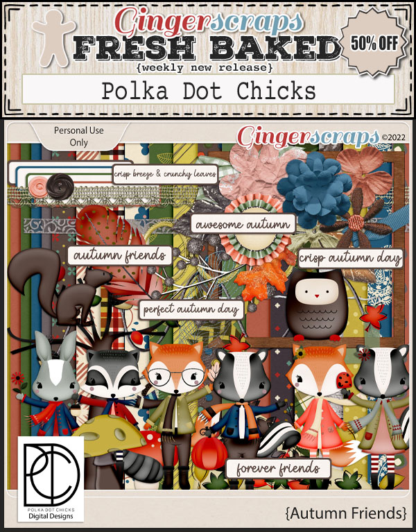
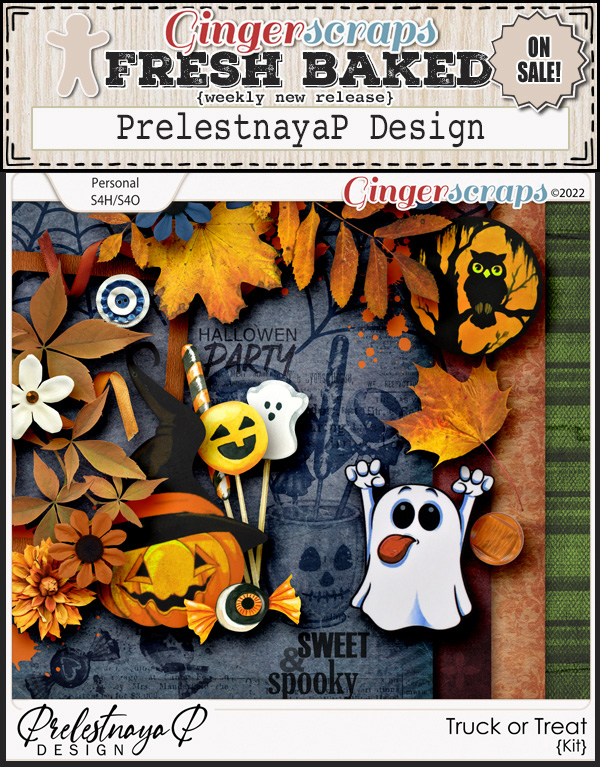
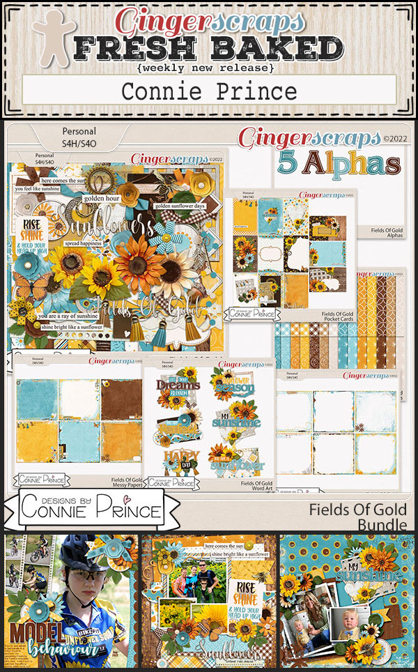
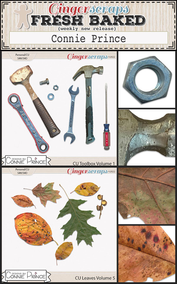
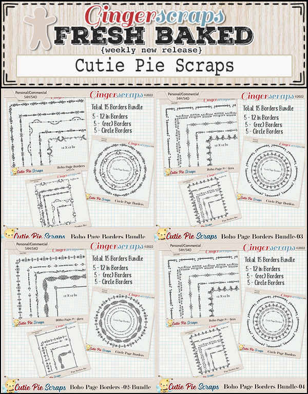
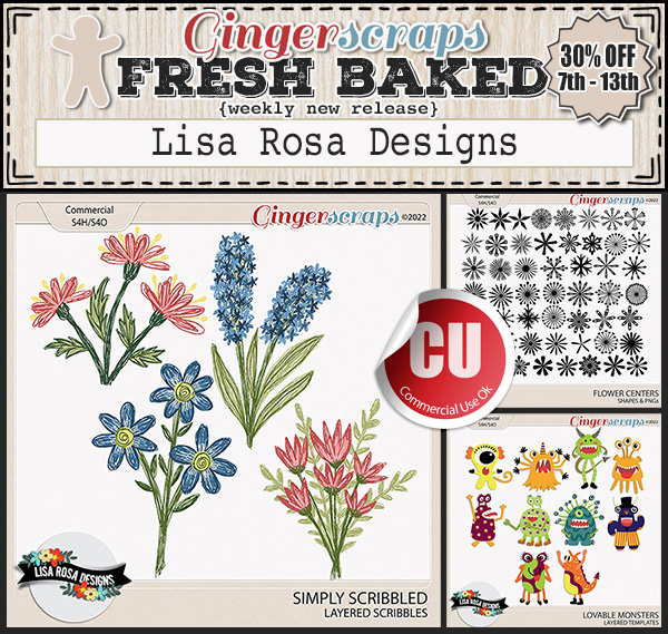
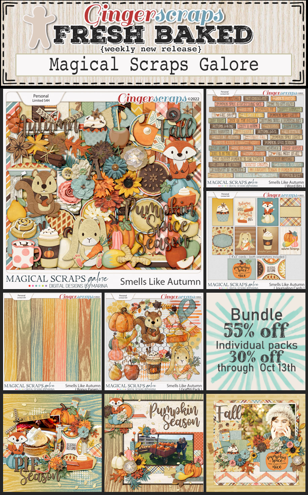
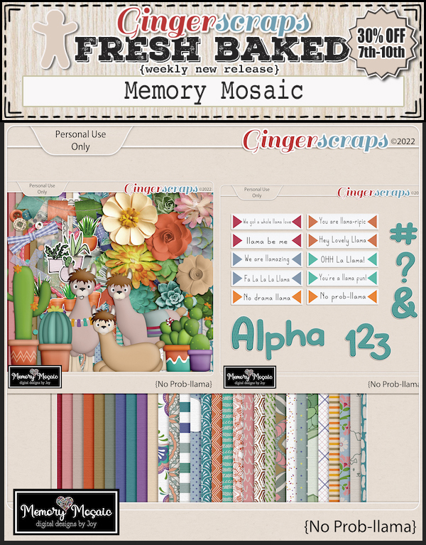
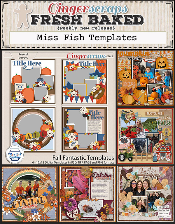
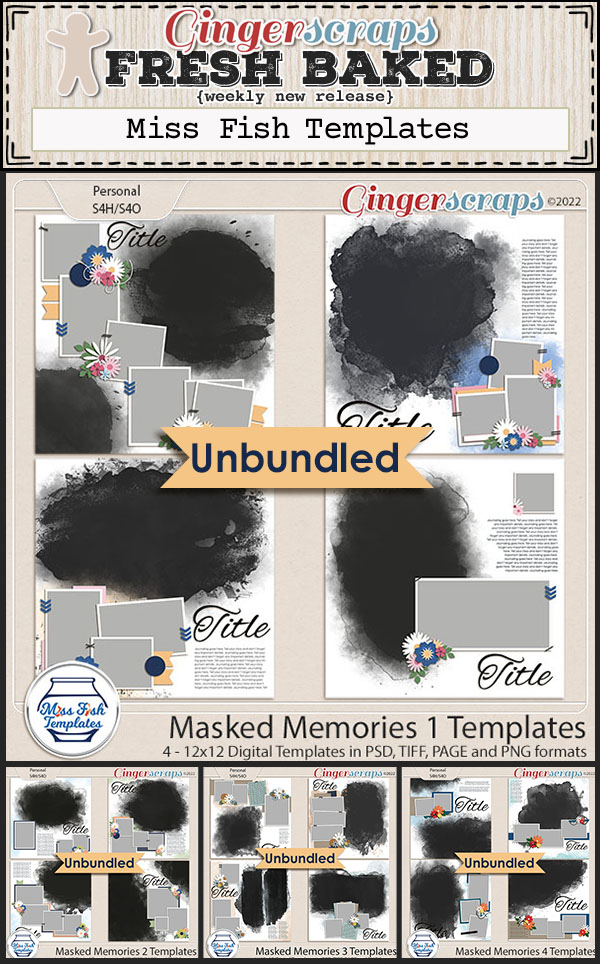
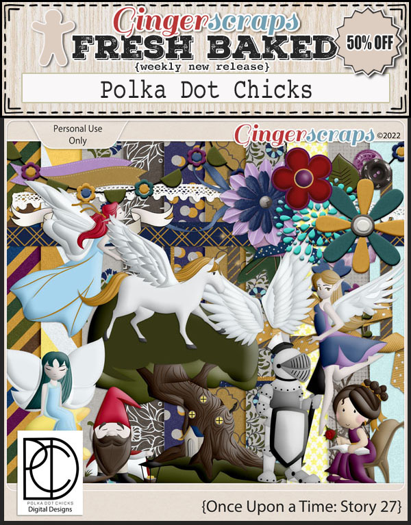
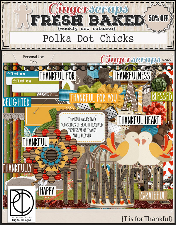
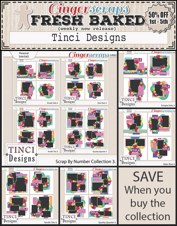
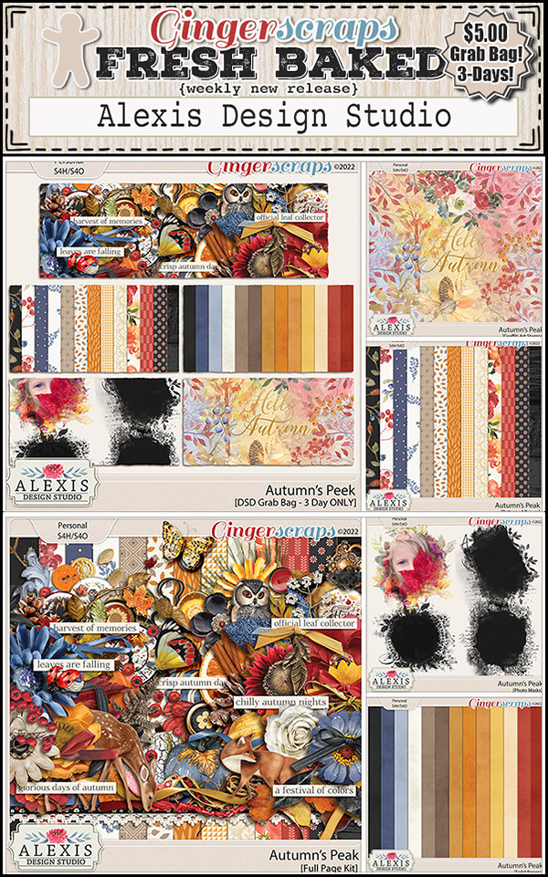
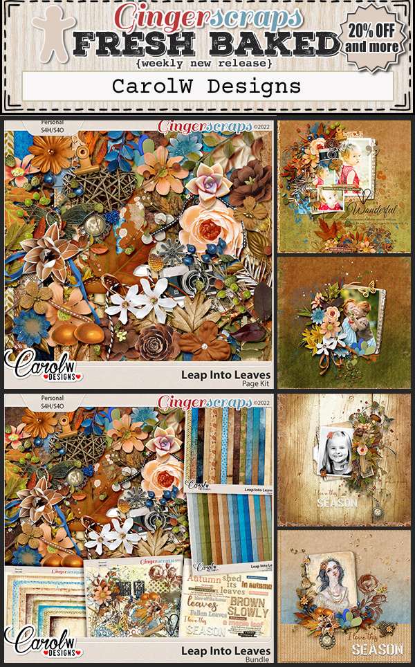
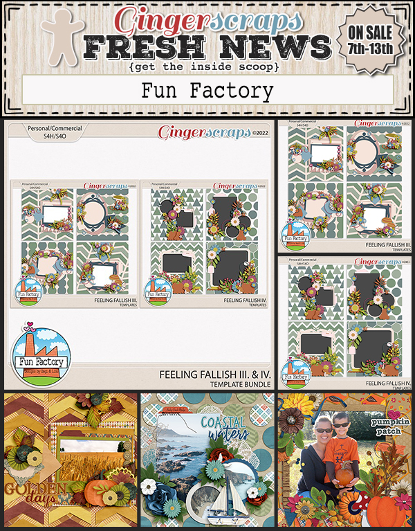
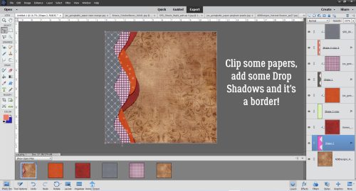
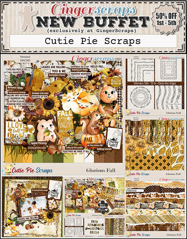
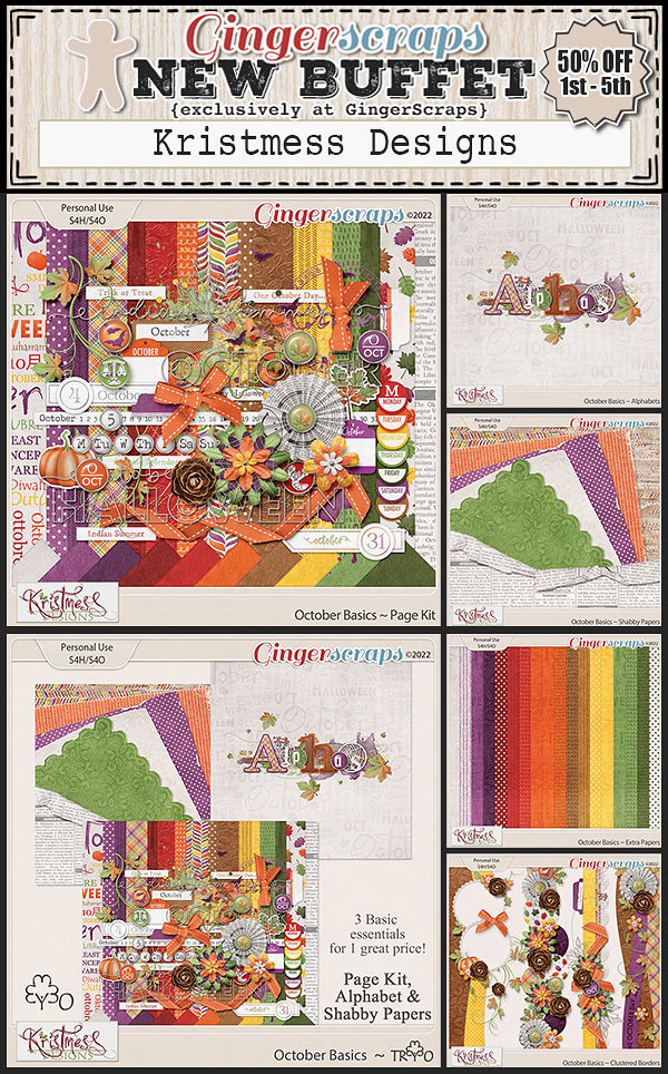
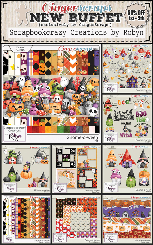
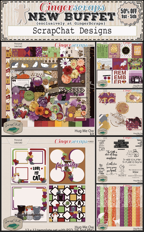
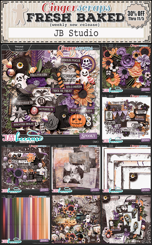
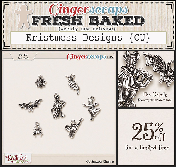
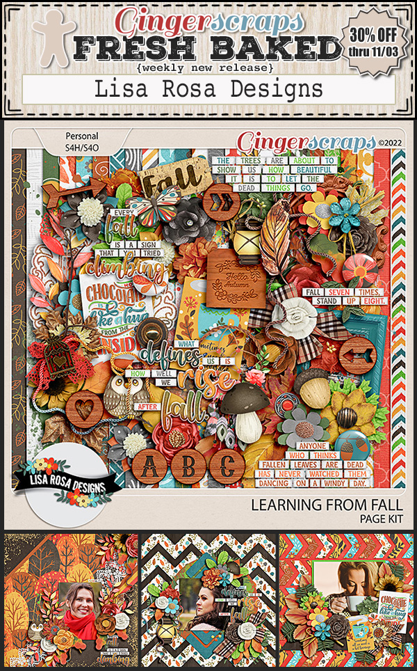
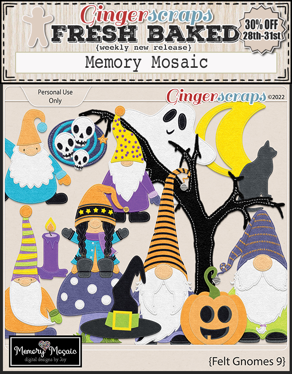
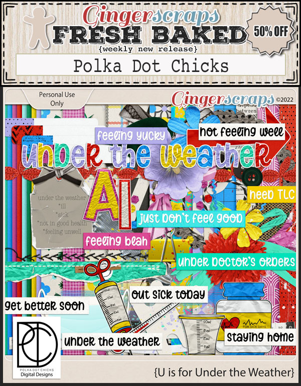
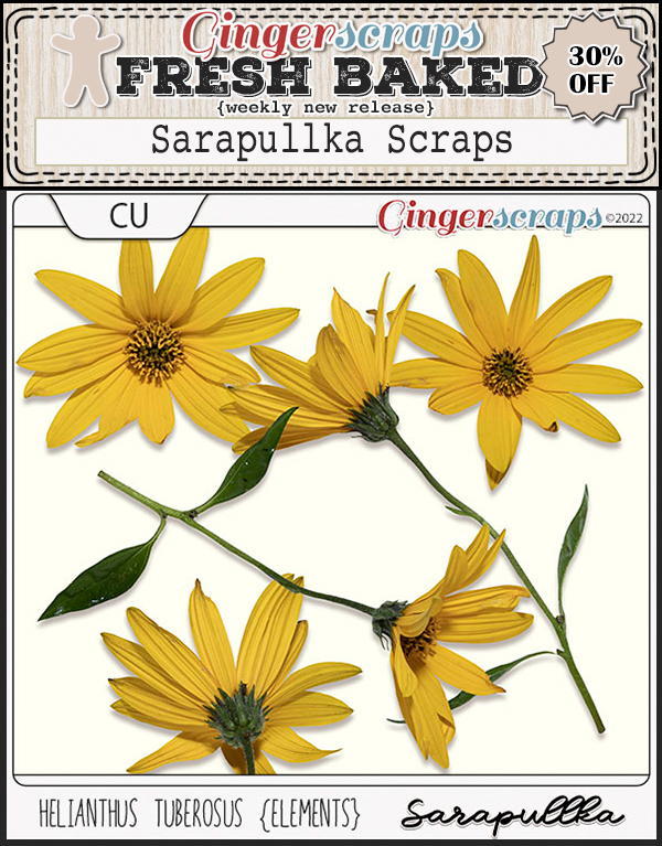
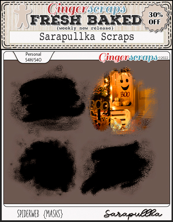
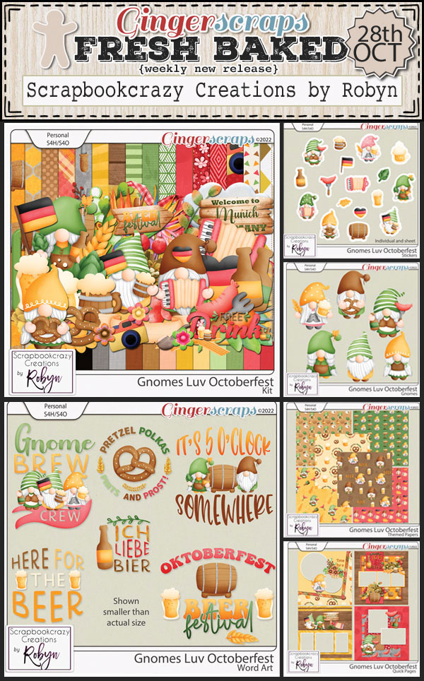
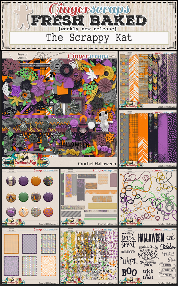
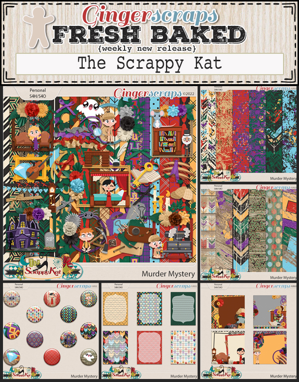
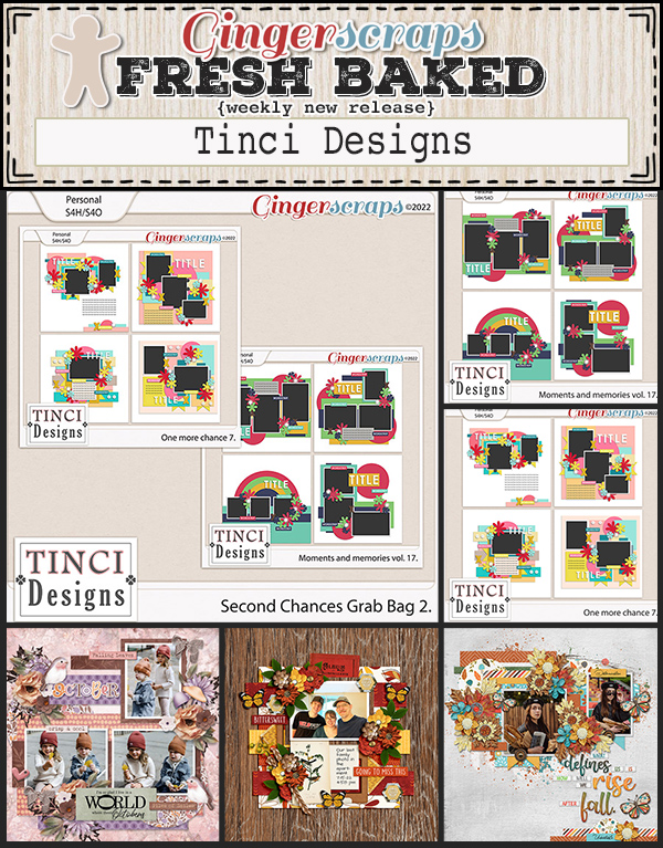
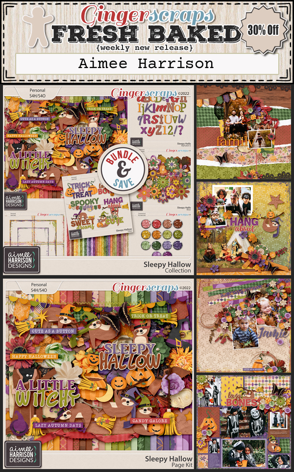
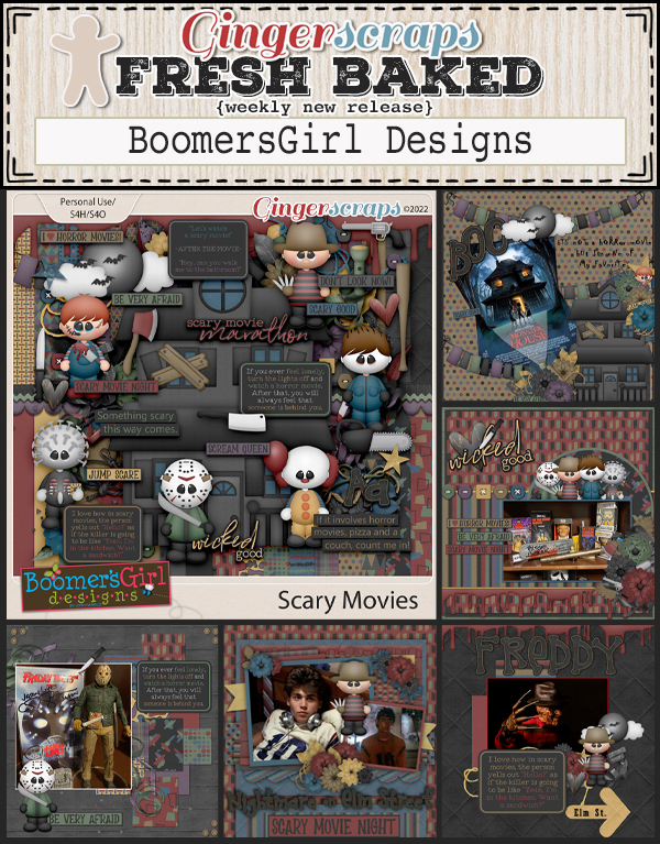
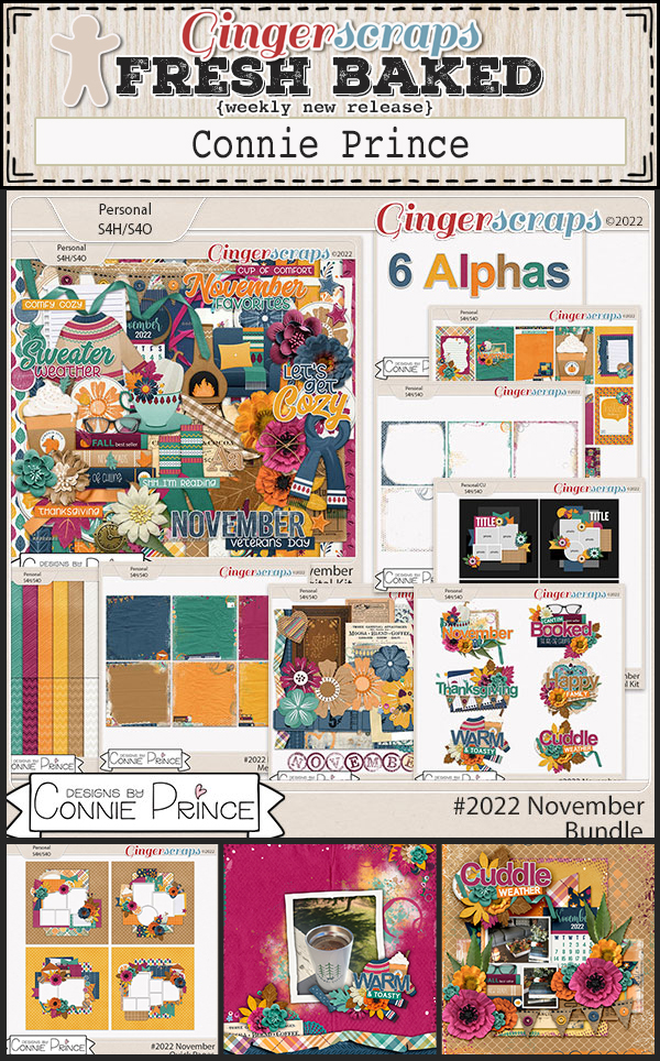
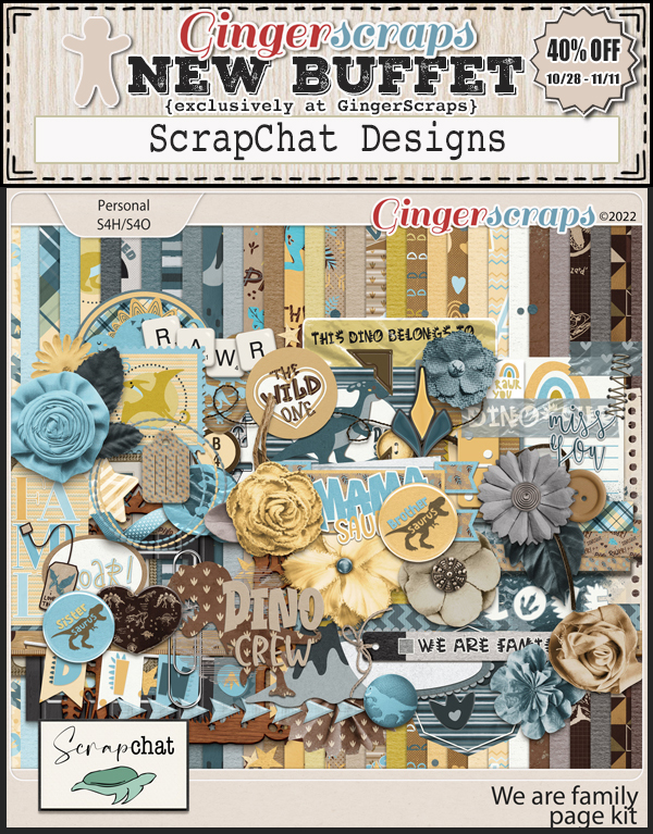
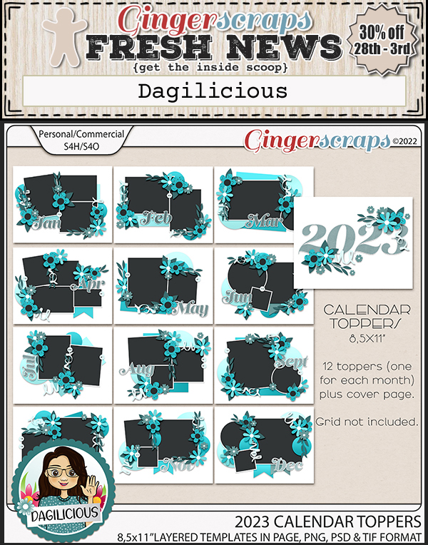
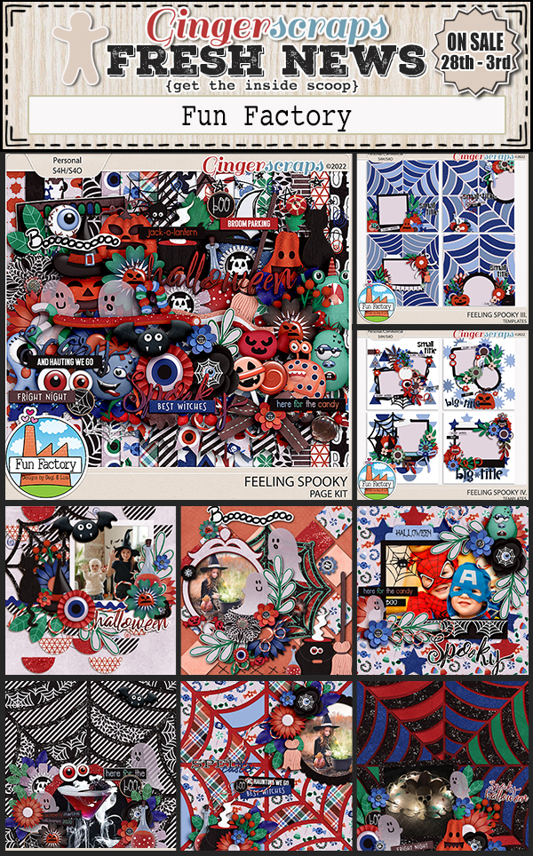
There are a lot of fall and Halloween goodies new in the store this week.


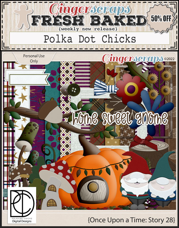


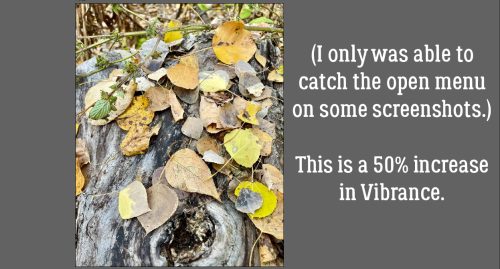
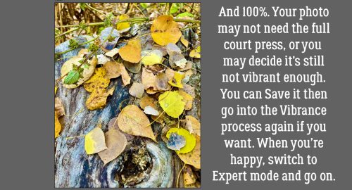
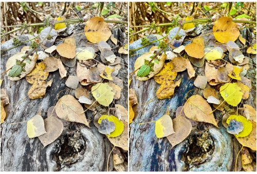
Are you still working on those challenges. Any 10 completed challenges gets you this kit as a reward.