Loading Those Styles Files
![]()
PDF Version : https://bit.ly/3RxUyDK
Back a couple of weeks, I said I’d put together a quick tut on how to load Styles into Elements. That’s where we’re going today. It’s really easy, but I can complicate anything! I’ll show you the easy way, and the more complicated way then let you decide how you’ll do it. Sound good?
But first, let’s talk about Styles a little bit. What are they, anyway? Essentially, they’re little automatic scripts that allow you to alter and enhance individual layers in your Photoshop Elements layouts. They include things like shadows, glitter, metal, fabric, gel, wood, cork, texture… so many different Styles exist and more are being created all the time. Several GingerScraps designers create Styles that coordinate with their kits. In fact, many of the GingerBread Ladies‘ collabs have Styles files in them, so you’ve probably got a bunch you aren’t even aware of! Let’s get you up to speed!

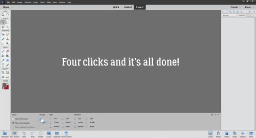
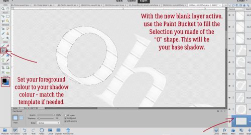
There are two ways to access your Styles portfolio. One is to click the Window tab along the top of the workspace then choose Styles from the drop-down menu. The second way – the one I use because it’s right there – is to click on the Styles button at the bottom of the Layers Panel. Once you’ve accessed them, there’s a Style Picker bar at the top of the Layers Panel.

Here’s the Style Picker. It will let you see all the Styles that are already Loaded. Elements includes several default Styles embedded in the software (Bevels, Complex, Drop Shadows, Glass Buttons, Image Effects, Inner Glows, Inner Shadows, Outer Glows, Patterns and more) That little stack of lines to the right of it is where the actual Styles Menu hides.

Let’s click on the stack of lines. Now choose Load Styles.

Here’s where I can complexify things… I learned how to find where my computer puts things and have worked out my own workflow using that knowledge. With Styles (and Brushes, which are Loaded in exactly the same way), I rename the files then move them into the folder where Elements will look for them first. I’ve outlined the path here. The path is C:\Program Files\Adobe\Photoshop Elements [Version #]\Presets\Styles. This makes it easier for me to find them later but it’s not the only way to manage them.

You can see that Styles files have the tag .ASL or .asl after the file name. Knowing that, you can let Windows search for your Styles. (Sorry Mac users, I know nothing about file searches in the Mac OS.)

Here you can see there’s at least one file I haven’t renamed. 😉 And it’s the file I’m going to use… To locate the folder it’s hiding in, I right-click on the file name and choose Open File Location from the drop-down.

Now I can go back to the Styles Menu, because I know where the file is, and retrieve it.

Click on the file and then Load. DONE!

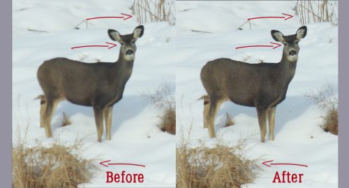
The set is there, open and waiting for me to decide which one I want to use. Hovering the cursor over the thumbnail will tell you what the Style has been named by the designer.

I tried the two blues, but liked the black best. As I’ve shown in other tuts, the Style can then be adjusted by double-clicking on the fx icon on the layer and playing with the settings.

There are lots of sources of free Styles online. Some Photoshop Styles will work with Elements and some won’t. Brusheezy, which I’ve shared before, is pretty good at separating them out. I’ve linked you up if you’d like to explore.
See you in February!
![]()