Realistic Folded Paper Shapes
![]()
PDF Version : https://bit.ly/3qGmUPF
I got a message from one of my most faithful readers, Karen Hampton, the other day. She had downloaded the Sweetheart template freebie that went out in Neia’s newsletter and was disappointed to find that although there’s a cute folded-paper heart on the layout, clipping a paper to the layer didn’t also recreate the folded-paper effect. She said she thought she could do it herself, but was very unhappy with the results. She was on the right track, but may have missed a couple of nuances. She asked if I’d do a tut, and here we are!
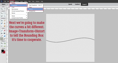
My example will start out showing a newsprint background paper that disappears a few steps in. You’ll probably figure out for yourself why that happened. 😉
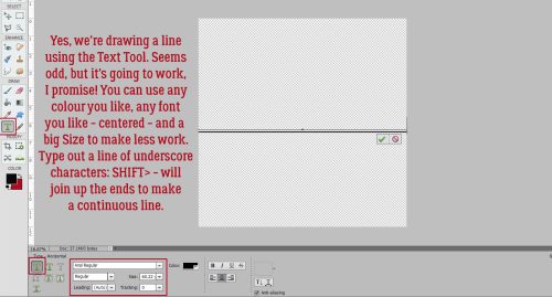
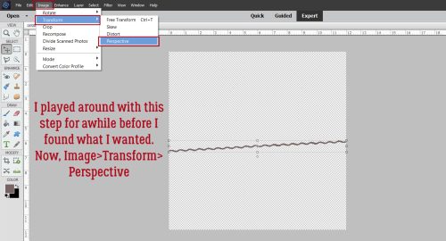
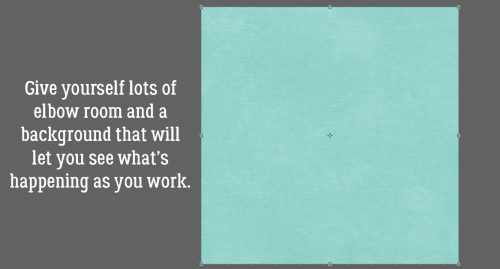
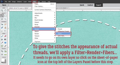
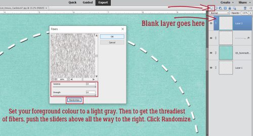
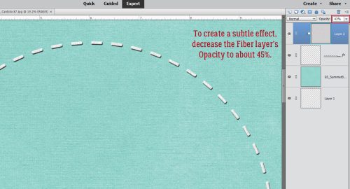
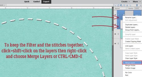
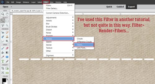
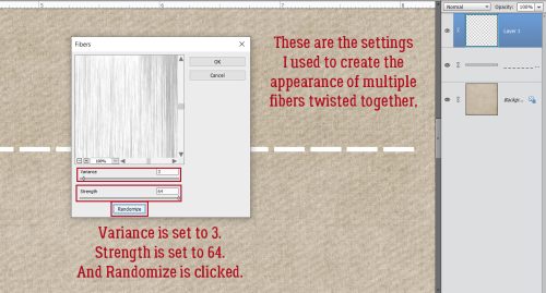
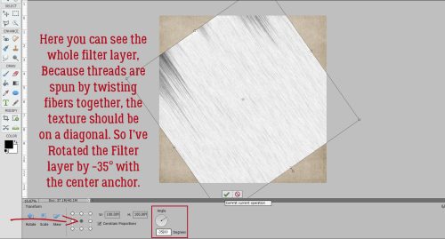
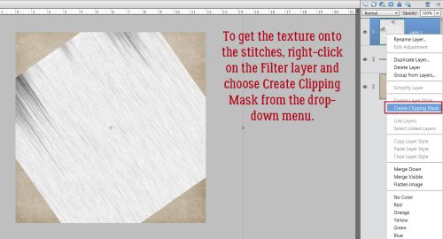
Open up a canvas. Mine’s 12×12, as usual. Drag and drop a background if you want. Or don’t. We’ll start out with the Custom Shape Tool, aka the Cookie Cutter Tool. Pick a foreground colour that you can easily see. I’m going with the absolute most simple options here but if you want to, use the Tool Options to get a perfect shape. I’ll use the heart, since the template has a heart, but this’ll work with other shapes too. To more easily see the changes made with each step I’m going to use a plain, solid red paper. The technique works just as well on patterned paper too.
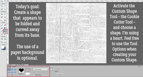
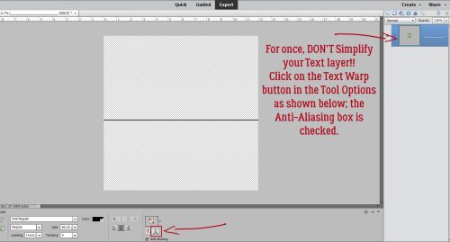
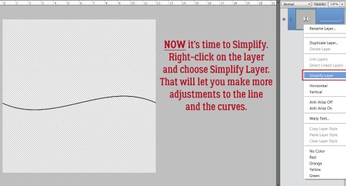
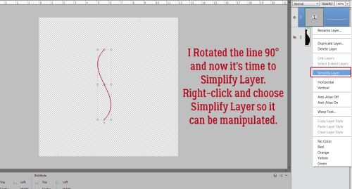
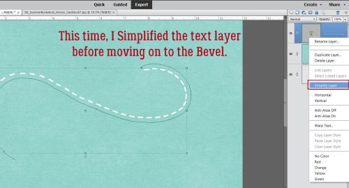
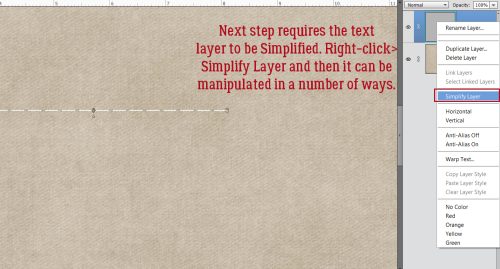
I dragged out a good-sized heart using the Custom Shape Tool. Note the solid line around the edge of the heart. That is one clue that the heart is a Smart Object. Another clue is that there’s a little icon in the lower right corner of the Layer Thumbnail that doesn’t show up on layers containing dumb objects. Before we can manipulate anything about that shape other than to resize it, it must be Simplified. In more recent versions of Elements, there’s actually a Simplify button in the Tool Options.
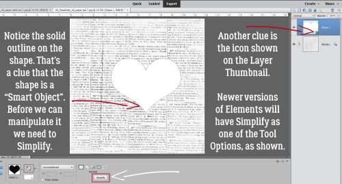
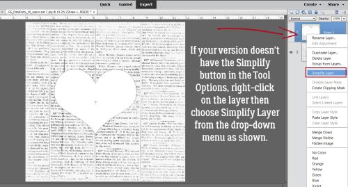
If your version doesn’t have that, you can accomplish the same thing by right-clicking on the layer to activate it and choosing Simplify Layer from the drop-down menu.
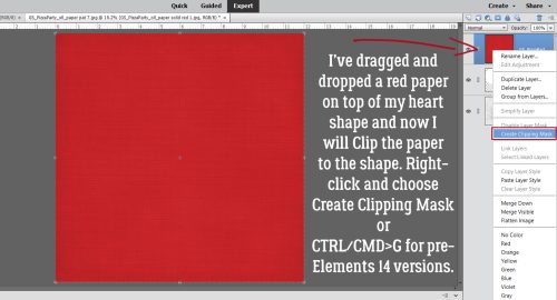
Here’s my red paper. To Clip it to the shape, right-click on the paper layer and choose Create Clipping Mask. If you’d rather use a keyboard shortcut, CTRL/CMD>G works with versions Elements 14 and previous. If you’re using Elements 15 or newer, that shortcut Groups Layers – which could be useful but doesn’t do what’s needed here. For you, the keyboard shortcut is CTRL/CMD>ALT/OPT>G.
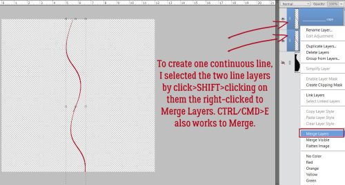
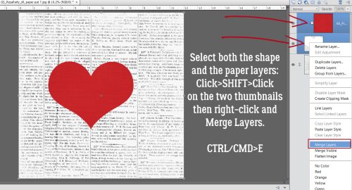
Once the paper is Clipped to the shape, the two layers can be Linked by clicking on the little grayed-out symbol on the left edge of the layers, which keeps the layers together if one is moved or resized. I prefer to Merge them into a single layer so I don’t leave part behind or do a bunch or work on the wrong layer. Click>SHIFT>click on the layers to activate them then right-click and choose Merge Layers or CTRL/CMD>E.
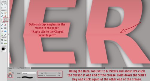
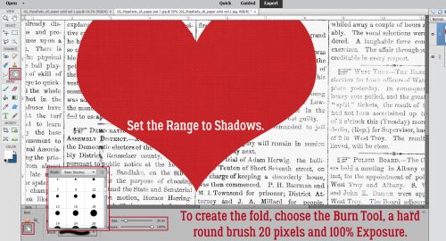
To create the appearance of a fold, we’ll use the Burn Tool. The icon looks like an “OK” hand signal (or half of Heidi Klum‘s opera glasses, for those of you who watch America’s Got Talent). Select a small hard round brush from the Brush Picker. 20 pixels is a good size. Set the Range to Shadows and the Exposure to 100%. What this Tool does is darken whatever it covers, but keeps the underlying colour.
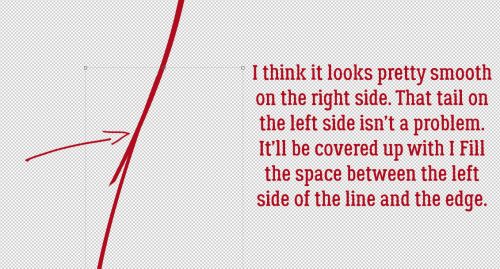
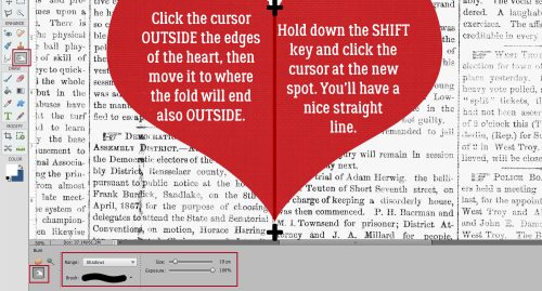
This is a hot tip: When using the Dodge and Burn Tools, to get the smoothest transitions, start your action OUTSIDE the object you’re altering. The effect will only be applied to the actual object on the active layer – it won’t touch anything underneath it! And to create a straight line, click>HOLD THE SHIFT>click. So I started my shadowy fold line by clicking off the red paper at the centre-top V on the heart (the upper + sign), held the SHIFT key down while I moved the cursor to below and outside the pointed end of the heart and clicked again (the bottom + sign). As long as you keep the SHIFT key pressed, Elements will know it’s drawing a line between clicks.
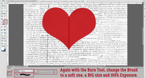
Still working with the Burn Tool set to Shadows, change the Brush to a BIG soft brush. You can resize your Brush two different ways. One is to use the slider in the Tool Options. The other is to use the keyboard. [ makes the brush smaller, ] makes it larger. Choose a brush size that covers about 2/3 of one side of the heart.
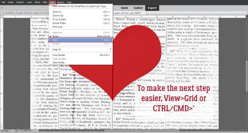
I like to have the utmost control over everything (Type A/OCD/ADHD??) so for this step I’ve turned on the Grid. View>Grid or CTRL/CMD>’ This way I can be sure the shading is oriented properly and that I’m starting and stopping in a straight line.
This screenshot expands on what I was saying about starting the Burn OUTSIDE the heart. I have my big, soft brush overlapping the fold by a bit (I think it looks more realistic, but you can line up the Burn with the fold if you want). I’ve shifted the left edge over 2 spaces past the fold. Click>HOLD THE SHIFT DOWN>click and there’s a nice shadow there.

If 100% isn’t quite as shadowed as you’d like, simply KEEP THE SHIFT KEY DOWN, move the cursor back to the first position and click again. If you click without holding down the SHIFT key you’ll be starting a new path and will be making work for yourself. Does that make sense?

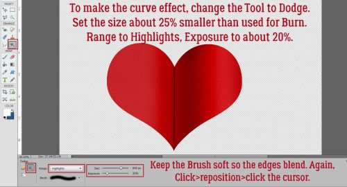
To make the right side of the heart look a bit curved, change to the Dodge Tool – the one that looks like that paddle the optometrist uses to cover one eye. Keep your big soft brush but make it about 25% smaller than your Burn brush was; set the Range to Highlights and the Exposure to about 20%. Repeat the same steps you used to create the shaded part. One pass should be enough. Can you see the curve?
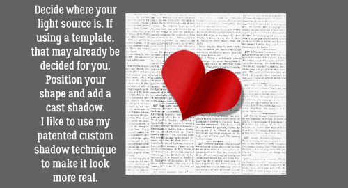
Once you’ve figured out your light source you can position your heart and add a nice cast shadow. And that’s it!
Let me know how this works for you. I’m always open to questions and suggestions through Private Messages. [User name ObiJanKenobi] See you next week!
PDF Version : https://bit.ly/3qGmUPF
![]()