Archives for July 2020

Fresh Baked: JULY 31, 2020

Happy end of July everyone. We’ve been in the 90’s for the last two weeks. I guess it is July and it’s supposed to be warm, but I’m ready for fall temperatures.

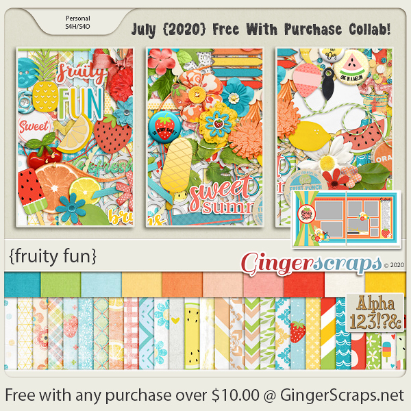
Today is the last day to get this colorful {fruity fun} kit for free with the purchase of $10 or more in the store.

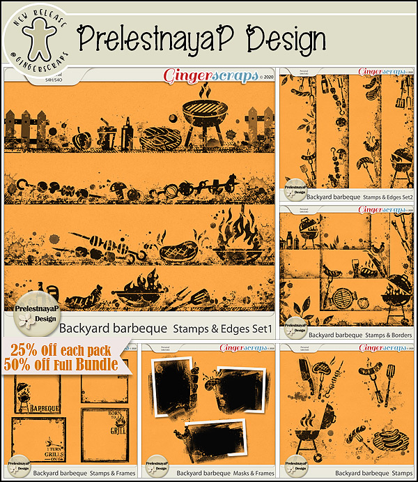
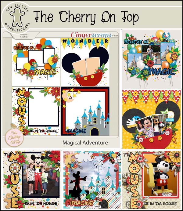
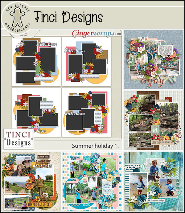
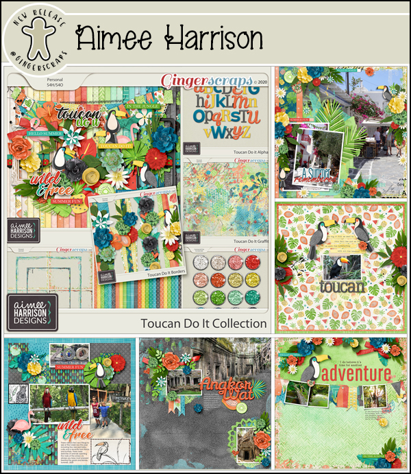
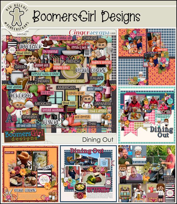
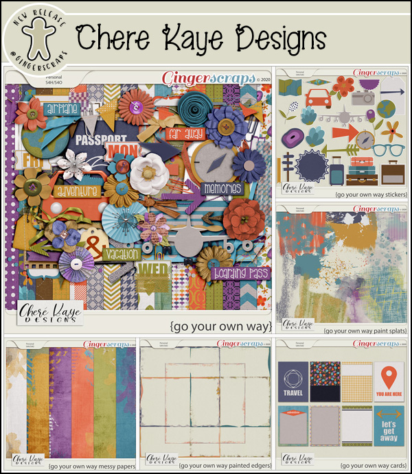
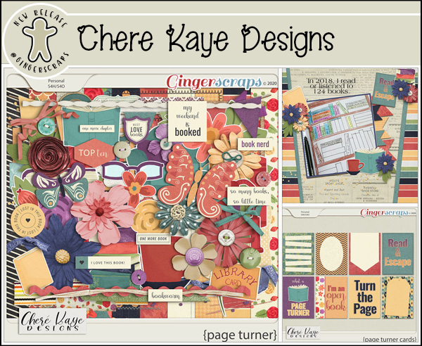
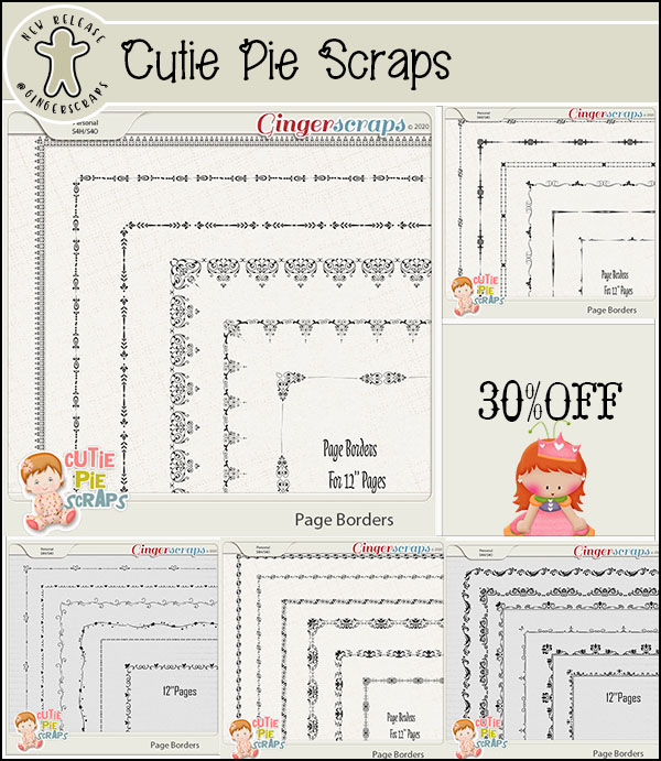
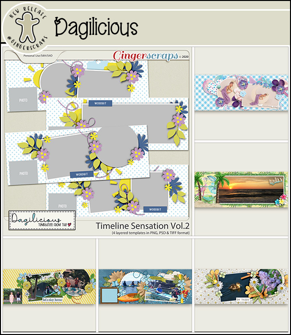
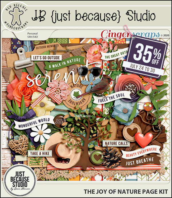
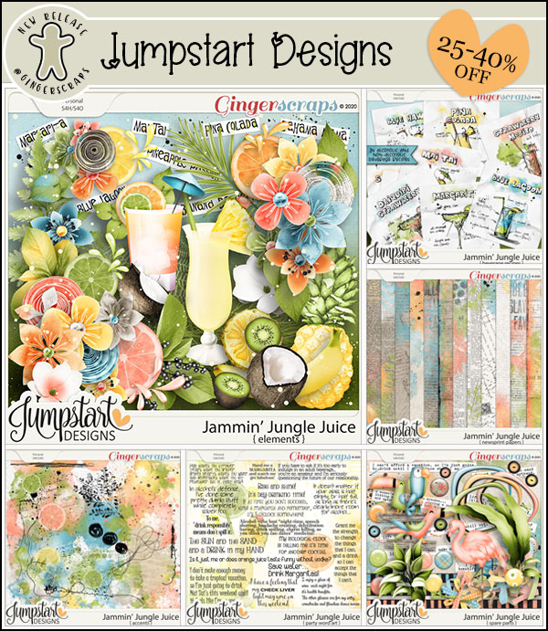
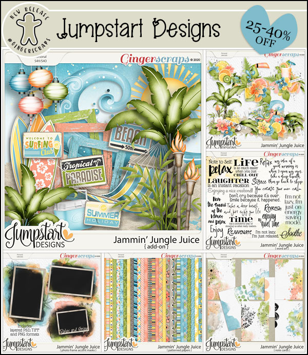
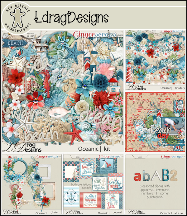
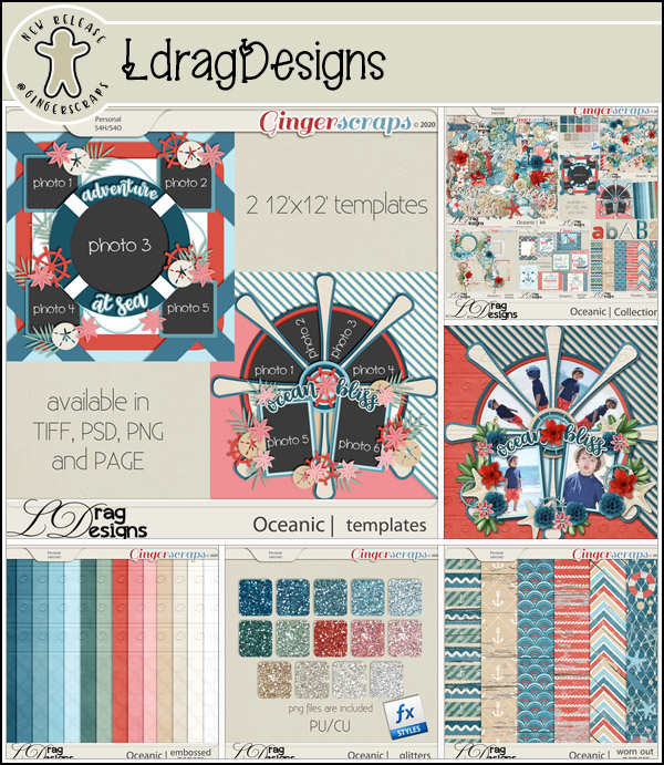
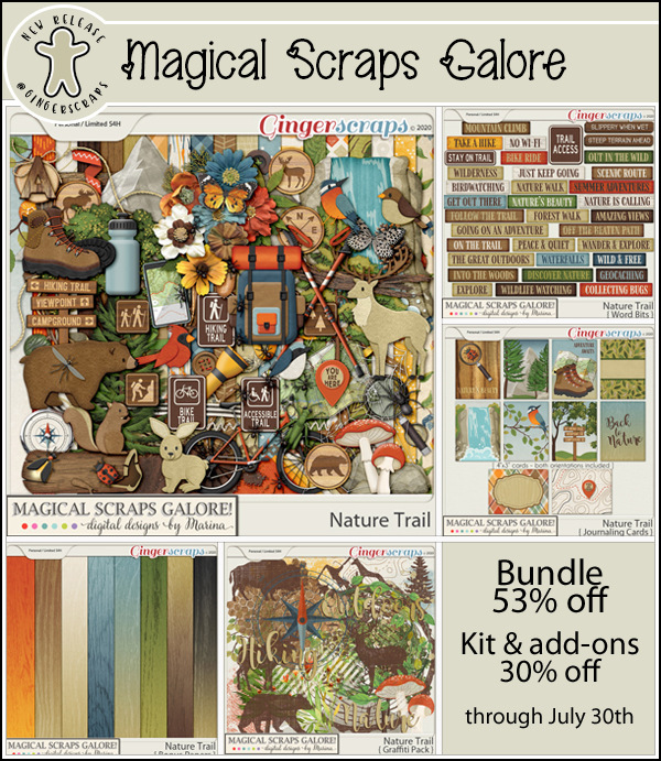
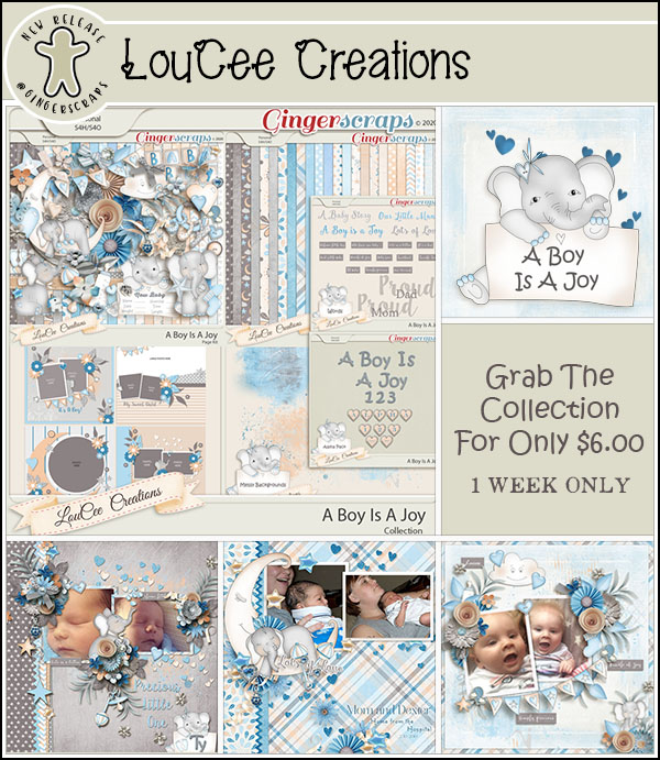
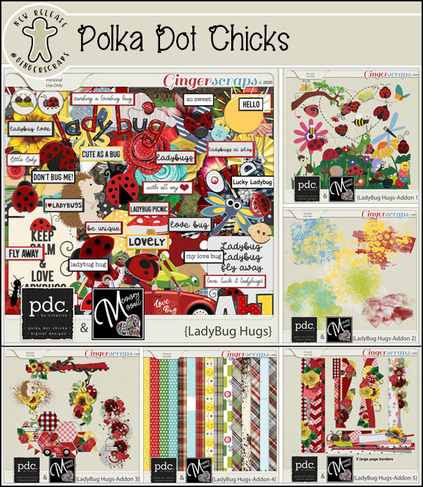
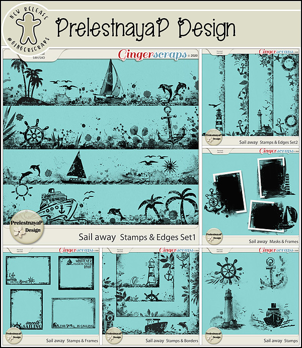
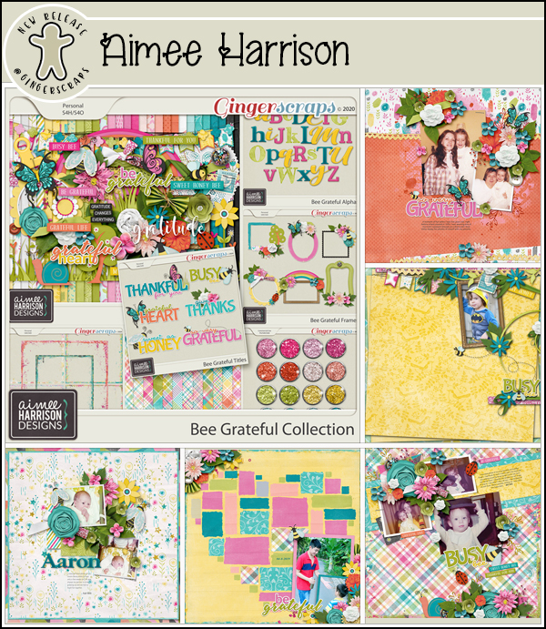
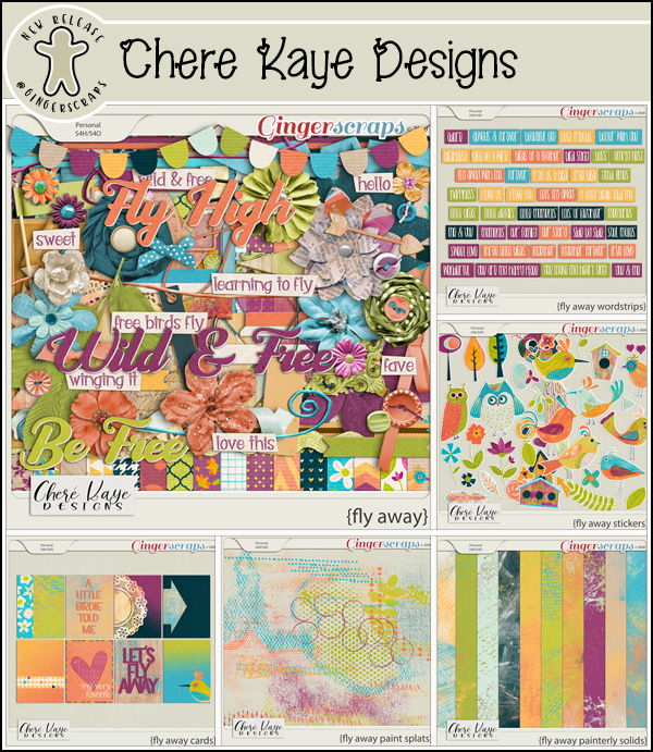
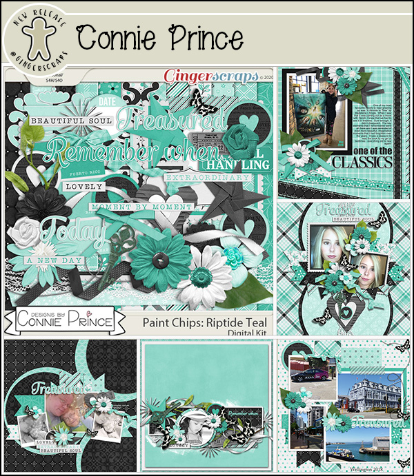
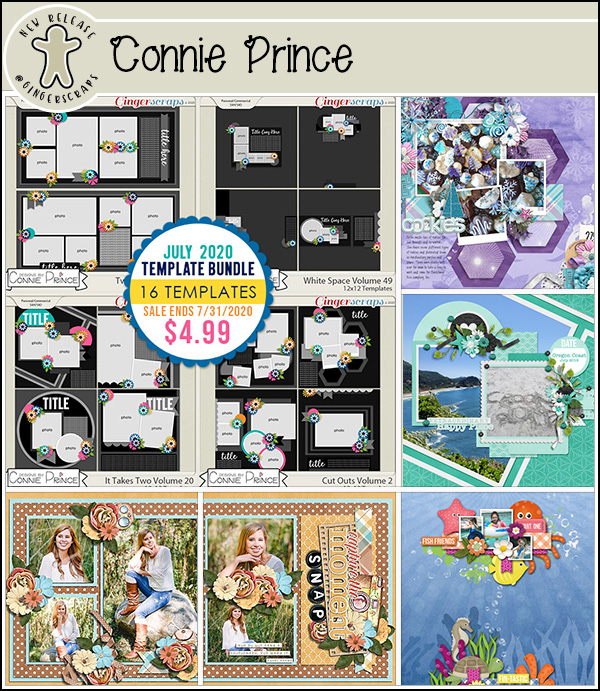
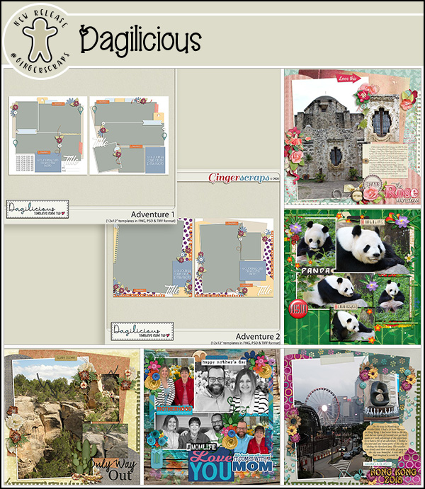
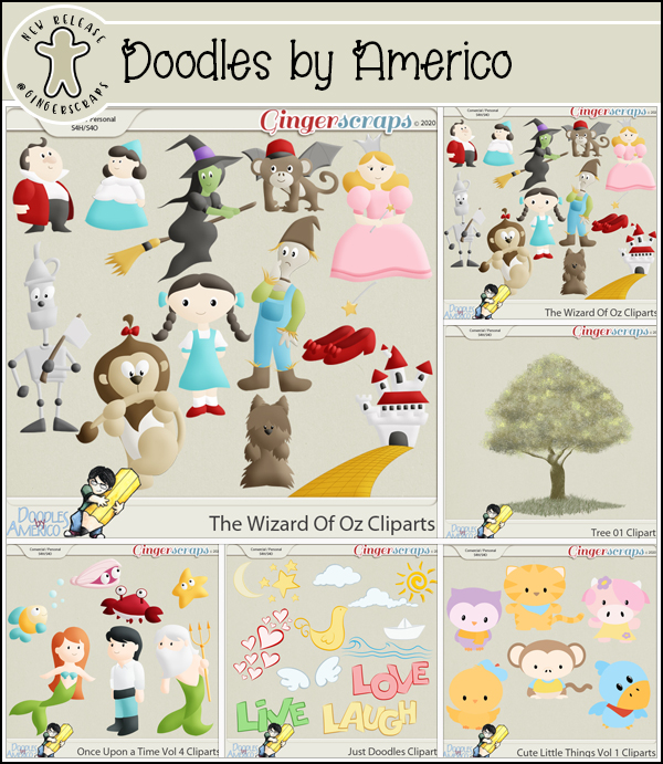
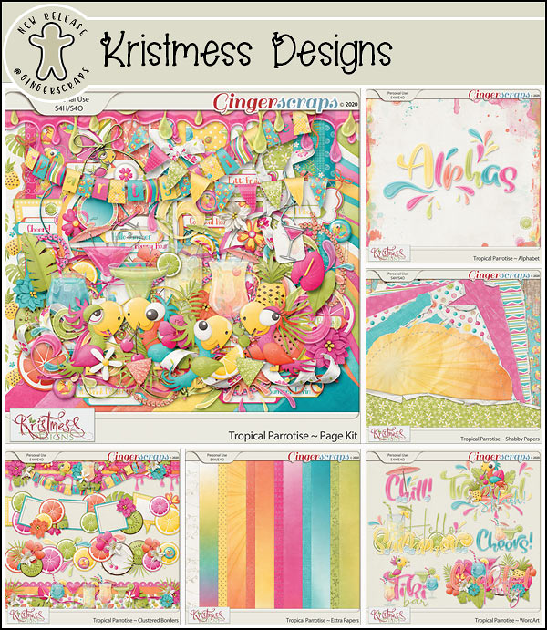
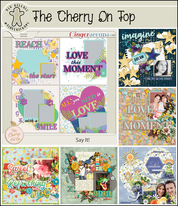
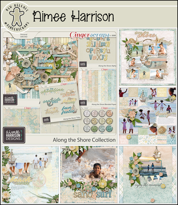
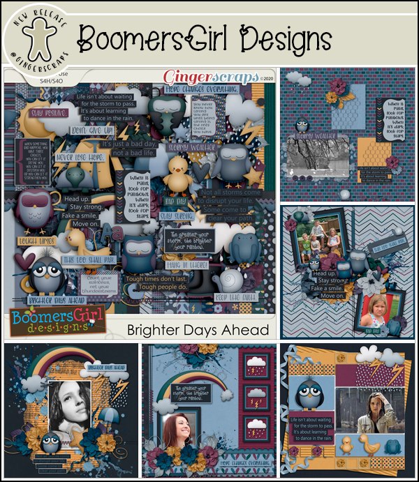
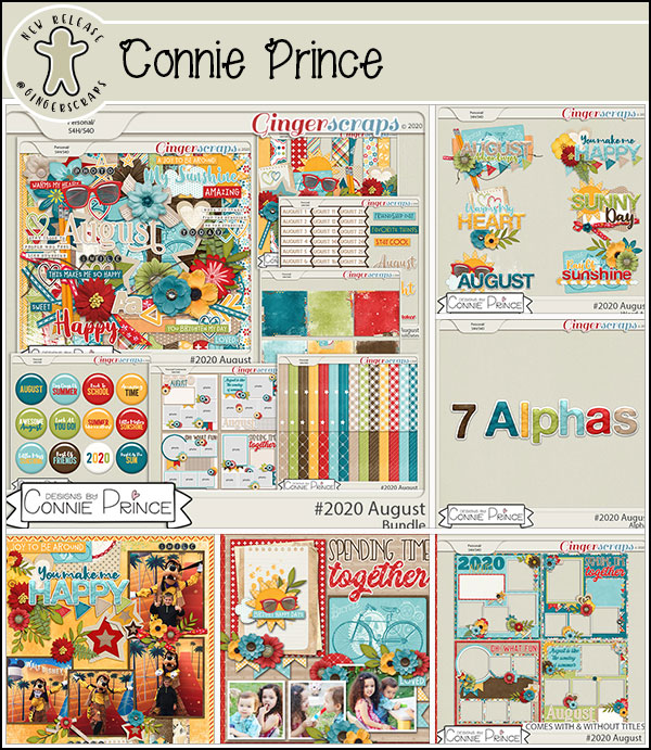
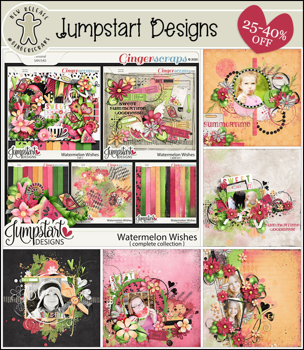
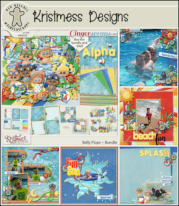
Let’s see what our designers have for the last Fresh Baked of the month.

Today is also the last day for the July Monthly Mix.

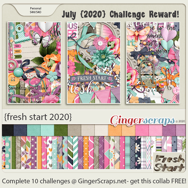
And make sure to get your challenges logged to be eligible for this fun kit for free.

Make sure to look for tomorrow’s post for all the Buffet goodies for August.

Tutorial Tuesday (Photoshop Elements)

It’s All a Matter of Taste – Black and White

Well, July is nearly over and I have STILL not managed to get any scrapping done. I thought about it, but that’s as close as I got. We had a crazy-busy week and I think we’re finally (almost) at the end of the big things we needed to do with the house. We have a fence for the dogs, we’re having synthetic turf put down in the yard on Thursday and once I get the plants I dug up from the backyard transplanted, I might be able to relax! Of course, Thursday is forecast to be the second-hottest day of the summer (36°C/97°F) and I’ll be outside shoveling river rock into our son-in-law’s truck. They better bring the beer!

Anyway… I was looking at some back issues of Photoshop Elements Techniques (only available now as an archive) and came across some tips on converting colour photos to black and white to make them look amazing. So I decided I’d check out the options. I’m using Elements 2019, but the tips I’m going to show you are easily found in most versions.

When I took a photography course many years ago, well before the advent of digital photography, my teacher talked about how black and white was THE true art of photography. I tend to agree with that notion. There are so many nuances to black and white photography that just aren’t there in colour images. Digitally speaking, turning a colour photo into a black and white one is easy, but the ART of it is more in the eye of the beholder. So let’s have a look. I’m using a landscape photo I found at Pixabay for my example.

This method is the first one I tried way back in 2006 when I was learning the basics of Elements. Enhance>Adjust Color>Adjust Hue/Saturation can also be reached by using the keyboard shortcut CTRL/CMD>U.

This method has been available in all versions, and so many of us have done it this way. Dropping the Saturation down to 0 removes all the colour. But that’s all.

It IS nice. All the detail in the clouds, rocks and reflections is there.

In all but the earliest versions of Elements, there’s an option to Remove Color in the Enhance menu.

And this is the outcome. I think it looks pretty similar to the desaturated one. Maybe just the slightest bit more contrast.

But then there’s this option… Enhance>Convert to Black and White. This option first appeared in Elements 9. Could this be the WSNH (Work Smart Not Hard) method of choice?

When I clicked on that button this is what came up. Below I’m showing the default settings; it comes up in the Portrait setting with the colour sliders (Red, Green, Blue and Contrast) as you see them. Now, I know you’re thinking, “Colour sliders? But there IS no colour!” Let’s unpack that.

I went through all of the Modes here, looking at where the colour sliders were in their default settings. See if you can see a difference in each of the images as we go along. Newspaper mode looks like this: slightly less Green, a smidge more Blue and marginally less Contrast.

In Scenic Landscape, the Red has been boosted and the Blue reduced. I can see that the image is slightly warmer looking.

Urban/Snapshots mode has somewhat less Red, slightly more Green, a bit more Blue and the same amount of Contrast, even though it seems like the Contrast is a bit less obvious. I think this mode would be great for architectural photos and streetscapes.

Vivid Landscapes brings the mood with it. Lots more Red, a good bit less Green and Blue, same Contrast. And yet…

I wasn’t sure what to expect with Infrared Effect. There’s less Red, a LOT more Green, a middling amount less Blue and the same degree of Contrast. I think I need to take a deeper dive into Infrared… stay tuned!

Okay, so I’ve looked at all the options. I decided to go back to the Scenic Landscape settings and play with the sliders.

I left the Red and Green as is, decreased the Blue a bit and increased the Contrast quite a bit. I like that the rocks look more carved and stark.

So I went with it. The image is a bit harsh, which suits the subject matter. I could just save it like this, but I want to play with it a bit more.

I really like to use the Levels adjustments especially with black and white images. It can be found by clicking Enhance>Adjust Lighting>Levels or with the easy keyboard shortcut CTRL/CMD>L.

In the default setting for this tool, the sliders for both Input and Output Levels are at either end of the boxes. With the Input adjustment, moving the slider on the left makes the lighting darker, the slider on the right makes it brighter. The centre slider offers a finer adjustment than either of the ones on the ends. For the Output adjustment, the changes are more contrast-related and inverse – the left slider lightens and the right slider darkens.

These are the settings I liked. When using Levels the best way to make them work for you is to watch what’s happening while you move the sliders. That way you’ll know when to stop!

There’s just one more thing I did to this image that I want to show you. As you can see, I added a Copy layer so that whatever I do, my original image isn’t touched. You may wonder why I keep doing more and more, when I have a perfectly useable image already. Well, how better to encourage you to experiment than to do it myself? There’s always the Undo (CTRL/CMD>Z) function! (And I use it a TON!)

I played with some Filters and liked how this one looked, so I clicked Filters>Stylize>Glowing Edges. What do you think happened?

This. This happened. Remember that when you use Filters, you’ll see this screen, with the Filter adjustment panel on the far right. It’s hard to know what it’s going to look like later, but I wanted to have the “glowing” effect to be prominent at this stage.

Here’s the result. So much drama! But it’s a bit on the gloomy side.

So I changed the Blend Mode (naturally I tried several before settling) to Soft Light and decreased the Opacity to 35%. Now I have what Mrs Hansen would call Photographic Art.

Give these methods a whirl and see which one works best for you!

Fresh Baked: JULY 24, 2020

Welcome to another Friday. I’m excited this week because ⚾ baseball is back ⚾.  I’m a pretty much all around sports lover, but I have missed the sounds of summer. My team has their opener tonight. Are any of you big sports lovers? Comment and let me know what sports and teams you love.

Remember only a week left to get this goodie. Any $10 spent in the store gets you this kit for free.

Have you seen the July Challenge reward? You get his awesome full kit for completing 10 challenges.

Sneak Peeks: July 24, 2020


There is just one more Sneak Peak before August! Where is the month going?

Aimee Harrison has a “punny” kit coming out!


[Read more…]

Tutorial Tuesday (Photoshop Elements)

How Can I… Pierce my Paper?

Greetings from the sunny Okanagan! It looks like summer has finally arrived, and the rain has gone away. (That reminds me, I need to water my pots!) I hope your weather is treating you well too, and you can get outside in the fresh air.

Today’s tutorial came from a challenge of sorts from Steph, who likes to see digital methods that emulate paper-crafting techniques. She sent me a couple of images showing a paper-piercing technique and asked if I thought it could be done digitally. Well, of course it can! I just had to figure out how! The image below is from Lisa Addesa‘s blog I’m In Haven. See the areas where she’s punched through her cardstock to add some texture and dimension to her card? How cute is that!

I went through my stash and found a cardstock that’s a similar grey. I could have chosen any colour, but thought it would make easier to see how it works if I used grey.

I thought about what would make the most sense to the most people (and didn’t cost anything) and opted to use a Custom Shape to create my path for punching. You could use a swirly brush, an element from a digi-kit or a hand-drawn path if you wanted to. The default shapes are uh… not what I was looking for!

So I clicked on the triangle at the side of the Custom Shape tool bar and opened up the tool’s menu. Right at the top of the list is an option to see ALL of the custom shapes in the library. And there are a lot.

I found a swirl about 3/4 of the way down the list that looks a lot like the one in the example, so I chose that one. But this technique can be adapted to ANY of the shapes you see here without any difficulty.

I used white as my foreground colour but again, it doesn’t matter at all what colour I used. As long as it shows up against the background, it’s all good. I clicked and dragged out a swirl as you can see. The shape is created on a new, “Smart Object” layer, meaning it can’t be altered in any way in its original state.

I plan to make some alterations so I right-clicked on the layer and chose Simplify Layer.

Now I CTRL/CMD>Clicked on the Layer Thumbnail (that little picture of the layer I’ve circled). That “selects” the edges of the image.

This step isn’t essential, but to avoid confusion I’ll show you what I did. You could just use the swirl as it appears, but this makes it easier. I clicked Select>Modify>Contract and that moves the marching ants that delineate the selected area inward. (Expand would do the opposite and make the selected area larger.)

I just picked a number (10 pixels) and tried it to see if it was a good number. It was, so onward ho!

This step too isn’t essential. You could leave the selected area inside the swirl alone and carry on to the next step. In fact, if I was using a more complex shape, I think I would skip this step altogether. Anyway, I clicked Select>Inverse to move the selected area from inside the swirl to outside.

Then I clicked Edit>Cut (CTRL/CMD>X) and that removed a large amount of the swirl without altering the shape.

See how it’s so skinny now? If I hadn’t Inverted my selection, instead Elements would have cut away the centre of the line, which would work well for the next steps too. I chose the Brush tool, a hard round brush 16 pixels in diameter at 100% Opacity and made some adjustments to the Brush Settings, which I’ll show you in the next image.

My current laptop isn’t as user-friendly with screenshots as my previous one was, and I couldn’t screenshot the Brush Settings menu, so I took the laptop into the laundry room where there’s very little light, and took a photo with my phone. The image shows the Brush Settings defaults. We’re going to adjust only that “Spacing” setting. I ended up choosing 125% as my spacing, but if you want your piercings to be closer together, use a smaller number. Farther apart? Go larger.

But………… before we go any further, Create a New Layer!! Brushes ALWAYS go on their own layer.

The starting point is a matter of preference. I zoomed in a ton and started at the open end. I held down the left mouse key and slowly, slowly followed my swirl path with my brush. The dotted line just appeared as I went along. When I had to stop and reposition my workspace, I just eyeballed the spacing for where the next dot should be and started brushing again from there.

Don’t aim for perfection. If you were actually piercing paper with a needle tool, the holes wouldn’t be perfectly spaced (although these ones are) and they wouldn’t perfectly follow the swirled line. It took me about 10 minutes to work my way around the entire swirl with my “holes” quite close together and my swirl covering most of my 12×12 paper. If I’d just Cut away the centre of the shape, it would have created a grey opening in the white swirl for me to follow. I tried it both ways and it really doesn’t matter with this kind of shape.

This is where you see how important it is to put the brush on its own layer. If I’d brushed directly on the swirl, I wouldn’t be able to turn it off and just have the brush left. At this point the swirl shape layer can be deleted. It isn’t needed any more.

Okay, that’s great. But it doesn’t look like the paper has been pierced. How do I get that? If you read and tried the tutorial on letterpress, you already know! I applied a Bevel Style: click the Style button at the bottom right of the workspace then select Bevels from the drop-down.

The best choice for this technique is the Simple Emboss bevel, the one in the upper right corner. It’s hard to see in the screenshot, but now it looks a bit like Braille.

To get the Bevel to look like a piercing, it’s necessary to change the settings on the Style. Double-click on the fx icon on the brush layer and change the Direction to Down. Leave the size at 21 pixels.

Let me show you what else you can do with that brush on its own layer. You can resize it to whatever size works for you. I like to start with a large image and then size it to suit, which makes it easier to see what I’m doing. (One caveat: if your dots/”holes” are close together when the image is fairly large, they will appear to run together when you shrink the image. So if you think you might want to make it smaller, leave more space between your “holes”.)

And you can copy it, skew it, rotate it and play with it until you have the look you’re after. I know I’ll be doing this on some of my creations!

That’s it for this week. Give it a try!

Fresh Baked: JULY 17, 2020

It’s Friday! Yay! Last week I mentioned that I was going to be on vacation this week. Or stay-cation. Seemed like a perfect time to have a new washer and dryer delivered, right? Today is day three of a crazy delivery fiasco. So much for “easy”. Here’s hoping that by the end of the day I will have both washer and dryer installed and working.

Remember, when you spend $10 in the store you get this bright and colorful {fruity fun} kit for free.

Let’s get a peek at some of the new goodies in the store.

And lastly, remember any 10 challenges completed gets you this kit as a reward. How many of us are ready for 2020 to have a fresh start?

Sneak Peeks: July 17, 2020

Oh, this week’s kits are definitely varied. We’re going from tv show-based to bright and sunny. It’s amazing seeing what the designers are coming up with each week!

Angelle Designs has an amazing kit based on the "Little Liars", and it makes me want to rewatch the episodes!

[Read more…]

Tutorial Tuesday (Photoshop Elements+)

The Key to Painless Extractions!

Greetings GingerScrappers! It’s Tuesday again… the weeks are just flying by for me. Hubby and I have started working on the “non-essential” area of the house, what I’m calling #jansworld… the huge room in our downstairs that will be my hobby space. The movers dismantled all of our storage shelves and two of my desks. They also just loaded the room with every box that had “office”, “Jan” or “craft room” on them, piling them up 5 or 6 high with no rhyme or reason. So it’s a monumental job to get that space sorted out. We’ve made a good start but when I told him today I had a tutorial to write and we weren’t going to spend any time in there… he went ahead and did some things without me and then had to interrupt me twice to ask for guidance. Grrrrrrrrrrrr. So I know I’m going to miss my usual post time. Sorry… Thankfully my boss (the amazingly generous Ginger!) isn’t too much of a stickler.

On to the tutorial. I’m feeling like I should be able to get some scrapping done this month so I looked at the July Challenges and decided which ones I might be interested in taking up. The Inspiration Challenge Lina of LDragDesigns has tossed out is to use an extraction on a layout. I like extractions but find them very time consuming. What to do, what to do… How about checking to see if Elements+ has a quick mode?! Why yes, yes it does!

I’m intrinsically lazy, so if I’m going to do something as fiddly as an extraction, you know I’m going to choose carefully. I’m going for a clean cut and as little work as I can get away with. This photo from Pixabay ticks all my boxes. The Elements+ feature I’m going to show you is in the Selections menu, which makes perfect sense because that’s what an extraction is. I think for the sake of Working Smart, Not Hard, I’ll be using the Effects button at the bottom of the Layers panel and choosing Elements+ from the drop-down.

You can see what each of those Elements+ icons is for by holding your cursor over them and letting the name pop up. The Selections icon is at the centre of the top row. The Selections menu appears on the left of the workspace as shown.

But first, before we go down the rabbit hole, I made a Duplicate photo layer… just in case I do something I can’t undo. I’m going to start off with the Polygonal Lasso Tool. It’s the one that looks like a Greek symbol with a tail. I also turned off visibility for the background layer.

You’re not going to believe how long it took me to figure out how to use the Polygonal Lasso tool. Let’s just say it took a LONG time – I hated it because it didn’t do what I wanted it to do – and leave it at that. But now that I know how to use it, I quite like it! The trick with it is to make small nibbles, and to get as close to your subject as you can. It might sound like a slow process but it isn’t. As my mother used to say, less haste and more speed! Click on a spot where it makes sense to start out. Then move your cursor to a natural spot to change course. I started at the left of her hands, just below them. I went over to the area just below where the heel of her hand starts to lift off the rock and clicked there as my next reference point. Then I went to the bottom of her bracelet, clicked and moved to just past the bead on her bracelet. By taking a little bit of extra time with this step, it sped up the subsequent steps. I kept making small (and a few not so small) runs, clicking at the end of each, all the way around her. When I got back to my original starting point I double-clicked and I had a nice, free-form selection!

In this screenshot you can almost see the outline of my Lasso’d area. Now I went back to the Selections menu and clicked on Quick Mask Mode. Red is the default colour, but if I was trying to extract something from a red background, I could easily change the mask colour to blue, green or a chosen colour.

And that was all I had to do to create a mask on my image! Now I can fine-tune the edges.

Next I went to the Brush tool to clean up my extraction. Because I’ve put a layer mask on the active layer, the Brush tool automatically sets up for concealing and revealing – the colours in the picker are black (which CONCEALS) and white (which REVEALS). I flip back and forth between erasing and replacing by clicking on the “X” key. (JUST the X key… I don’t want to go to another keyboard shortcut accidentally!) I was able to get pretty close to the outline of her body with my Lasso so I can go with a fairly small brush size – 9 pixels – and I can adjust the size up or down by using my square brackets keys. The Left bracket makes it smaller, the Right makes it larger in the same way using them with the CTRL/CMD key zooms in and out.

I just started brushing away the mask with the foreground colour set to white. I zoomed in quite a lot to see clearly where my edges are.

There is a bit of very minute detail in her hair that I’ll have to brush back in, so I can switch the foreground colour to black, make my brush smaller and paint it back. Before I forget… If I didn’t manage to include an important area of my image, I can add it in during this step really easily. Brush it in with black!

My brush size ranges from 1 pixel for the really tight spots, to 12 pixels for the straightaways.

Now that I’ve finished with the clean-up, I went back to the Layers panel. This step tells Elements+ that I’m moving on to a new operation.

To get Elements+ to finish the job, I clicked again on the Selections icon then told it to Exit Quick Mask Mode.

The red mask is gone, and now I have marching ants instead. I just need to…

Invert the Selection (Select>Inverse or CTRL/CMD/Shift>I) and then I can eliminate the sky, the water and the rocks.

Two ways as usual, Edit>Cut or CTRL/CMD>X.

Boom! It looks pretty sharp to me.

Here’s what the whole workspace looks like when I Zoom back out.

So before I Save it, I’m going to Crop it down to a more useable size.

I want to keep the background transparent so I’m going to Save As a .png. The keyboard shortcut for Save As is CTRL/CMD>Shift>S.

To keep as much sharpness as possible I’ll save it at the Smallest compression but it doesn’t need to be interlaced.

Now I can put this yoga queen on just about anything! I’ll have to figure that part out later.


Fresh Baked: JULY 10, 2020

It’s Friday!!! And when I get done with work this afternoon, I’m technically on vacation for a week. It’s a stay-cation and right now I’m working from home so…. not sure there will be a real difference. But vacation is vacation.

Can you believe we are less than six months from Christmas? A little crazy, right. Seems like a perfect time for a sale.

I think it’s time to go shopping. 🙂

Remember, any $10 spent in the shop gets you this full collab.

Now let’s see what’s new in the store.

Have you grabbed this gorgeous Monthly Mix kit for July?

And finally, how are you doing on your challenges this month? Any 10 completed get you this kit as a reward.

Enjoy your weekend!

Sneak Peeks: July 09, 2020

Hopefuly no one caught this post before I type this out.

It’s been a bit since I’ve posted one of these. I apologize. 2020 is taking us all for a loop, and woo, it hit me hard last month.

But I’m back and back into the swing of things!

ENJOY!!

Aimme Harrison

has an adorable collection coming out, celebrating “Bees”!

[Read more…]