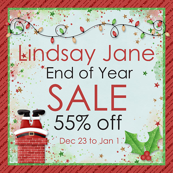
It’s the last Friday in 2022. This year has flown past. We cannot wait for you to see all the wonderful things in store for GingerScraps for 2023!
Have a very Happy New Year!!
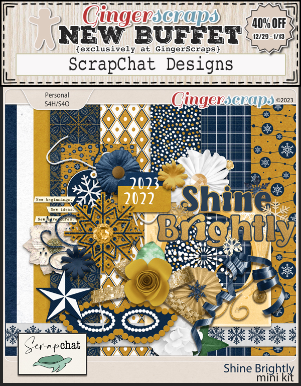
Spend $10 in the store and get this great kit for free!

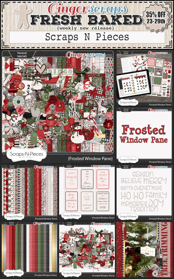
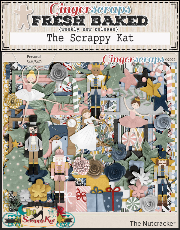
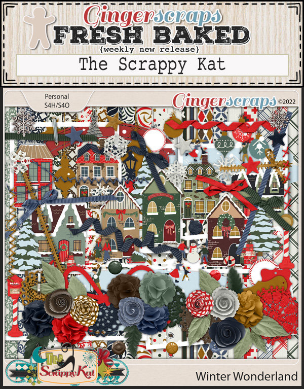
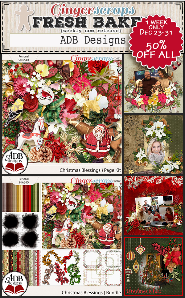
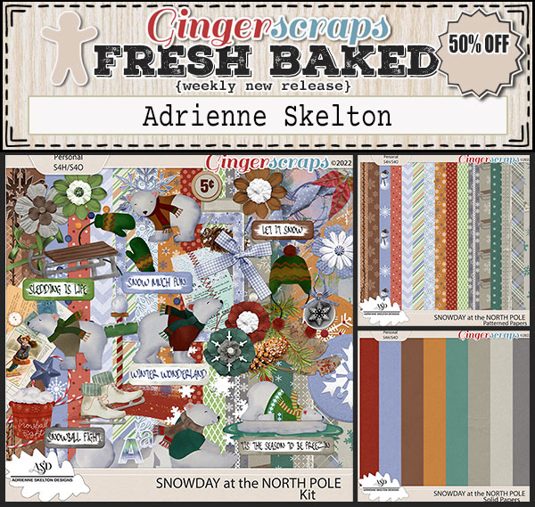
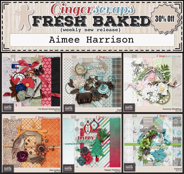
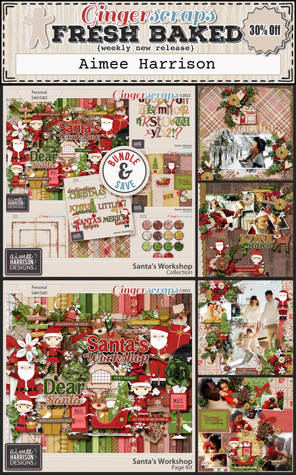
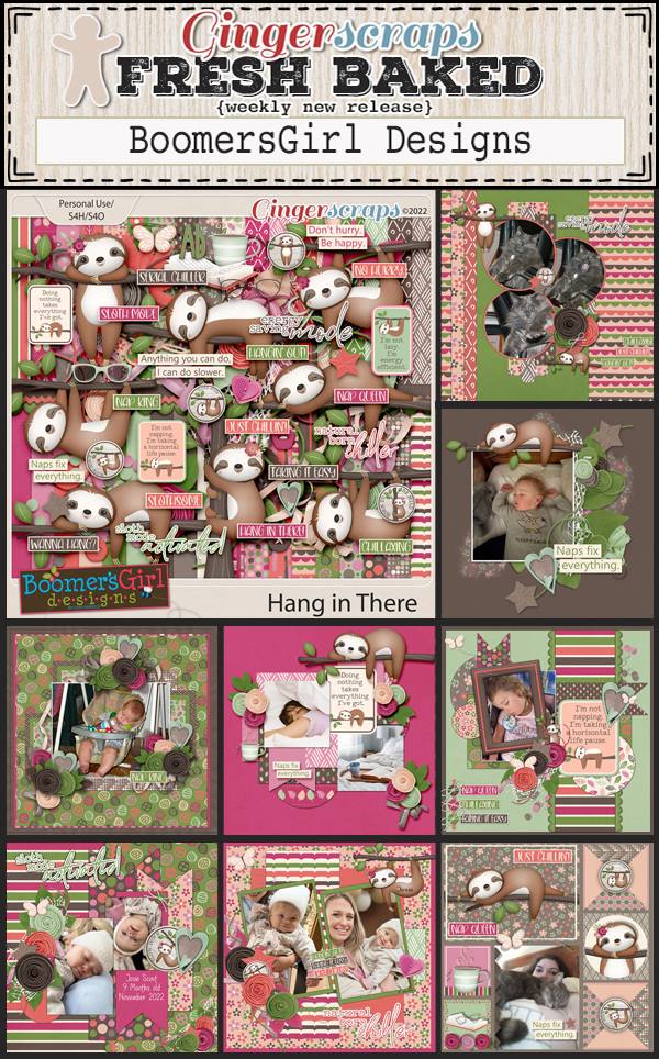
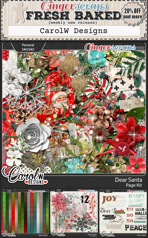
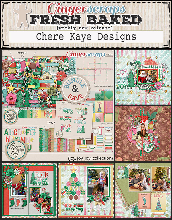
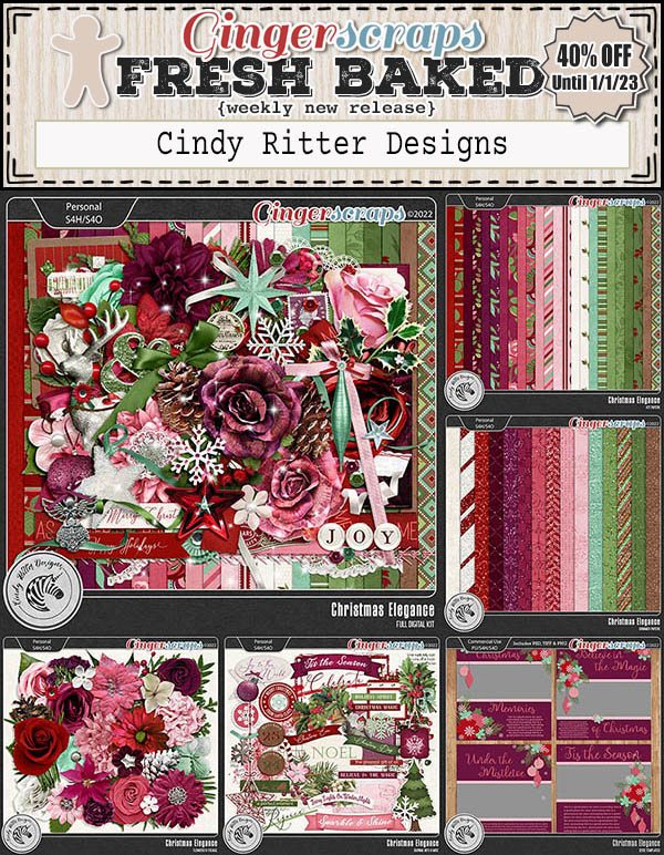
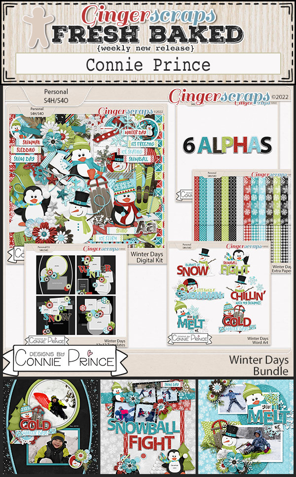
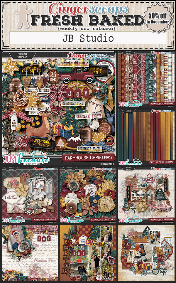
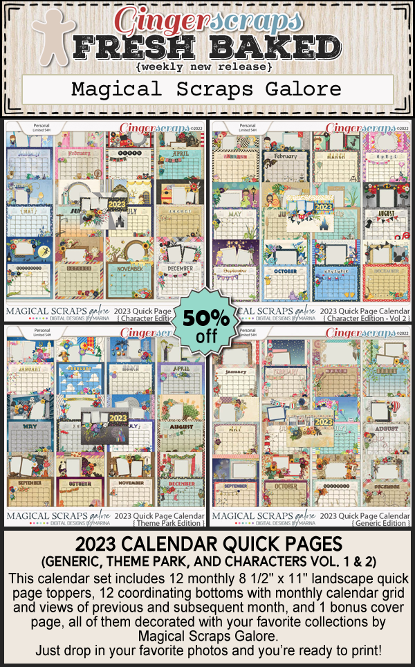
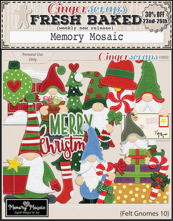
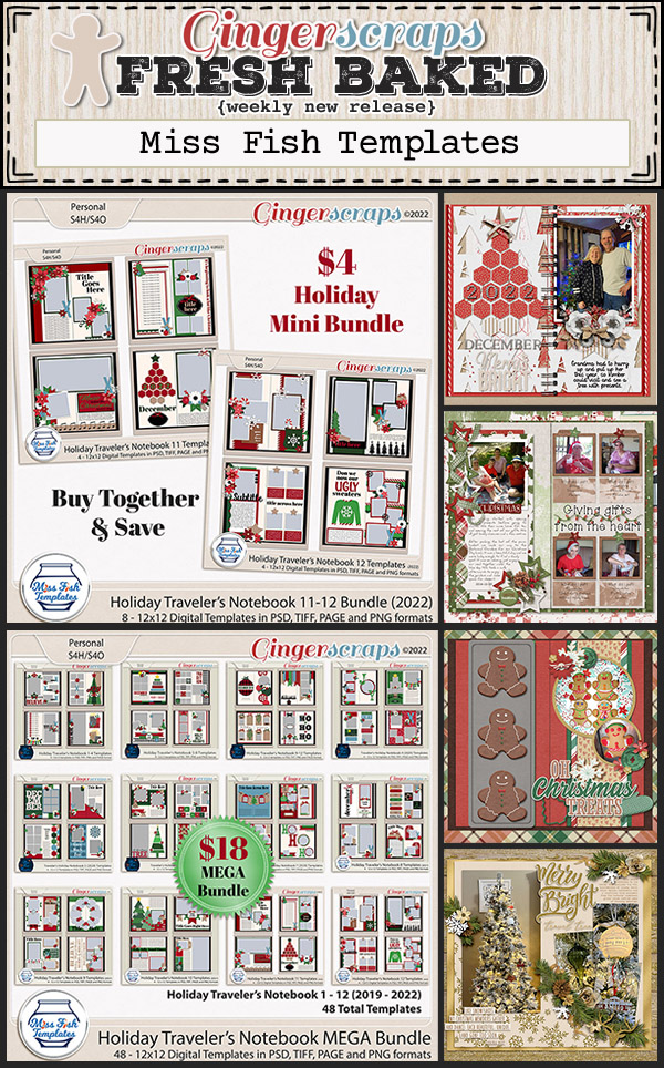
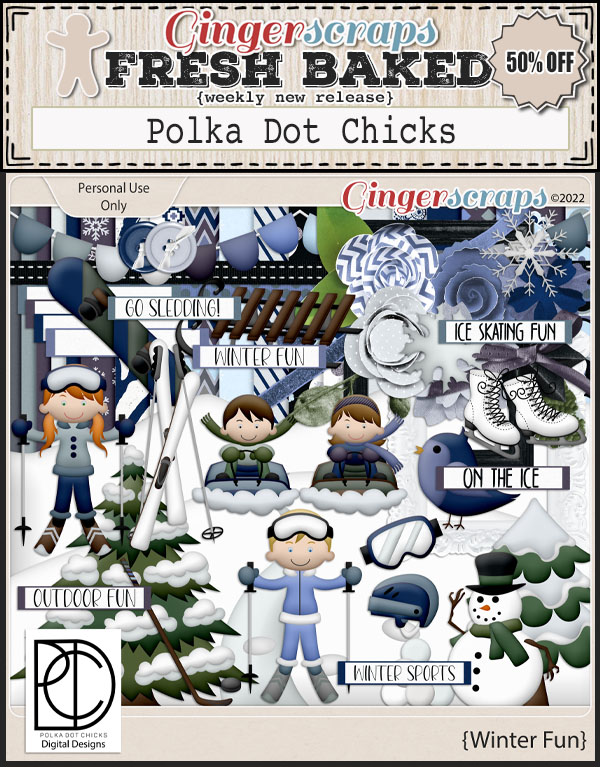
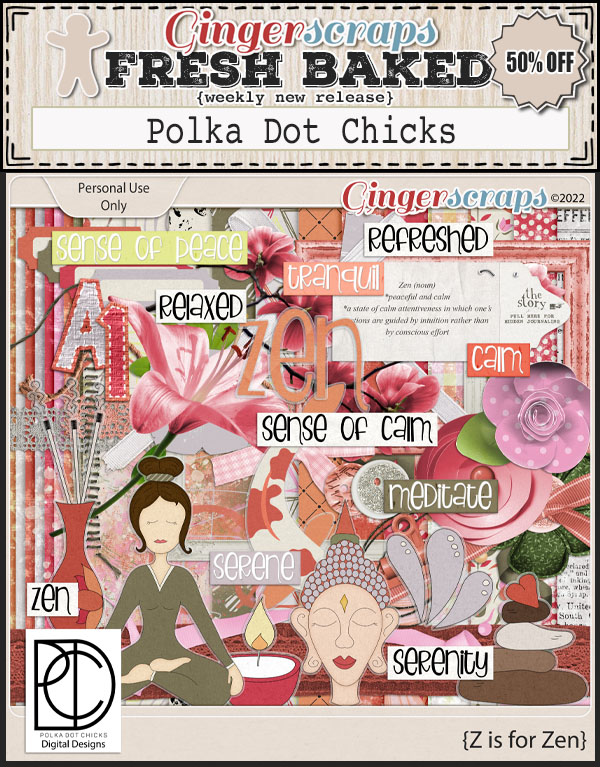
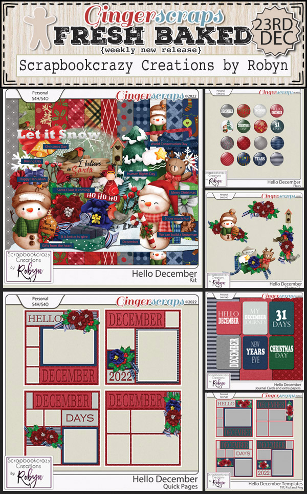
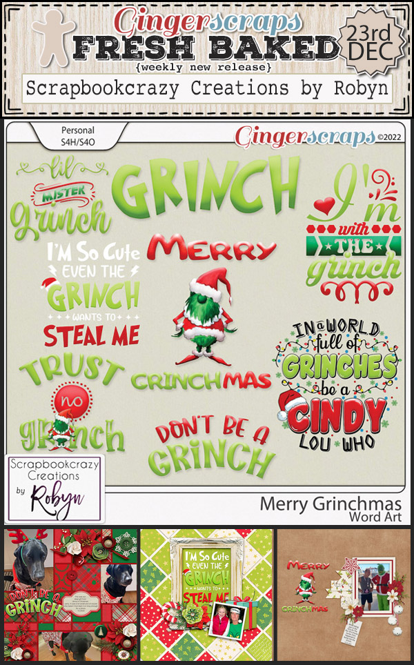
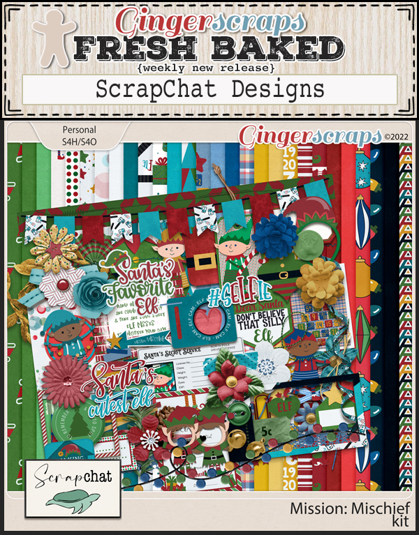
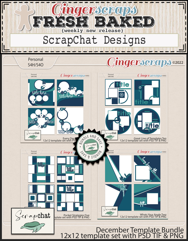
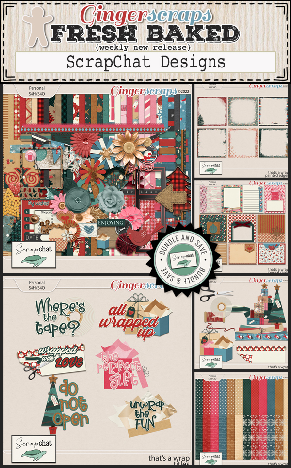
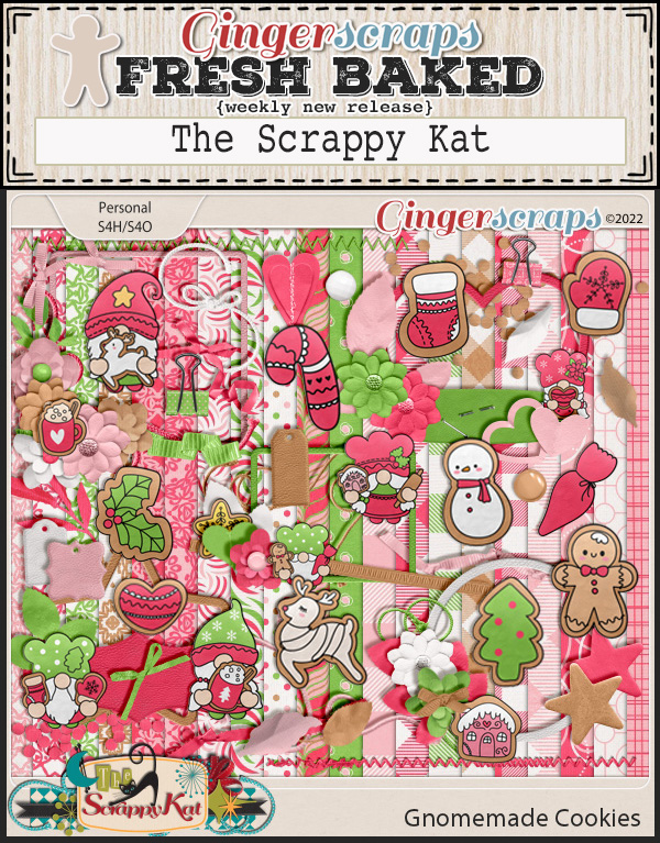
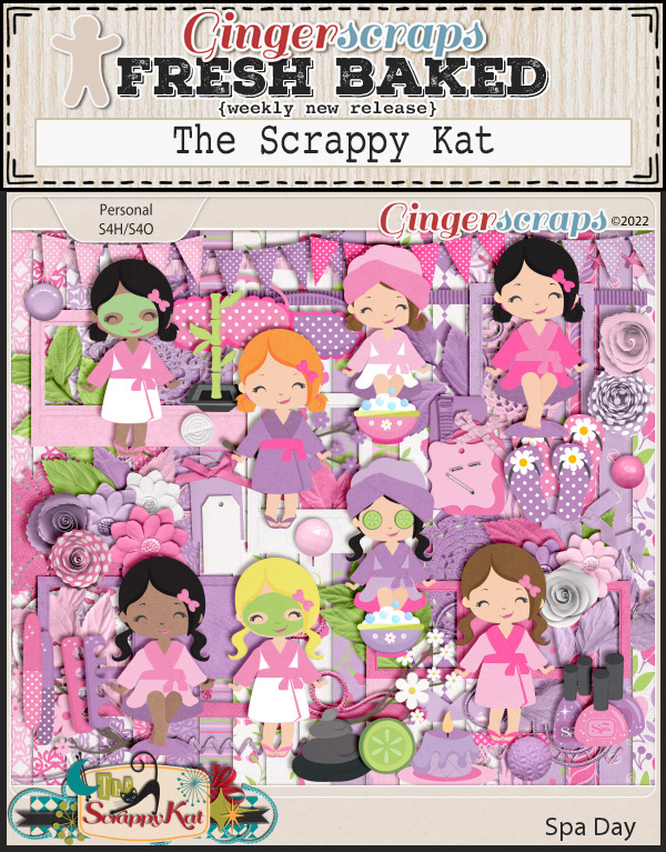
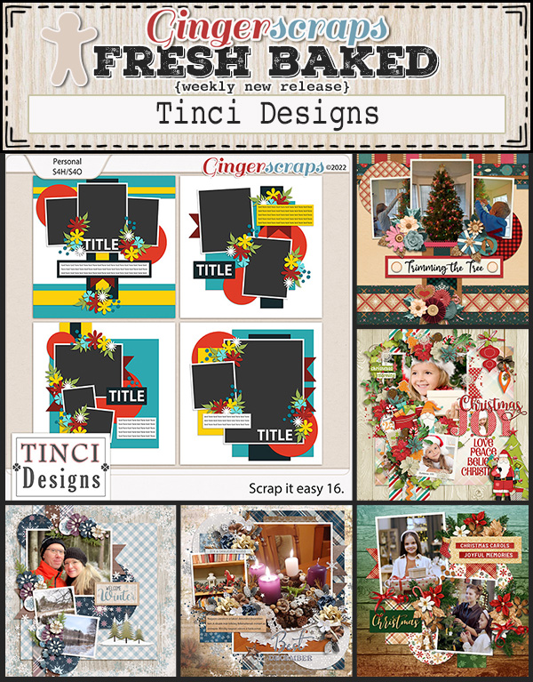
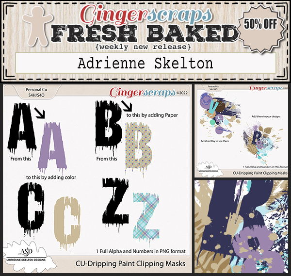
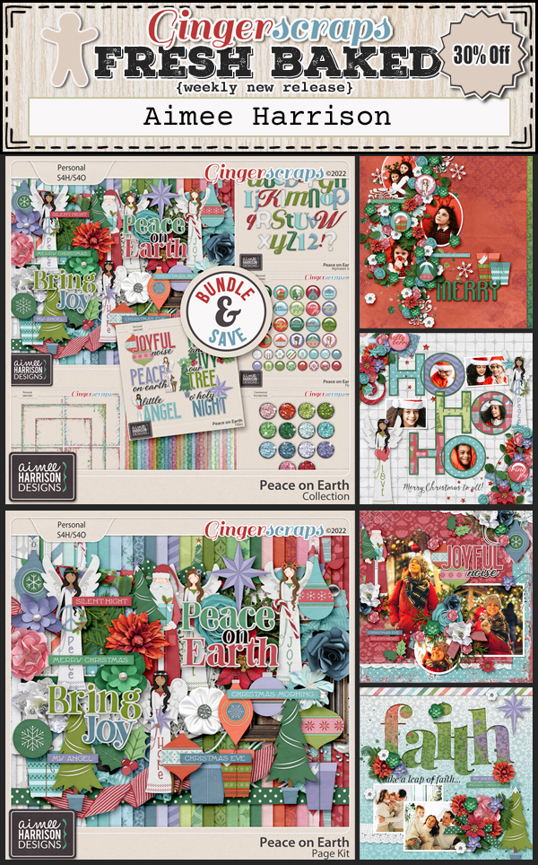
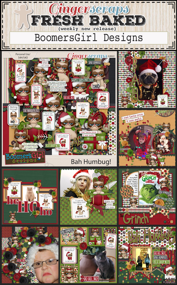
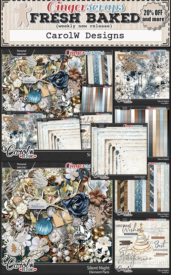
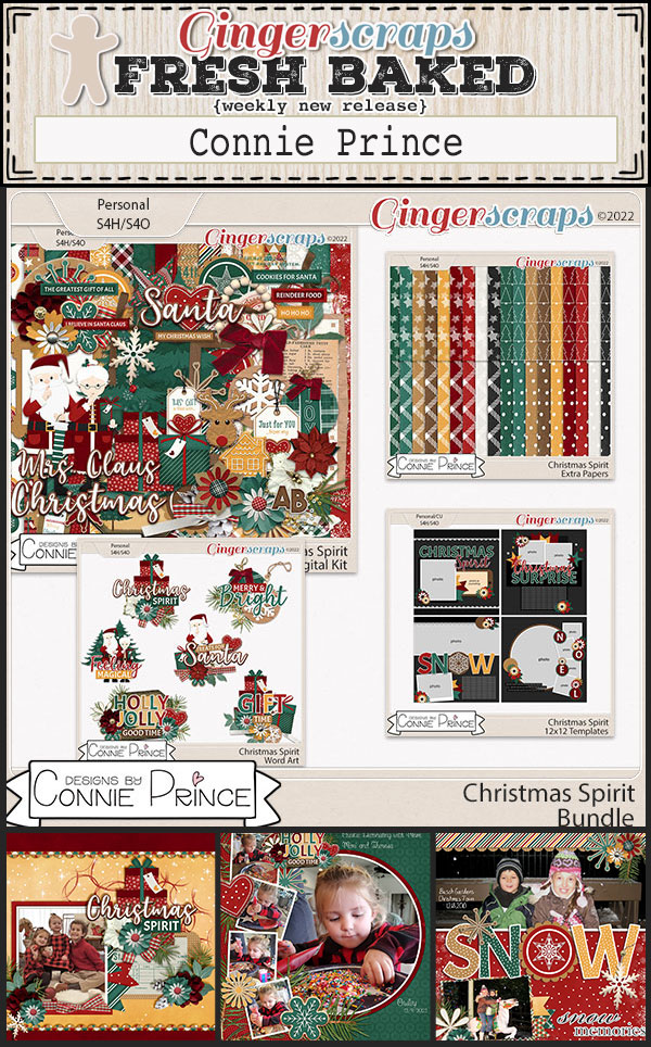
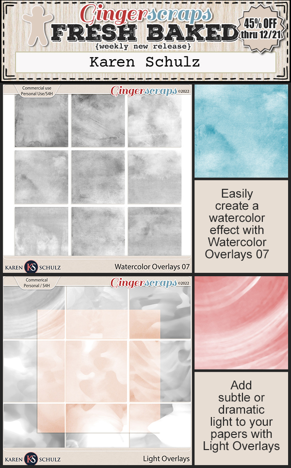
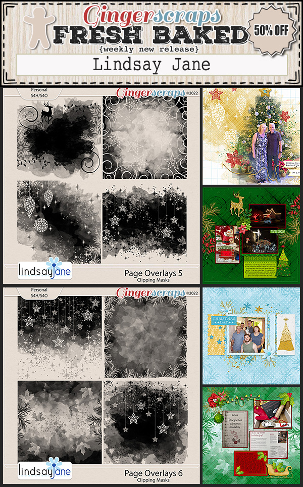
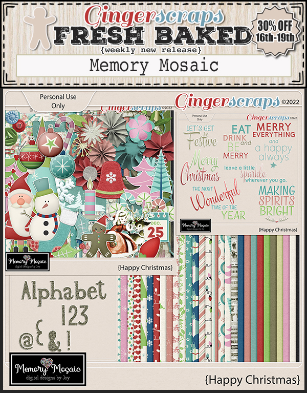
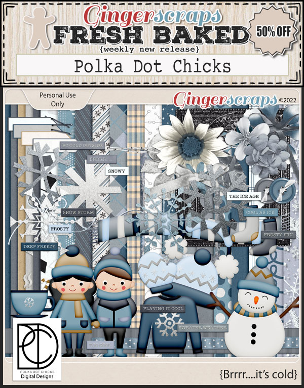
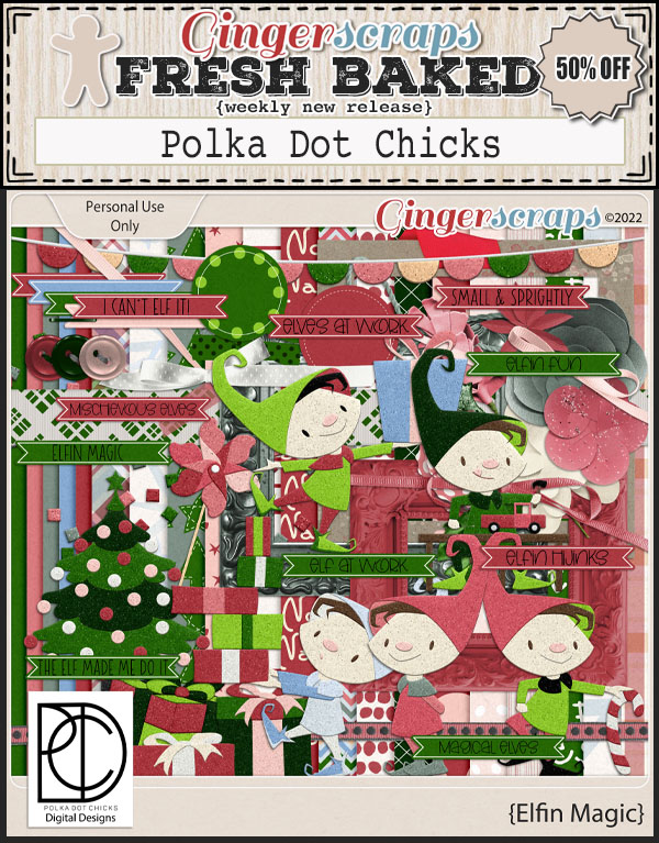
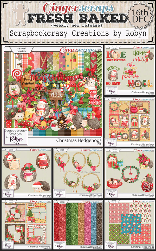
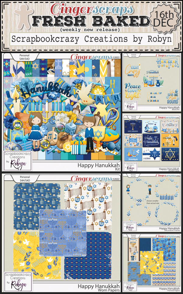
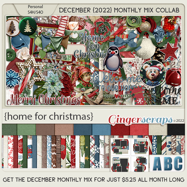
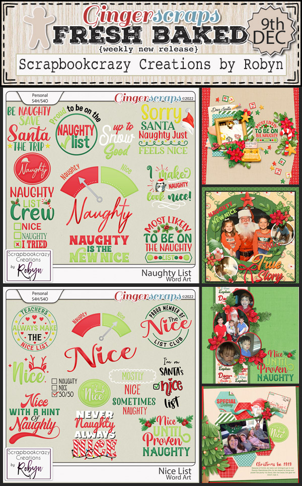
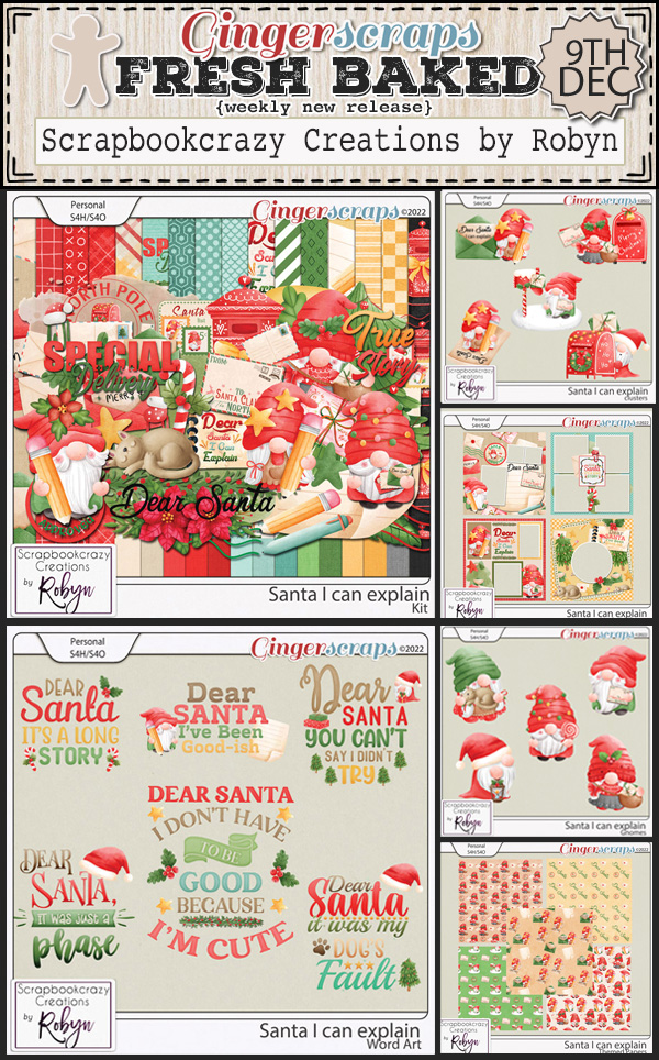
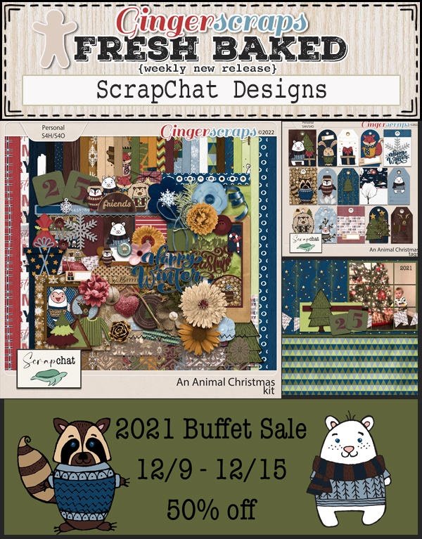
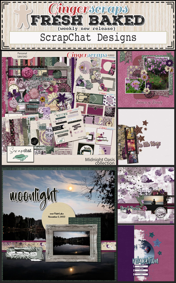
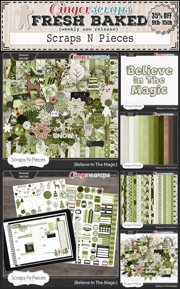
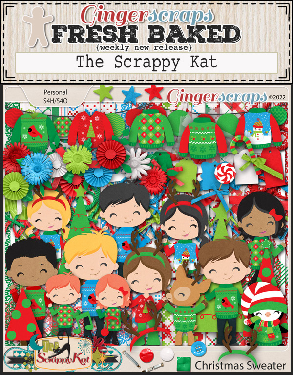
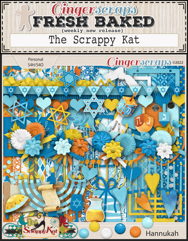
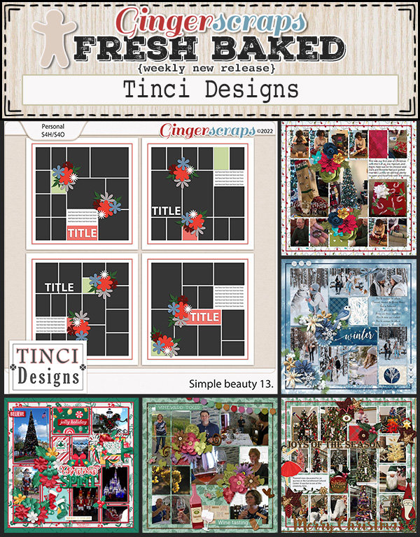
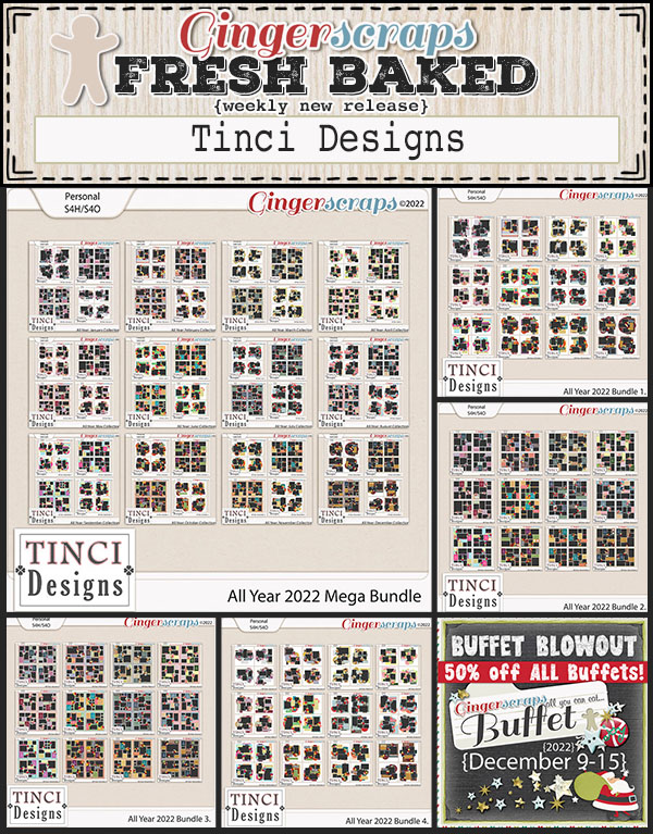
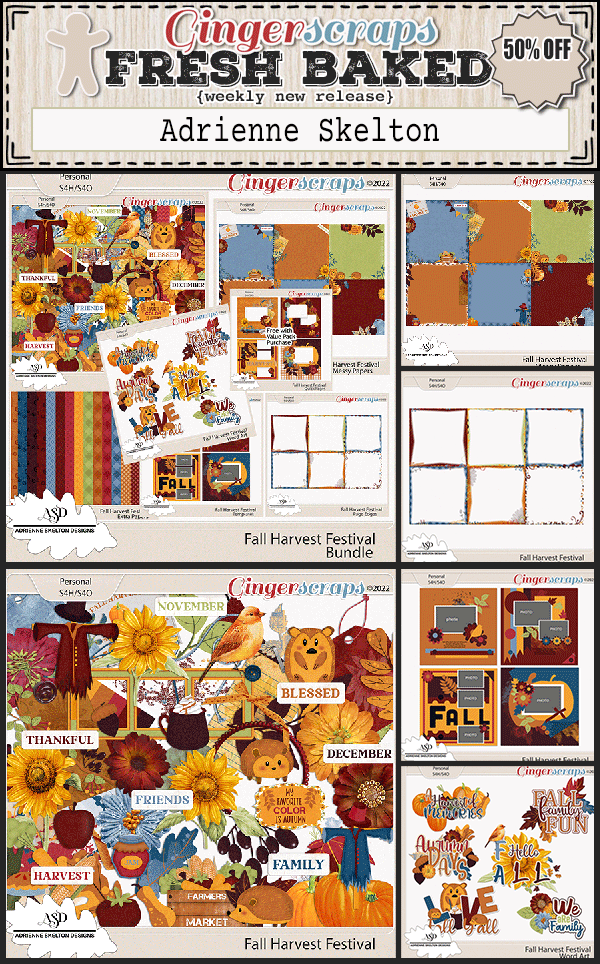
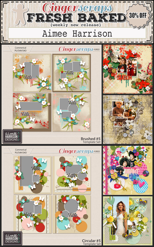
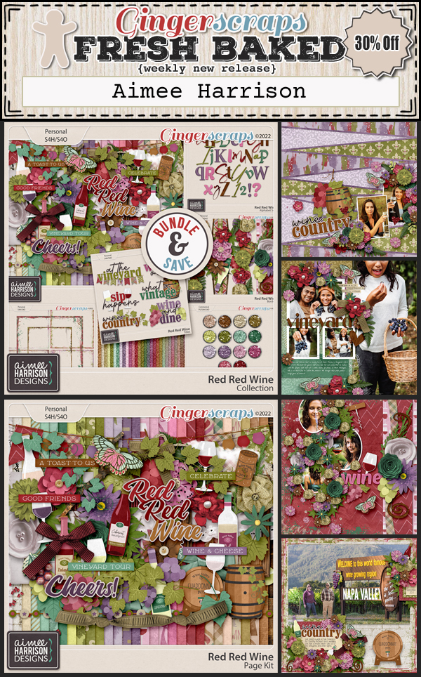
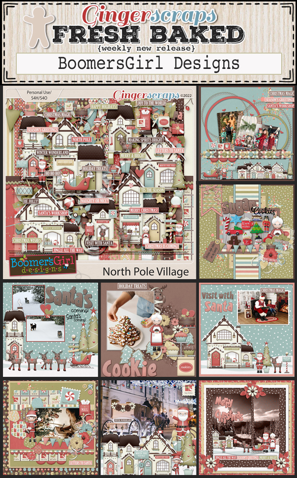
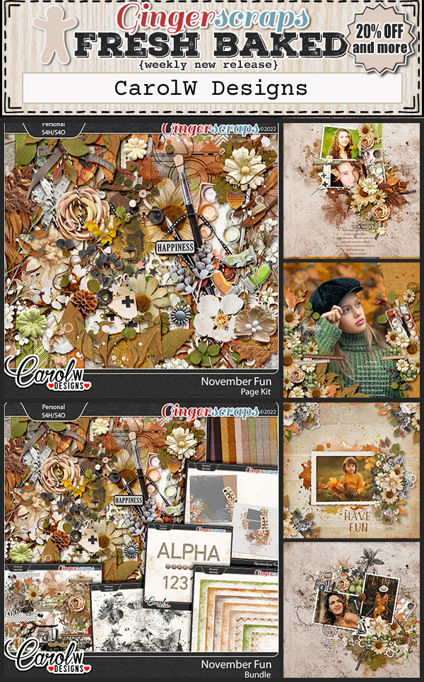
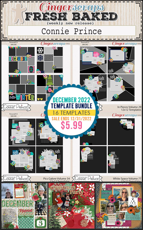
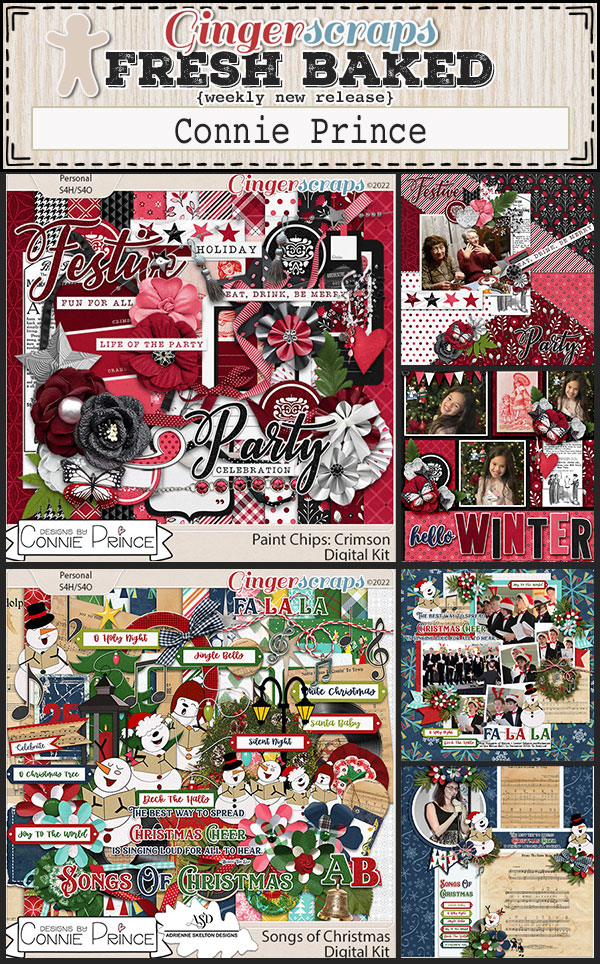
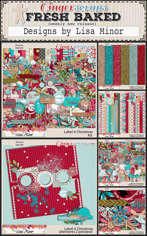
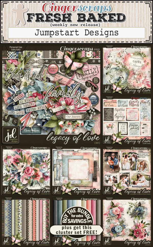
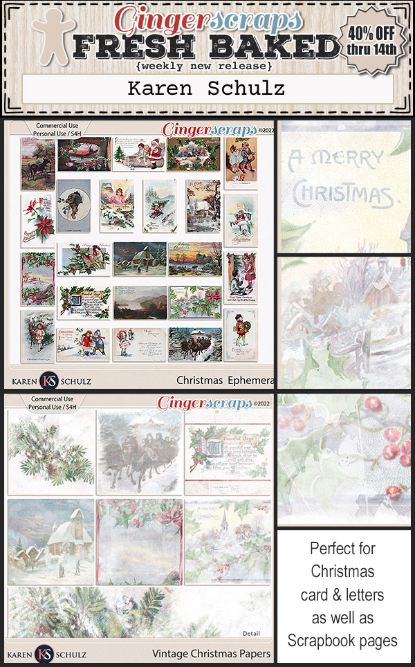
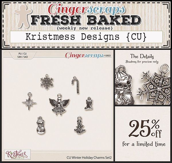
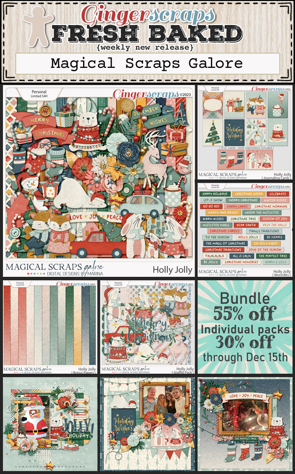
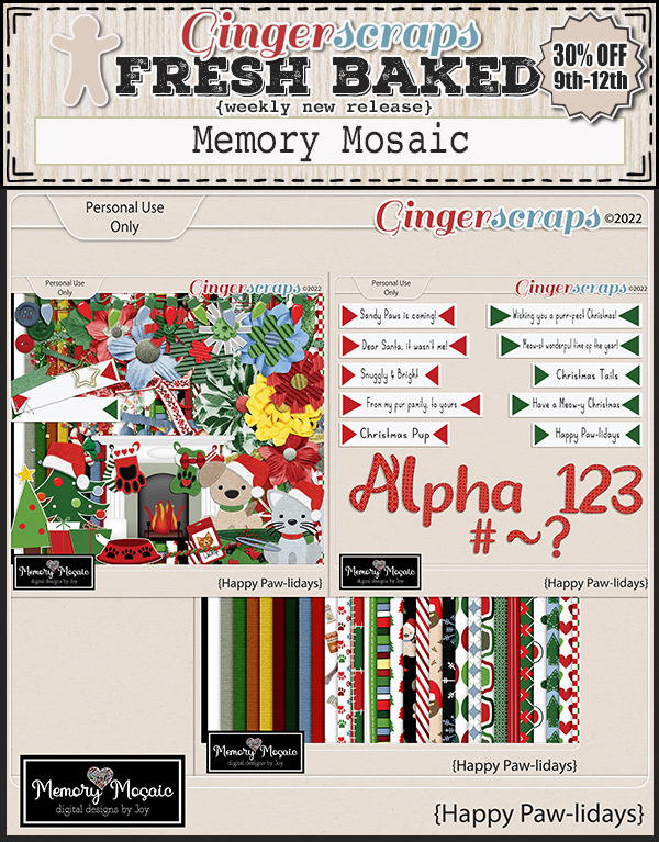
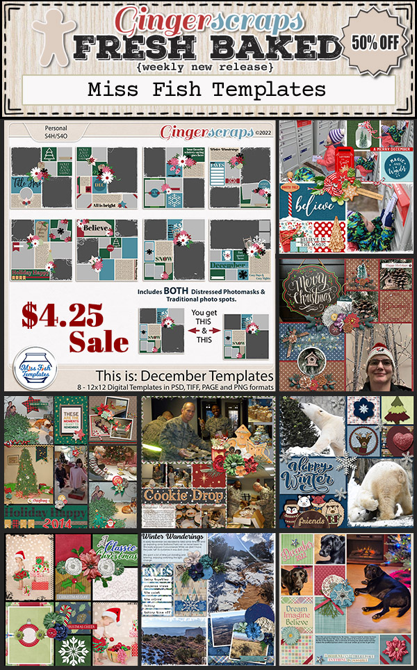
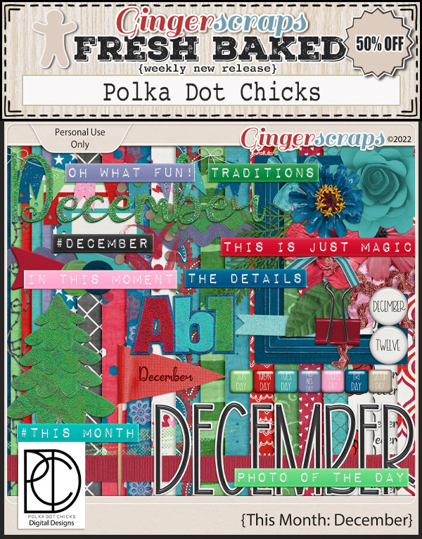
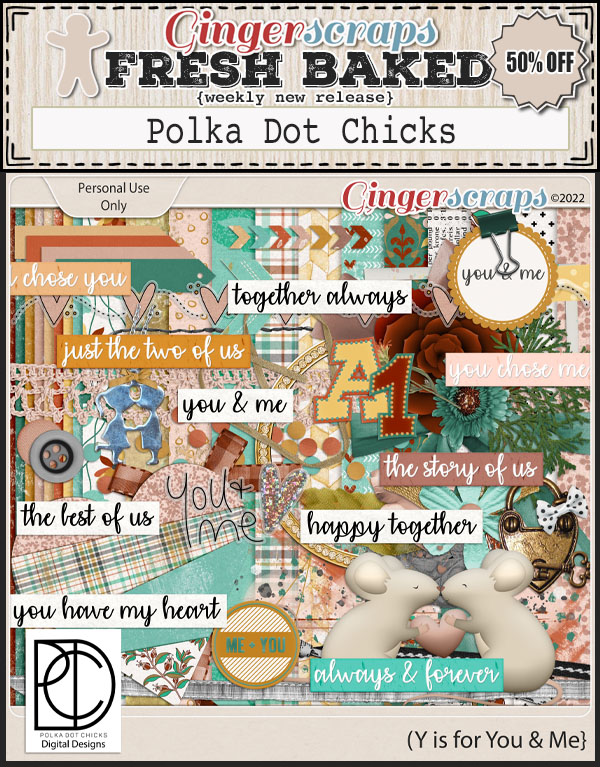
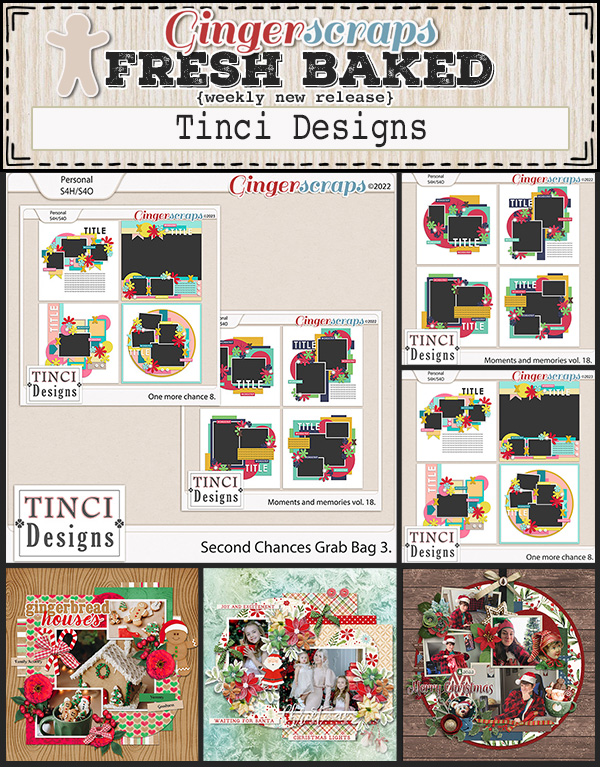
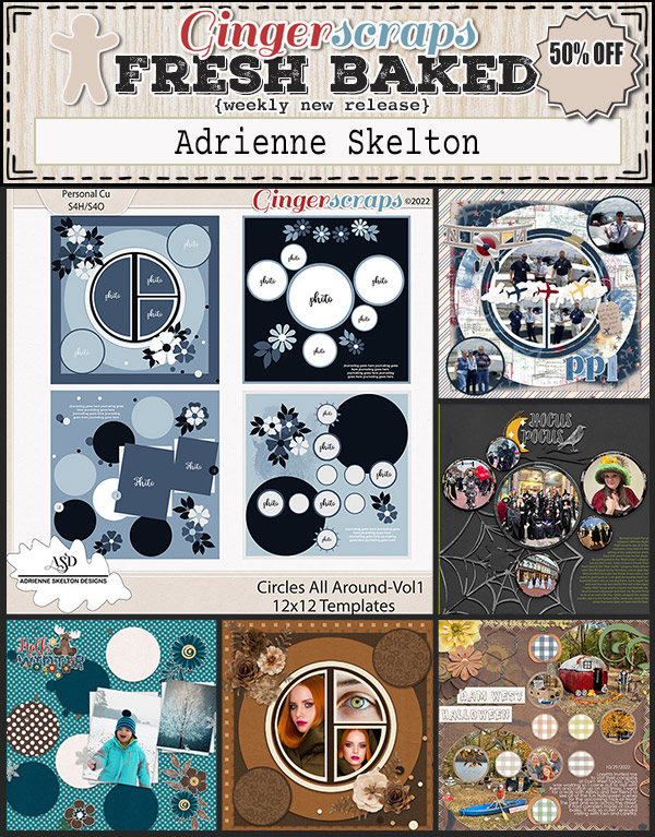
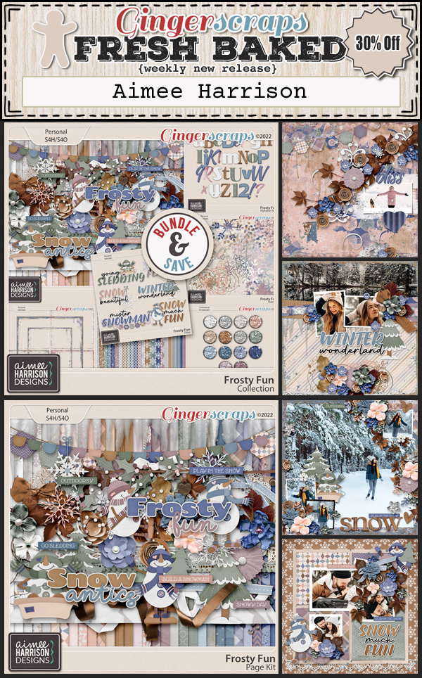
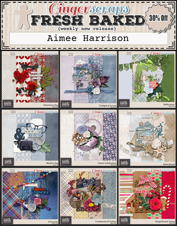
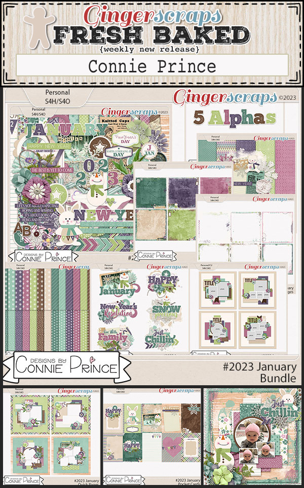
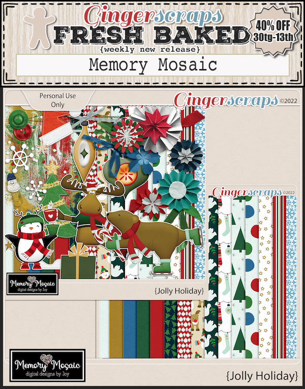
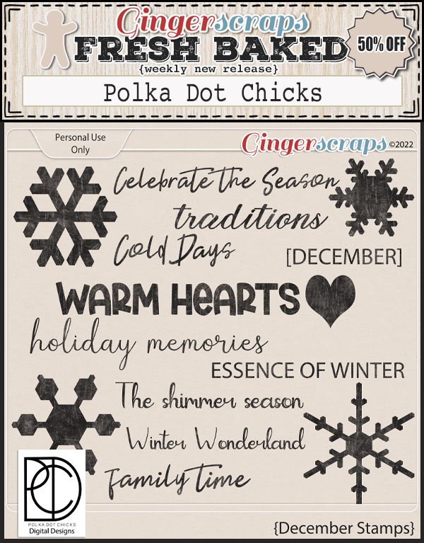
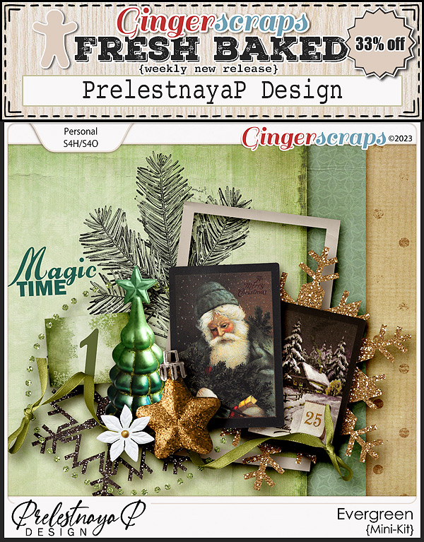
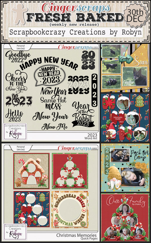
Let’s see what our designers have for this last week Fresh Baked in December.
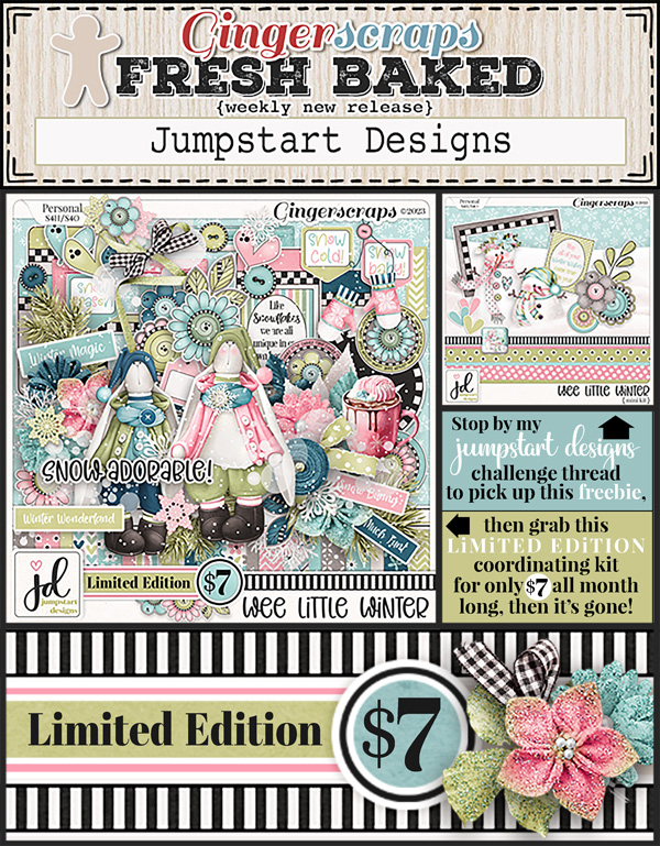


Just a couple more days to get our challenges done. Complete any 10 challenges and get this kit as your reward.